Typefaces
-Blunt stiff pen used on photoshop to mimic typically drawn tabs identifying genres and a-z in record stores and personal human touch-vinylcuts/vinylstickons type too decorative as body text and make interface look less mature and marker pen arrow has potential of not being legible and not being appropriate for mature users

-dj fonts typeface for legible universal vinyl symbols, appropriate for international users of the website. website must be universally recognised as a vinyl marketplace with non bias layout and inspo from typical record store layouts and features
-use helvetica as it is the most legible and universal typeface which is well known, and will have no issue for the older audience
Layout
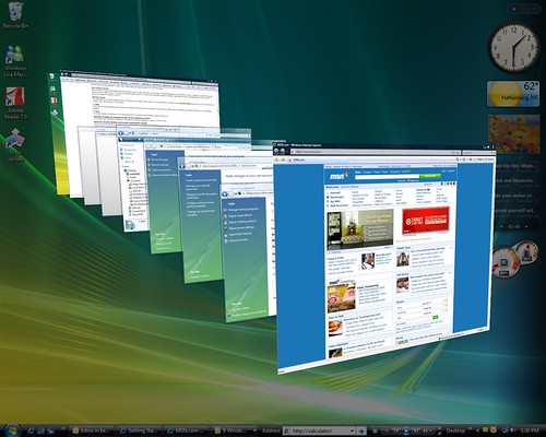
-static menu, scrolling recommendations of just uploaded adjusted to your purchase and search histories, which sidescroll more like browsing a record store-it has been suggested I recreate the stacks like Windows Vista but I feel this would be very offputting and time consuming considering my audience and the initial problem of it being time consuming and messy
-Hover over vinyl artwork was favoured for minimalist layout and less mess of text which is an issue with Discogs marketplace identified
-To give the most correct mimic of the randomizer, I used Discogs switching up specifications and copied and pasted random vinyls up for sale to display the range of genres, styles and artworks showing the magnitude of the uploads and usage. No more would be built up than the ones stacked, would be discarded in the design.

FIRST WIREFRAMES, TWO INTERFACE LAYOUT IDEAS

-was the favoured layout in feedback as peers felt the artwork would be more of the eyes focus as the top isnt taken up by the menu and title
-large easy to see search bar for non confusing, direct searching which is an improvement on the clunk confusion of Discogs marketplace
-notifications for a Wishlist for passionate collectors in the corner can be transferable to mobile alerts and is agreed this is ideal for Discogs audiences as there are many collectors/businesses and those wanting to invest in valuable vinyl
-keeping the layout simple and images gridded was favoured, as was the multiway scrollbars which I was surprised at
-less menu options as too many are overwhelming which is an inital problem of the Discogs marketplace

-this is where I displayed the quick view/hover intention which was said to be a valuable part based on the fastness and efficiency I want to create with this interface
-as an initial visit to the page, having latest for sale will display the vast variety of vinyls on the site to a first time user and jumps straight in, as record stores do, with artworks in your face as soon as you enter. although I want to create a simplistic interface, the excitement needs to be kept to be relatable to the stores and draw in the other half of the vinyl buyers who have no interest in using Discogs marketplace which in feedback has been called 'messy', 'clunky' and 'diluted' with no visual resemblance to record stores.
No comments:
Post a Comment