Points raised with my thirsty planet direction
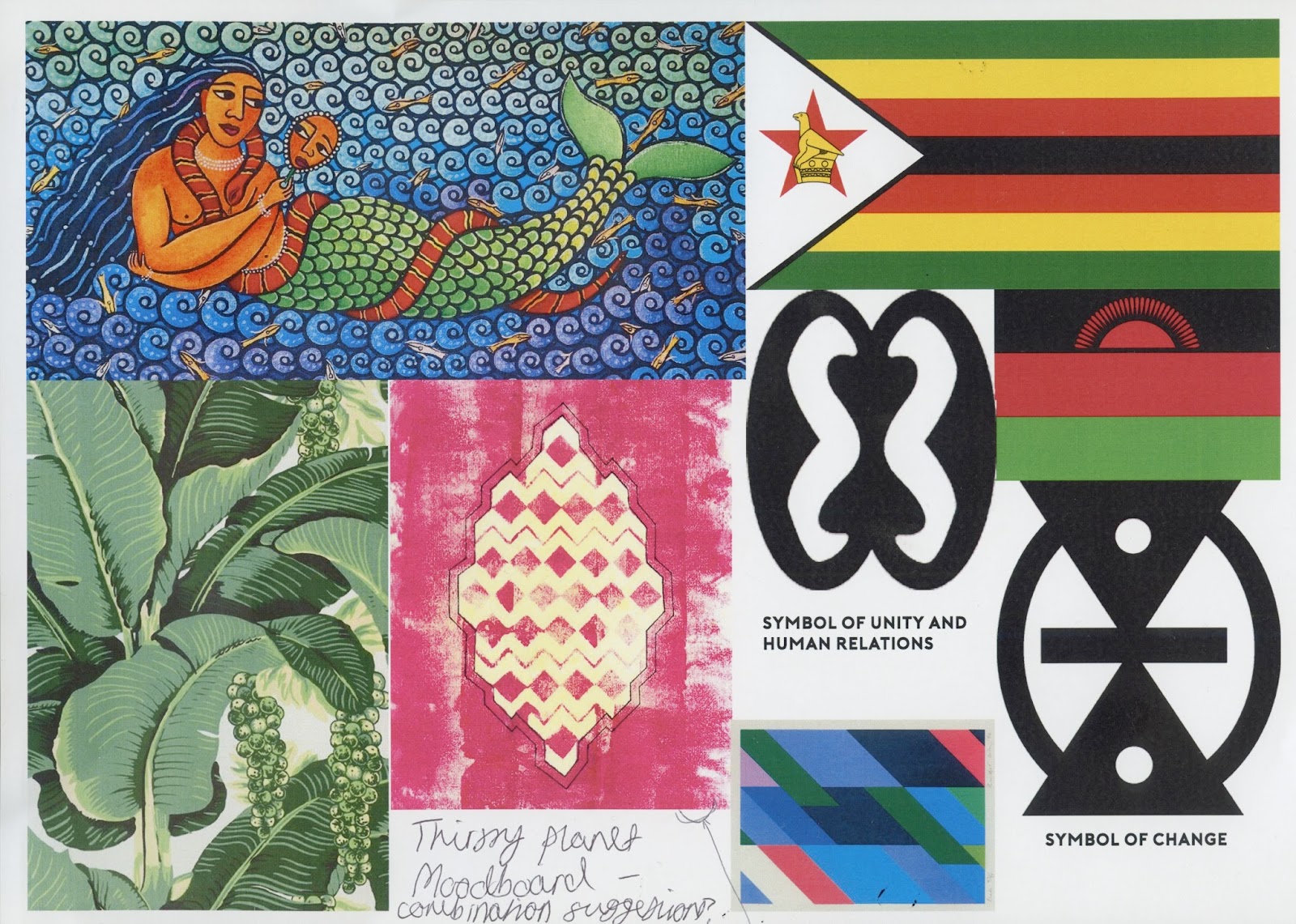
Making this moodboard for the crit has made visualising other design ideas so much easier, and the general feedback about it was positive and that it fit to the target audience of 18-24 yo's who unfortunately, are attracted to what is aesthetically pleasing as most are busy and finding a strong sense of their style. This is why I implemented the palm leaves as they are a current trend amongst young adult, bloggers particularly.

my example edits of my painted colour schemed waves overlayed with monoprints and palm leaves
-'textures create interest,more tactile and likely to be picked up'- useful if there were to be flyers or other products sold, would buy because of the design over a simple one in some cases
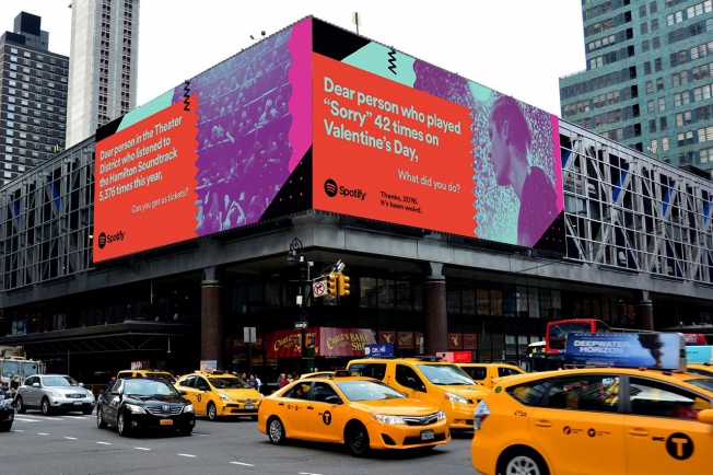
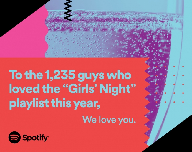
-'colour,texture,motion and vibrancy are going to be a fundamental part of the response. Consider how effective attention grabbing copy could and should enhance the message. Look in to the new Spotify campaign.'
-'this one can have a direct impact, nature>engaging>textures>craft>ethnic art. Look at clothing of villages,materials, scale. projected imagery,wrapping buildings in colour scheme, events,sponsors,experiences,would would it impact.
-'the phrases demand the viewers attention and the use of uppercase sans serif typography creates an effective juxtaposition with the textured colourful background'
-'phrases work well'
-'the phrases are unique and leave you wanting to know more'
-'phrases are distinct, they make a strong impact'
-'they grab my attention-makes it exciting!'
When asked how shall i simplify, suggestions were to change the text to white for more legibility or transparent to show water behind. I then asked what else people would find useful to create for a succesfull campaign...
-'credit card size vouchers?'
-'smaller handout prints'
'billboards and print material
-'really bright and engaging with the young adult/student audience'
'consider a minimum of 2/3 more phrases for it to act as a campaign,try a range of colours. Animation may add personality'- ideally I would prefer to have an animated campaign, but the program software isn't something I adapted to easily and struggled with a lot.
Adobe 'Show what you know'

friendship, fun, youth, vibrancy, edgy, memories, party, drunk,movement, colour, music, individuality, friendship
was suggested I add sketchy outlines to add movement and energy to the specifications of what image is implying influenced by the disclosure album covers
in feedback, the describing words for the images came out perhaps like i should have expected, about parties and memories rather than the deeper meanings tied to each image as it is hard to extract out.
Displeased nobody got the 'rabbit in the headlights' vibe from number 3 as its very relevant for student life, I knew this direction wouldn't work in the way the brief could and doing 2 big briefs would be a risk of making one more diluted so therefore I scrapped this brief and plan to make an instagram of my film photography as I am very fond of.
No comments:
Post a Comment