This module has been an exciting chance to experiment
and revisit skills and a chance to work to live briefs and gain an insight in
to how briefs are set at a professional level which if anything has make me
more excited to work up to a professional level.
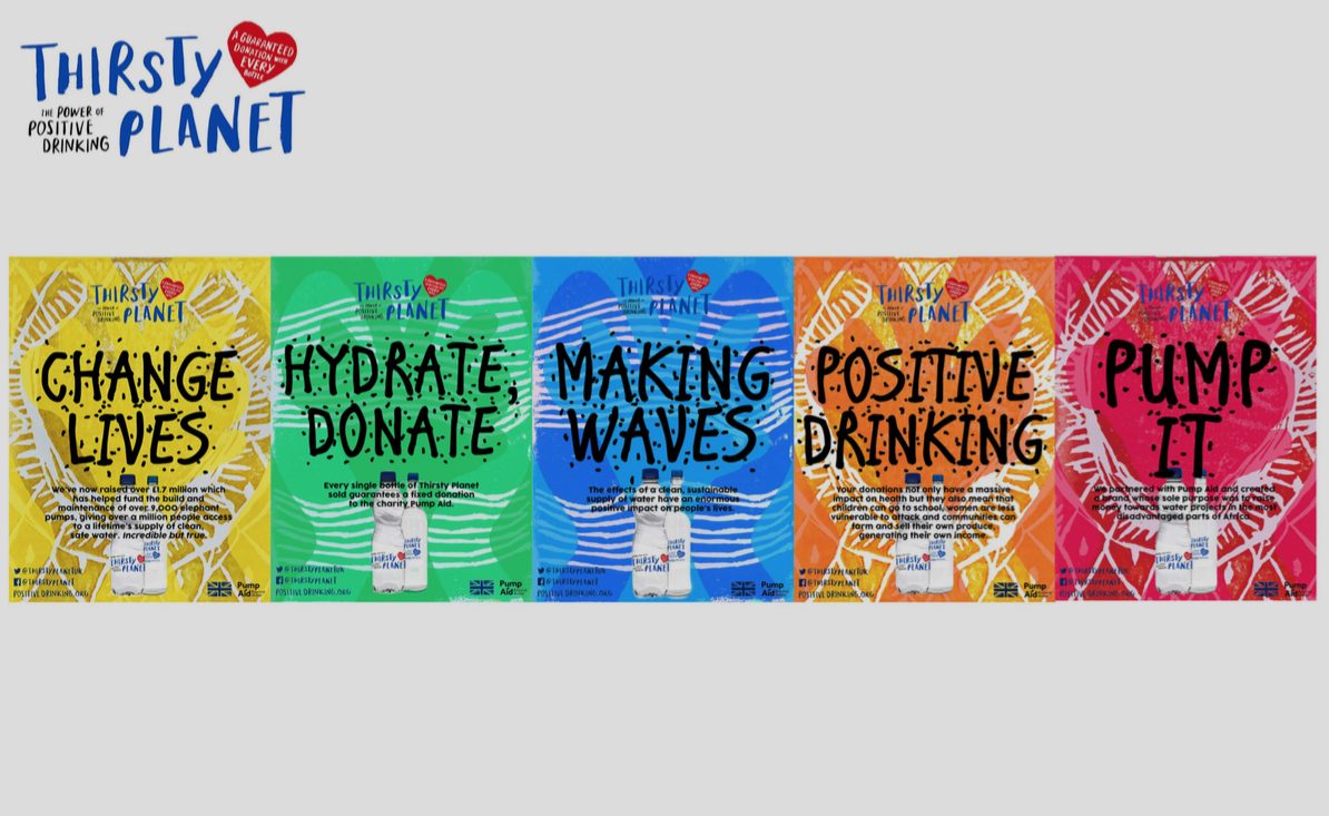
Thirsty Planet
Working on this brief showed me more than ever how important getting feedback is, and to try obtain it outside the studio as much as I can in future. I was delighted that Thirsty Planet actually came in to talk to us about their brand and what they were aiming for, and getting feedback from the marketing director herself reassured me I was working towards the right look for their fresh contemporary rebranding. Part of choosing this was the target audience they aimed for on the briefing, as it gave me the opportunity to make an assumingly boring category of selling water in to an exciting campaign. They were very focused on their ethos being dedicated to their donation and charitable work which I directed the campaign to focus on.
Mini Briefs
Being able to choose the mini briefs allowed me to revisit favourite designs skills and allowed me to work for audiences such as designing for young children and work toward helping an organisation that prevents young suicide. Causes such as these require a happy, positive, fantasy world to be created and I thoroughly enjoyed being able to draw for these and it gave me a chance to practice with my new graphics tablet.
Designing for ‘Up Yer Sleeve’ was a delight as Secret 7” was my favourite live brief last year, and designing for music is one of my goals and interests as it allows so much interpretation and freedom of design within this.
These briefs allowed me to set sights for the future and what causes I want to design for. It makes sense now that I have always wanted to create colourful, motivating pieces to add a bit of joy to the world and seeing the amount of companies submitting to YCN and D&AD it has given me confidence the work is out there and I enjoy setting myself the tasks and concepts for them. If I were to do anything different I honestly would have enjoyed to work on more as coming up with concepts for such different briefs given is exciting to me as I would like to think I come up with work a bit different to others.
Collaboration
This part of responsive was rewarding and showed me that I still have the organisation and leadership skills that allow me to step in to set deadlines when need be.
What also surprised me was that I took on the role of type, which is usually the opposite. I discovered and took reassurance that I have learnt a lot about the key principles of graphic design and that I have stepped up my standards as I would not settle until we both were happy with our card range.
I feel I was a motivating partner who set time frames when my partner wasn’t in or we were slowing down the process. Our outcome is work I am proud of and can relate to my design style, and is part of my developing ethos as a designer.