Monday, January 30, 2017

Thirsty Planet Development

Final crit/feedback
'the type for the first is too bold and it takes too much away from the background design'
'first typeface is...abit to serious for the style of poster' 'reminds me too much of lush or bodyshop which has already been done'
-Need to simplify and use successful moodboard and feedback for a set
-More phrases
-Use handmade elements for genuinity as most successful campaigns seem to be photographic of the situation, and as I can't do this, this is needed to empathetic impact.


Design Decisions
-Lowered opacity layers based on existing subtle shape layering/styling already used by TP seen here
Thirsty Planet Pump Aid
-3 colour swap of unity symbol shape informed by flag colours
-water splash coming from bottle, advertises the actual product
-large catchphrase encouraging feel-good positivity about the brand and the donations

-tropical leaves based on the location and represents nourishment, painted to display honesty and -ethics of the company. also catch the attention of target audience age range as tropical leaves are a current design trend selling well currently
-Typeface more honest and less flashy, with small detail embodying little splashes coming off the lettering. that style typeface has also been a trend of late within the 18-24 age range
-plastic effect on painting in the background mimics water drops on the water, aswell as with the bursts of colour symbolism of health and nourishment, and the plastic bottle.
-quotations directly from website to get their ethics out there accompanying relevant catchphrase


Monday, January 9, 2017

Studio Brief 2 Evaluation

Initially with this brief, due to companies sharp awareness of impressions made from designs of interfaces, main websites and apps work very well and are easy to navigate and direct. Finding issues with any was hard at first, and was based off aesthetics and style rather than actually being hard to use.

Then inspiration struck when hearing friends complaining about Discogs marketplace, the biggest international online vinyl marketplace. After exploring myself its issues, it was realized quickly that its searching was not as efficient as it should be with searches not being consistently best matched and there is that much text and clunk on the interface, it is daunting for first time users to get their heads round. Furthermore when delving in to asking vinyl buyers about if they use Discogs in class and outside a local music venue, I realised that people thought the interface was offputting and some preferred the novelty of going in to a record store due to the excitement and anticipation of finding a hidden gem.

Therefore, my research went in to combining the excitement and experience of a record store with a more direct, clear, enlarged interface which cuts out the too much 'diluted' information. The problem was that their is a very large vinyl community internationally, and many would be offput by the dull clunky interface of Discogs. I wanted to recreate the marketplace in to its own, celebrating the universal vibrant exciting clutter of record stores making it the focus of the new interface, simplifying the existing interface and also the record store. My second idea of a vinyl shuffler was also incorporated however to please both audiences.

Finding inspiration was not too hard for this interface, as programs such as Spotify and Itunes are clearly succesful using the tiling of album artworks which is an attractive feature. On my interface, being able to personalise with purchase history what comes up as recommended, reflects the users personality and taste, like a vinyl collection does according to a record store worker I spoke to for research.

I took the strengths of the timeless record store that is coming back massively, enlarged artwork recognizable without a title for passionate music lovers, the thick sharpie written type, and the ability to shuffle and not know which record is behind. In combination, following guidelines of web design that is most universal, which justifies my use of Helvetica and the simple interface design, with the focus of the artwork which will always be universally loved by the audience. This is why the artwork is the focus. To minimize clutter, the artwork titles only come up on hover.

Problems I had with this project were knowing what to incorporate, also considering my target audience is so vast with no particular age group. I had to consider all the persona's I created, and the best way to do this was base features off legibility and record store features. As vinyl buyers of Discogs, I have discovered, are a very high trust tight knit community, I feel having a clearer understanding and navigation of the website would be extremely beneficial and would push Discogs marketplace further with this type of interface. My final interface of a sidebar was chosen opposed to standard sandwich layout, as it is an alternative way which shows more of the tiled artworks off which are the main draw of attention. A constant search bar also allows quick efficiency for businesses, as does the notifications pop up for wishlists.

A limitation of being a screen interface as a website is that web connectivity could be limited for some people, and also the shuffler is only partially the same experience as choosing a vinyl in a record store.

An issue with my presentation of my website interface is the fact I have not animated, as I felt very underconfident with After Effects workshops and XD can't be downloaded on to a Windows PC which I have created my interface on over the holidays. This kind of presenting,I would need a lot of my own time to practice as it doesn't come to me naturally. Ideally, this would be done, but however, I feel the way I have ordered and added hover cursors, it is easy to follow and understand the use and navigation of the website which is one of my aims, for an initial problem being the overload of text on the original site!

Finals in order

new wax logo when added decreased the impact of the branding contrasted with the simple website interface layout, and if made smaller to fit menu this did not have the same affect and became smaller than the login, so I have stuck to original.


Friday, January 6, 2017

Ongoing recognition of Neon's dazzling presence and attention grabbing nature


https://www.artsy.net/article/artsy-editorial-take-a-tour-through-las-vegas-s-museum-of-forgotten-neon-signs
A link sent by a friend about a museum dedicated to signs dating from the 1920's, with hundereds of shares and comments about how enjoyable it was to visit and picture!
'...opportunity to talk about how, unlike with other materials and objects, you cannot use a machine to make neons,” Zakri explains. “A human being is making every piece.”

Trinity Kitchen Leeds


due to their high impact direction of peoples eyes, neon signage is used in a variety of different styles to illuminate sections of trinity kitchen which undeniably adds speciality 

Thursday, January 5, 2017

Final self arranged crit and final production plan/ branding

Needed pages

Initial page (revised) DONE
Logged in homepage (revised) DONE
Quick view example DONE
Product page (revised) DONE
Vinyl Randomizer genre options drop down DONE
Vinyl Randomizer (revised) changed to shuffler, 80s new wave example DONE
Hover over on vinyls on shuffle page DONE
Genre specifics page due to mass complexity of vinyls sold in the marketplace (same as homepage layout just with hover over genres, not stated as recognizable faces from decades are used in this example) DONE
Decades example page leads to what the user wants to shuffle, in this case, 50's/60's and so on
Take away extras like merch and tickets, add genres for vinyl randomizer to resemble record shop experience DONE
Login page DONE
<Account page with preference settings such as currency, location
Selling page
Purchase history
Wishlist
Help page> (SAME LAYOUT FOR ALL) DONE
Wishlist push notifications
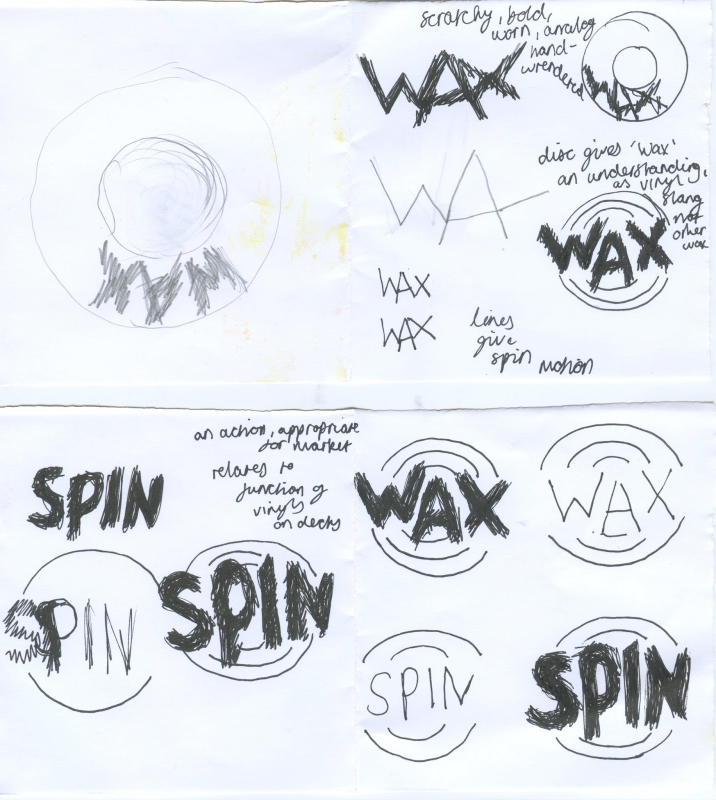
More branding sketches DONE


Type sizes currently fit the 12pt minimum criteria for legibility so do not need increasing, but have with header and search bar to stand out more
 

Tested arial and georgia serif, and both don't make the interface look well developed and rebranded, whereas Helvetica is bold and very legible with a modern accent to the letter forms making it appropriate for old and young, and newer audiences alike.


Shuffle replacing 'randomizer' as it makes more sense and fits the menu bar

Despite peers enjoying the multi way scrollbar of the vinyls, i feel older audiences would be confused by this and that it is an unecessary development of the interface which would cause confusion and go against the issues needing to be fixed, therefore those arrows have been removed.

An even low opacity background of posters/stickers inspired by going in to stores and from speaking about famous record stores, makes the interface too busy and emphasis on the direct and clear interface would be tainted, so a white background has been stuck to as the artwork and logo are the decorative feature. however, this can be integrated when on the shuffler to really immerse the experience and would be suitable for those wanting to shuffle, whereas those who just want to search for/sell what they want don't have the record store background. As the artwork is maximised, the options for the user aren't lost within the background, and this means the websites interface caters for both sides of vinyl buying audience I have identified and combines my two interface ideas together.
the background chosen from my own images from visiting local record stores sat the best with the composition of the interface.

Arrows on shuffler drawn in thick black pen style like in record stores, thick and legible enough against faded postered background clickable to go back and forth on vinyls

Spacing where record symbol to preview record on the page selling the vinyl chosen allows room for longer song titles of tracks as my example has short titles, making the layout versatile for this.


Full screen adapted with central scroll and side non moving poster imagery

Mockup of alternative interface layout fits the criteria and allows the tab feature, and enlarges artworks even more, but in the end comparatively hides more than my other interface structure does at a first glance and is more congested

Despite enjoying this interface, its design doesnt improve the issue and just looks more arty. Although easy and concise to use, having classic posters on the sides and the vinyls centred based on own taste preferences, it resembles modern day websites created to look aesthetically pleasing such as clothing brand websites I use, whereas the other interface layout has a less used style which resembles the vinyl buying community in that they are a specific community therefore relates to them more whilst solving the issues of the Discogs marketplace interface being messy and offputting for record shop enthusiasts. Having an alternative interface composition is appropriate for the tight knit community.

Brandingas recommended in the discussion with the 'Records' curator, look at record store branding and think of a simplistic way to represent the passion and the community of the audience.
Wax- a slang term for vinyl, an inside joke almost, known to the passionate community highlighting the trust in the community that it is their place. Sounds a little similar perhaps subconsciously like 'whack', whacking something on?? the vinyl?
Spin- More understandable to outsiders, the motion of the record on the deck, and is an action implying action on the website which for a marketplace is appropriate.

Curved circular outline mimicking a vinyl also replicates the motion of vinyl records when playing and makes the title pop.
Both strong, straight to the point names.
Handwrendered to represent analog element, black marker quite scratchy replicating the handwritten tabs in the stores and scratches the record player makes and is a bold, worn style implying the long lasting love for vinyl and how much they are played, the fragility, and the secondhand aspect of selling or buying secondhand on this interface and in stores. Rarely shiny and new. Style contrasts with simple layout and Helvetica typeface, being decorative whilst still being bold and striking.


Because of inside knowledge of Wax being record slang, I will keep the name Wax and adjust with the record spin outline which also diverts from other connotations of wax

Wednesday, January 4, 2017

Production Decisions presentation key points and problems

-Making a web interface and designing for screen, colour coding must be given with final hand in to ensure consistency (standard or Alexa) and final prompting of feedback on Facebook wether to do a website or an app, a friend who uses Dicogs replied - ' Redesign of discogs, I hate searching on there but like the fact you can create a wish list x' 
And in regards to which idea to bring forward, the shuffler or the marketplace expanded and simplified, ''
Being able to scan Vinyls for price and condition would be pretty great, but if you didn't have the physical record in front of you, it wouldn't work. Could you not maybe join both ideas together? 
-We were given research that shows 80% of web typefaces in a million are serif, which justifies my use of Helvetica, which was also chosen as most universal. Arial and Georgia serif were also shown to be the most commonly used and therefore most universal, so I could try these as they are viable options suitable for my mass audience
-Most commonly, titles and menu are at the top, which I used in one wireframe. However, one peer said this distracted too much from my picture grid layout interestingly, and that my sidebar wireframe was a lot more suitable. It is difficult to decide as that was a few peoples matter of opinion, against what is the most common layout which less digitally able vinyl buyers would feel at ease using more.
-There is a 12 grid theory which allows ease of movement of interface parts,flexibility and consistency will be needed depending on which way I develop my interface further. Although I have a grid used as seen on my mockups and wireframes, having more flexibility would be ideal depending how I go as now my interface has columns due to my focus on enlarging and celebrating vinyl artworks like in the stores.
-12pt minimum type size for legibility, 6-8 words length which is important to remember as this is relevant information as my website is universal.


Problems-header title and menu or sidebar?
-Marketplace as intended with less other features, and the vinyl randomizer, or just a website and app dedicated to shuffling different genres or other groups of vinyl on a marketplace with just a search option?
-Plain background for simplicity and enhancement and contrast against large artworks or full poster/music sticker walls like in vinyl stores?

Wireframing and start of digital production feedback


Before business/personal login, homepage would contain images of the latest vinyls up for sale with a hover over feature for quick specifications. direct search bar, simple and direct headers and side bar. many said having the usual scroll down bar with also a side bar on each column would make the website more exciting and add discovery and mix ups such as in record stores. this is shown with the black arrows on second digital inital mockup with the side black arrows, but this needs to be made clearer if taken further.

Here is an example page when a vinyl image has been clicked on or searched and specifically chosen through quick view option, coming up with detailed specifications, tracklist, and a vinyl symbol used as it is a universal symbol, that can be clickable to preview the tracks. this was suggested in feedback and emulates the benefit of being able to listen to vinyl in a record store before buying. a contradiction however, is that many I asked for feedback from specify vinyl sounds better than digital, and on a website or app these can only be played digitally, so I am debating wether this is a needed feature. No comments were really made during feedback so this may be left. What is crucial to the audience is the trust of the community, the specifications, rating of sellers as mocked up, actual images uploaded on the page for that particular vinyl and sellers notes. Shipping is also given based on location straight away which would be an adjustable option in Account. This was proven to be an annoyance, not knowing the full price until checkout which could be a lot if sold from overseas.

My vinyl randomizer, is my second idea attached, of an online/possible app that enables shuffling of vinyl like in a record store to contain that visual excitement of the unknown loved by many vinyl buyers and sometimes favoured. With our visiting professional within the crit, he specified this was a more unique idea that isnt as standard as a lot of interfaces such as my inspirations of Itunes and Spotify, and that completing this second idea seperately while reiterating the online record store experience by being able to shuffle through different genres such as in record stores, offers, specific artists, etc. Although I agree this would be an interesting interface development, I feel it moves away from my initial problem sourced from Discogs marketplace being complicated and offputting to use to a much larger vinyl buying community that would rather go in a record store for a more interesting engaging experience. Men I went and asked in the local record stores all agreed this would be a beneficial feature of a new vinyl marketplace, catering for already active savvy dedicated online vinyl buyers, but also for those wanting to discover something new.

I have concluded the marketplace will be developed as a website with the merch/tickets part taken off and catered more specifically for finding the best value collectors vinyls from sellers, an easy to use way to sell vinyl as a business or personal, and the option to shuffle vinyls online but with genre specifications as done in record stores as due to the mass amount of vinyls sold on Discogs marketplace, there would be a very diluted and less engaging experience from one randomizer, so a specific page will be created in ties with account preferences and purchase history.


My sketches of seperate features inspired by record stores ability to listen to the vinyl, and shuffling through.


Feedback from peers
-'randomizer' would not be appealing or clear to click on, must be named vinyl randomizer or likewise to be clearly communicated as a feature
-this is a 'great' opportunity to give the vibe and universal features of record stores transferable through the design of the interface
-non-clinical design
-as Discogs Instagram is mostly artworks and stacks, this reinforces the striking visual aspects of record stores and what vinyl buyers are drawn to and what is celebrated within the record community, which it should be through this interface also, which is not present on Discogs marketplace or its competitors on the level and ease it could be
-create an interface for a record store to locate vinyl as people enjoy the experience of going to a record store more than searching online
-have a hover box such as ebay where you can quick preview the vinyl images, so you dont have to keep going back and forth between pages and search specifications fast and efficiently
-least buttons as possible, group where possible to avoid cluttering which was an initial interface issue
-an app with price comparisons based off scanning artwork to give the buyer a fast comparison without having to pay full price or not get a good condition in the record store. seeing if they can get a better deal online just by a scan solves the issue of the two split audiences of online and physical, but I feel due to the mass audience of vinyl buyers this may not be as prevalent as a new web interface designed for a vinyl marketplace.
-sidebar allows artwork to be displayed well, whereas the wireframe with the menu at the top with the tabs draw more attention to them rather than the artworks which is intended to be the largest interface element.