Blue for exhibits (more neutral)
Red for facilities (alert, incase of emergency)
helvetica Bold is clearest from far away
types are set sizes
bigger and bolder in arrangement compared to old


The sizing is legible and clarified, however the muted red contrasts well but in a place like the gallery doesn't fit the clean crisp space designed as a canvas for the art to come alive so this will be scrapped and I will continue to use the blue at it's neutral and works with the space with its cool tone and has the British meaning behind it opposed to the previous mint green.


Framed idea to relate to proud preservations of art at the gallery, very simple to not distract but relate to institutions theme


smaller to be appropriate for the spacing
FEEDBACK HAS INFORMED THAT THE FRAMES ARE MOST APPROPRIATE BUT FIRST TRY PAINTING AND VARY ARROW SIZES TO PICK BEST OPTION

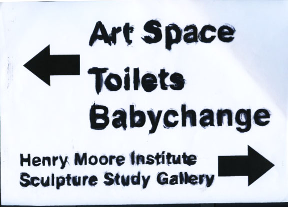
This sort of design style, brush stroke detail to represent its fine art core, for a British Art Gallery very much involved with its heritage and traditions would not suit well to the high class family-friendly environment overall. Looks like it would work more for a graffiti/street art style exhibit but this brief is to consider the institution as a whole therefore is not a successful design decision.
No comments:
Post a Comment