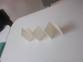
Given examples of sizes of stock used for certain publications and formats such as A/B format, Octavo and Legal, it was mentioned that children's books are often the most flexible in how they are designed size/shape wise which lead me to think Studio Brief 1 can be a children's booklet for Colour Theory. In my the presentation I was focused on finding the sizes that resemble a flip book as this is a fun and safe way for children to look at colour choices. A flip book format which would be landscape orientated also can be used for manuals and finding colour swatches which is ideal for this thought.
Another option is a more sophisticated approach such as this that can group the colours together for theory and can be mixed up.
Whichever way the booklet, it is an ideal layout for simple design and for children to learn. Despite this, when we were given different examples of how we can put together our books in various folds I wanted to explore the options. These were the booklets I took a look at
Constatina folds are an easy but fun way to put together a publication, filling all pages or not. This would be ideal for an ordered colour theory booklet and binding isn't necessary. Techniques such as illustration/print/impasto and many more could be explored in an interesting way. The look of the springing zigzag would appeal to children more opposed to an average book as well I believe, depending on the cover.
I picked this up as I haven't actually really seen a booklet done this way and for the study task, as I seem set on a flip book style, I want to try something different and this is still fun and as I am focusing on colour theory, the blocks of colour layered have great potential. It can be very simple and straight to the point.
I took a very lighthearted approach to the instructions for making this sort of book, which involved cutting A4 in half, folding and guillotining in order to make each next page a longer shaped layer. The style of headings is to match the 'Slayer' part of the name which is typically known as quite a rock/metal idea so I used scribbly strong writing and the instructions very basic handwriting. I also tried out subheading each other side of the page and trying directions in landscape form. This would have been better if I had stapled and considered the binding. However, done within one session the idea was grasped well and having it small and only a few pages with simple instructions and some humour would work well for a kids book.
Despite enjoying this particular style of folding/making a booklet, I have to consider my target audience which will be children learning about colour (so presumably in primary school) and due to so many health and safety hazards, this kind of shape cutting of pages might not be as safe as a booklet pages of the same size bounded by its cover size. It is a fun publication, but target audience is most important. Even when stock is considered, a thinner stock would probably begin to curl and be damaged due to the uncareful flicking through of the booklet and a heavier stock would have sharper/thicker edges which would be more dangerous.
In conclusion, either a constatina style or a flip book size in landscape is the route I will take when creating the specific content for Colour Theory for kids in a straightforward step by step approach like I tried here, and is an approach I have admired as it is easy, direct and fun to read in George Lois's book 'Damn Good Advice.'


No comments:
Post a Comment