Tuesday, December 8, 2015

Photography Induction


Slow shutter speeds to show the motion and movement of its subject


Fast shutter speed done to capture the focus of the students working and their concentration

A Mouses Tale Study Task 8

Original Concrete Poetry


Modernist

disconnected arranged fragments of the poem


Post Modernist

In shape of a mouse head without words being on the line, angled and varied in sizes 'not as legible' but still concreted poetry

Monday, December 7, 2015

Wayfinding Adjustments

Centred doesn't seem at the same ease of reading as left aligned


Is one of the clearest of empty arrows due to shadow depth


too much detail for simple wayfinding signage

This seemed the most popular adjustment between fellow design students to my surprise, but that is only one singular target audience so I need to ask a wider age range to match the galleries target audience.


Without the fill it looks more of just the shape rather than a strong direction from far away according to feedback.


Isn't as clear from far away as other options.


My original arrow with the thicker frame. Depending which arrow is chosen i will keep the frame thicker for further clarity of signage from far away.


Understood but deemed too much to a certain style to be as versatile as the way finding needs to be.

Wayfinding Final Critique and Manifesto

The wayfinding system of Leeds Art Gallery has been adjusted to be more cost efficient for changing exhibit signs, larger, clearer and more legible for the wide range of visitors to reduce confusion and has crisp contrast against the cream canvas like walls to not distract from the artwork the gallery very proudly displays. Helvetica bold was chosen at it one of the most universal typefaces and is clearest from far away. Large arrow and framing are consistent between all signs to be clear wayfinders in the institution, and only black is used to let the art speak for itself and come alive. The framing helps define the signage and relates to the gallery’s proud heritage.

Questions I asked were to indicate any adjustments that could be frame, if it was appropriate for the art gallery and could I do anything to make it clearer as this was one of the most important factors.

Peers said it was appropriate and with the framing tied in with the theme in a low key way and having consistent framing makes the way finding stand out and indicate successfully. It was suggested I try different arrows, different types of frames and vary composition to see which is most successful. Someone suggested having coloured frames but as this wasn't previously a success and the black works so well in being clear against the walls I am going to focus on other suggestions such as including pictograms.
Nothing was given back as negative against the typeface as it one of the most legible choices I could have made and serves its purpose. To consider once all signage is done and placed in better images of the gallery is the sizing and how high up it will be.

Sunday, December 6, 2015

Wayfinding Development ADD APPLIED PICS

So far in my experimentation of ideas relating to the gallery such as painted signage/use of pastel colour/framing, Ive concluded the framing is the most appropriate form of signage although this needs to be critiqued and varied to get the best outcome.

When trying layer effects applying the signage in to the environment itself, the 'darker' layer effect made the sign only the black signage which looks a lot more thought out as when I put the initial black and white sign up it had the danger of looking like it had just been typed up on word and stuck up/not thought through. This layer effect gave the signage the look of a vinyl, and the contrast/clarity works brilliantly as the black is against the clean white/cream canvas like colour of the walls made to make the art come alive, which my wayfinding has been designed to not take away from but be clear and efficient in directing visitors. Another way this works well for the art gallery is that vinyl is easily applied, which means changing signage for each new exhibition wouldn't be damaging to the walls, and is very cheap to produce which means it is a cost efficient solution for the council funded institution.

While developing this strong idea further, also what needs to be considered is if it will stay as flat vinyl and other ways it could be adjusted dimensionally to stand out more to visitors. As the vinyl seems most appropriate, having the idea of it being a raised sign is something to back up my design further as it is very simple and one colour, and the frame isn't overcomplicated therefore other methods could easily be adjusted to the wayfinding. After the final critique, the signage will be finished and applied in to the high res images of the gallery and adjustments based on feedback will be applied to get the best result.

Bigger signage than current depending on space of walls.

Wednesday, December 2, 2015

Wayfinding Initial Designs

White for doors
Blue for exhibits (more neutral)
Red for facilities (alert, incase of emergency)

helvetica Bold is clearest from far away
types are set sizes
bigger and bolder in arrangement compared to old


The sizing is legible and clarified, however the muted red contrasts well but in a place like the gallery doesn't fit the clean crisp space designed as a canvas for the art to come alive so this will be scrapped and I will continue to use the blue at it's neutral and works with the space with its cool tone and has the British meaning behind it opposed to the previous mint green.


Framed idea to relate to proud preservations of art at the gallery, very simple to not distract but relate to institutions theme


smaller to be appropriate for the spacing
FEEDBACK HAS INFORMED THAT THE FRAMES ARE MOST APPROPRIATE BUT FIRST TRY PAINTING AND VARY ARROW SIZES TO PICK BEST OPTION


This sort of design style, brush stroke detail to represent its fine art core, for a British Art Gallery very much involved with its heritage and traditions would not suit well to the high class family-friendly environment overall. Looks like it would work more for a graffiti/street art style exhibit but this brief is to consider the institution as a whole therefore is not a successful design decision.

Folds Study Task 7 AND Initial Ideas for Studio Brief 1

This task made me feel a lot better about options I could take that would be effective and interestingly designed without being overly complicated (although there were those options, such as origami.)

Given examples of sizes of stock used for certain publications and formats such as A/B format, Octavo and Legal, it was mentioned that children's books are often the most flexible in how they are designed size/shape wise which lead me to think Studio Brief 1 can be a children's booklet for Colour Theory. In my the presentation I was focused on finding the sizes that resemble a flip book as this is a fun and safe way for children to look at colour choices. A flip book format which would be landscape orientated also can be used for manuals and finding colour swatches which is ideal for this thought.


Another option is a more sophisticated approach such as this that can group the colours together for theory and can be mixed up.


Whichever way the booklet, it is an ideal layout for simple design and for children to learn. Despite this, when we were given different examples of how we can put together our books in various folds I wanted to explore the options. These were the booklets I took a look at


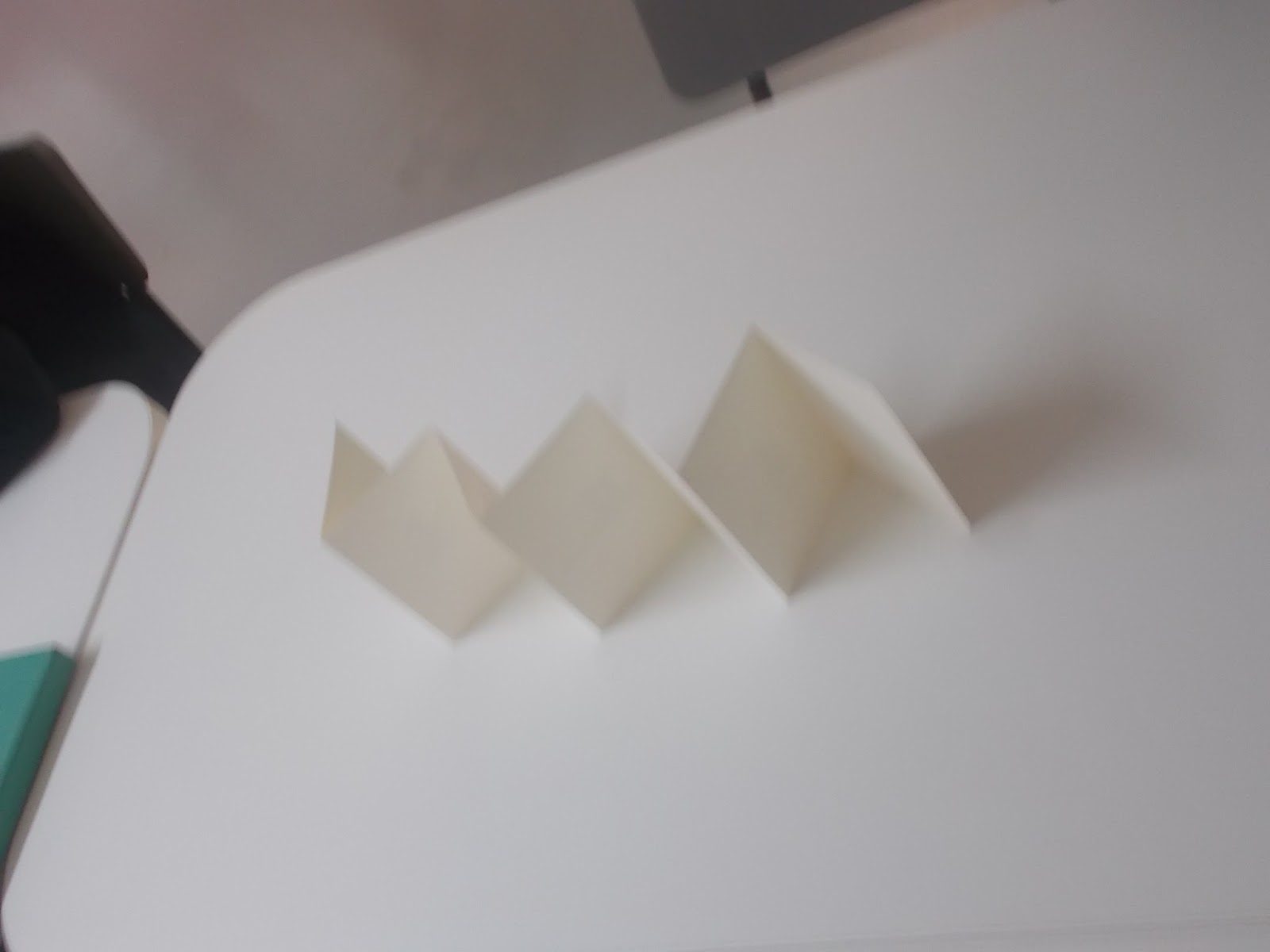
Constatina folds are an easy but fun way to put together a publication, filling all pages or not. This would be ideal for an ordered colour theory booklet and binding isn't necessary. Techniques such as illustration/print/impasto and many more could be explored in an interesting way. The look of the springing zigzag would appeal to children more opposed to an average book as well I believe, depending on the cover.


I picked this up as I haven't actually really seen a booklet done this way and for the study task, as I seem set on a flip book style, I want to try something different and this is still fun and as I am focusing on colour theory, the blocks of colour layered have great potential. It can be very simple and straight to the point.


I took a very lighthearted approach to the instructions for making this sort of book, which involved cutting A4 in half, folding and guillotining in order to make each next page a longer shaped layer. The style of headings is to match the 'Slayer' part of the name which is typically known as quite a rock/metal idea so I used scribbly strong writing and the instructions very basic handwriting. I also tried out subheading each other side of the page and trying directions in landscape form. This would have been better if I had stapled and considered the binding. However, done within one session the idea was grasped well and having it small and only a few pages with simple instructions and some humour would work well for a kids book. 

Despite enjoying this particular style of folding/making a booklet, I have to consider my target audience which will be children learning about colour (so presumably in primary school) and due to so many health and safety hazards, this kind of shape cutting of pages might not be as safe as a booklet pages of the same size bounded by its cover size. It is a fun publication, but target audience is most important. Even when stock is considered, a thinner stock would probably begin to curl and be damaged due to the uncareful flicking through of the booklet and a heavier stock would have sharper/thicker edges which would be more dangerous. 

In conclusion, either a constatina style or a flip book size in landscape is the route I will take when creating the specific content for Colour Theory for kids in a straightforward step by step approach like I tried here, and is an approach I have admired as it is easy, direct and fun to read in George Lois's book 'Damn Good Advice.'


Monday, November 30, 2015

Leeds Art Gallery research and ideas

framed signage
painted signage
neutral/pastel colours, if any colours
larger than current
just above average height level due to crowds
helvetica/futura, most universal and very clear typefaces?
are guides, arrows
no pictograms necessary (apart maybe from loos) as the art is there to visualise to visitors, not taking away from the art (is detail rich in the art, content needs to be lesser to expand the detail to visitors)
right aligned is easiest to read
clear arrow to not confuse direction, tried just end but could look like vertical direction and too modernist


'free for all cultural visit'
'Leeds Museums and Galleries exists to collect, preserve and interpret historic, cultural and scientific collections and historic sites and use them as inspiration for educating, entertaining and inspiring the people of Leeds as well as visitors to the city.'
home of British contemporary art


Helvetica regular, helvetica bold (see if this is clearer from far away)
british flag colours muted? current muted mint colour has no relation
try frames
try painted
optical kerning spaced apart 25+ for clarity

begun in standard international paper landscape orientation 


Helvetica Bold


Futura Medium, second with muted royal blue of British flag


Helvetica regular which doesn't look as impactful as it is thinner/longer, and is tracked more there would be too much space. Not as legible from far away

The pastels are working quite well in terms of legibility and contrast with Futura and Helvetica and are informed, therefore I shall continue to experiment with these colours.