Coming
up with my own projects was ofcourse going to be exciting in terms of portfolio
and being able to use my style with my strengths, but I didn’t realise it created
a lot of unpredictable development which was retrospectively very interesting.
Attached along with this pack are two early versions of my written briefs, and
through these and developments for each project on my blog, you see how
projects have jumped changed and formed, most times, in to a completely
different deliverable!
Exploring possibilities of outcome given our more flexible time period created
chance for designs and new ideas to grow a lot better than they would have done
in a shorter span of time. Although I always aimed to have certain projects
done by a certain mark, I took the chance to give some a little more time when
an interesting point of feedback or inspiration took course.
Working on these showed reiterated how quickly getting contact/feedback should
be done as a big learning curve was that feedback is essential to any brief and
design development. Graphic design is about the demographic being targeted and
the way the design will be channelled and this year I have explored more of a
variety of these avenues, wether it be stickers or social media advertisements.
This has shown me I enjoy being versatile in my deliverables, and I have been
challenged in this by clients or by experimenting with different outcomes such
as pull up banners. I have a more informed awareness of the power design has to
get a message across, wether it be words or visuals. My projects aimed to show
versatility in outcome as graphic design can be applied everywhere! Despite
this I still wanted my own style to come through in the way I design.
Feedback throughout this year through portfolio surgeries, placement and
careers advice have strengthened my style more than ever as I have received
feedback that I was aiming to hear. My portfolio and style have said to have
been commercial, fun and easy to understand. It was also encouraged to keep inputting
illustration as it can be an additional strength to separate me from competitors
in industry.
I have been applying for jobs and opportunities as I have learnt on this course
to just go for it, which is a confident skill I have gained. I have had my
first creative interview which through my variety of professional engagement
this year and professional feedback, would have been less prepared for.
In presentation feedback, I was delighted to be complimented on my presentation
and people skills which suit my desire to work in groups. I am very much a
people person and communicator, always enthusiastic to my peers, which will
give me an edge in interviews and for the types of agency brand jobs I have
been applying for. Going freelance has never seemed suitable for me due to my
character. Through this year I have realised through end results of my projects
that I would have loved to expand them even more with other skills, that would
be present with a creative team. This is positive as I could see my end designs
going in to other avenues which indicates they are strong.
My design is always quite bold and colourful, which gives me a style. I worry
about this however, not looking versatile enough, but the jobs I am going for
require a eye catching design or idea. I have chosen not to visit or apply to
extremely corporate companies as this is not me.
Definitely for improvement while I work towards the future is too polish my end
products even more as the mock-ups I have created this year I haven’t been
happy with. Beginning to do product shoots with relevant materials beside the
product would have really boosted my design work and I am going to do this from
now on. Also, I realise I have been lucky in terms of time to complete these
projects but realise in industry there are strict deadlines and unexpected
ones! Thankfully, I enjoy deadlines and towards the end of one I thrive under
the pressure, and this year managing my own projects and collaborations has
strengthened my scope on how much more I can transform my ideas in to and
present them to team or client.
Despite these issues I am quite happy with my work, as I wanted the pieces to
show who I am as a person and a creative in my portfolio, and through feedback
I am happy to hear this has come through to people! My self-branding and
portfolio are tied in together importantly to represent my energy and enthusiasm
as a designer which I hope works well for me in the future!
Sunday, May 13, 2018
Saturday, May 12, 2018


Thursday, May 10, 2018


Research Brief 10- Evaluation
This research brief was an exploration in to the impact design can have on a person's mental state, mood, and the transforming the environment they are in. I was particularly interested in researching how colours can affect the mood of a room and what visuals would make people of all ages in group therapy feel more inclined to open up, relax them and calm the environment.
For this brief my focus was a group therapy session called frazzled cafe held in M&S cafe's up and down the country. Through research and personal experience, counselling appointments are hard to get and mental health problems are rising in society. Having a session like this is a great way to allow those struggling to come and talk to others. I have always had a key interest in mental health and this was a way of tying graphic design with this.
For primary research I wanted to speak to a variety of professionals who work in mental health units/group therapy to get an idea of how or if design is implemented as part of the therapy. I spoke to a mental health support worker who gave me useful information on what visuals and colours irritate patients. I also emailed an art therapist who gave me useful links and advice based on his experience with using art working with people with mental health problems. I contacted Inkwell arts and Morag Myerscough (who inspired my project idea), but unfortunately they didn't get back to me as they are understandably busy!
Research was also obtained through personal experience in medical/therapy rooms, which I found a theme of abstract art, which I concluded was to not be relatable or too distracting to the patient but adding a sense of self development and expression. I wanted to have informed primary research for this project as well as visual research, to get the most effective result. Whilst speaking to a Lush employee similar themes were used within their product design, as well as bold natural shapes such as leaves and flowers. There is a universal enjoyment of natural scenery which was important to experiment with for the banners.
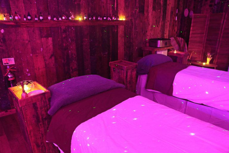
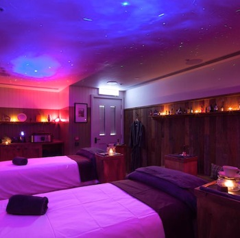
Pull up banners were chosen as they are transportable and the concept is they are design that can be taken in to any situation and transform the space to relax the patients/members. Sessions in places like cafe's could look distracting or not catered to a session so this is a way of having transportable interior design almost!
Using the existing Frazzled cafe branding was done as in future projects in studios, there will be a lot of designing around existing logos and brand identity so this was great practice for that. They have their successful brand identity already and this was a way of extending this to cater their sessions. I have emailed them to ask if they would like to use my designs but unfortunately did not hear back in time for submission. This has taught me as this is a research project, these contacts should have been contacted a lot earlier in the year even before starting design, to gain more input professionally. However, through visual research and feedback, as well as my interviews, the designs are well informed and hit the targets.
The aim was to create pull up banner visuals that were relaxing, soft, non distracting, adding calmness to any environment. I enjoyed experimenting with linoprint for this project, as print is more trusted than digital, but in the end the leaves added a holiday aspect to the designs so this wasn't taken further. This taught me a lot about environments impact on people. Plants are suggested for those stressed or that have mental health problems and I would suggest these are brought to sessions, but work well with the pull up banners I have designed.
It was quite hard working to the size as I found it quite limiting due to the narrowness but is informed and has the affect desired. The research was very enjoyable and can apply to future projects. If I were to do it again I would have created an adult colouring book full of plants, as this has been a popular therapeutic tool of late. This is because I wanted to the workload to reflect the weight of the research. I am considering doing this as a personal project and if Frazzled Cafe get back to me, I could suggest production for this.
For this brief my focus was a group therapy session called frazzled cafe held in M&S cafe's up and down the country. Through research and personal experience, counselling appointments are hard to get and mental health problems are rising in society. Having a session like this is a great way to allow those struggling to come and talk to others. I have always had a key interest in mental health and this was a way of tying graphic design with this.
For primary research I wanted to speak to a variety of professionals who work in mental health units/group therapy to get an idea of how or if design is implemented as part of the therapy. I spoke to a mental health support worker who gave me useful information on what visuals and colours irritate patients. I also emailed an art therapist who gave me useful links and advice based on his experience with using art working with people with mental health problems. I contacted Inkwell arts and Morag Myerscough (who inspired my project idea), but unfortunately they didn't get back to me as they are understandably busy!
Research was also obtained through personal experience in medical/therapy rooms, which I found a theme of abstract art, which I concluded was to not be relatable or too distracting to the patient but adding a sense of self development and expression. I wanted to have informed primary research for this project as well as visual research, to get the most effective result. Whilst speaking to a Lush employee similar themes were used within their product design, as well as bold natural shapes such as leaves and flowers. There is a universal enjoyment of natural scenery which was important to experiment with for the banners.
Pull up banners were chosen as they are transportable and the concept is they are design that can be taken in to any situation and transform the space to relax the patients/members. Sessions in places like cafe's could look distracting or not catered to a session so this is a way of having transportable interior design almost!
Using the existing Frazzled cafe branding was done as in future projects in studios, there will be a lot of designing around existing logos and brand identity so this was great practice for that. They have their successful brand identity already and this was a way of extending this to cater their sessions. I have emailed them to ask if they would like to use my designs but unfortunately did not hear back in time for submission. This has taught me as this is a research project, these contacts should have been contacted a lot earlier in the year even before starting design, to gain more input professionally. However, through visual research and feedback, as well as my interviews, the designs are well informed and hit the targets.
The aim was to create pull up banner visuals that were relaxing, soft, non distracting, adding calmness to any environment. I enjoyed experimenting with linoprint for this project, as print is more trusted than digital, but in the end the leaves added a holiday aspect to the designs so this wasn't taken further. This taught me a lot about environments impact on people. Plants are suggested for those stressed or that have mental health problems and I would suggest these are brought to sessions, but work well with the pull up banners I have designed.
It was quite hard working to the size as I found it quite limiting due to the narrowness but is informed and has the affect desired. The research was very enjoyable and can apply to future projects. If I were to do it again I would have created an adult colouring book full of plants, as this has been a popular therapeutic tool of late. This is because I wanted to the workload to reflect the weight of the research. I am considering doing this as a personal project and if Frazzled Cafe get back to me, I could suggest production for this.
Tuesday, May 8, 2018
Research Brief 10 - Final banner


Final feedback on these was that the second two are more visually interesting, but could still look quite harsh. It was suggested with the shapes I source inspiration from Japanese designs like these


'smoother images are more soothing. Maybe try taking the third one and apply a Gaussian blur. Love the texture just think it’s a bit more aggressive if you get me but a blur could make it look more like clouds?'


My solution was to pick the middle image but using gaussian blur on the shapes to soften the imagery. My conclusion was that the leaves looked to tropical, even though they are definetley calming, they are better there physically along with the soft imagery. In this case it looked too plant themed rather than a non distracting environmental/interior addition.
Similar to these images just put up in university about mindfullness. Similar direction in designing a visual to accompany mindfullness, soft blues/whites shapes.


Monday, April 30, 2018
Brief 7- Evaluation
As this was inspired by a business pitch, I wanted to make this as exciting as I tried to pitch it as a business idea. Creating my own festival branding has always been of interest as combining music, experience and design are key interests of my practice. As well as this, creating exciting design that attracts a consumer. Making this festival a special 'ultimate' holiday festival experience required implementation of this in the brand identity most importantly.
I incorporated the features of the sea, island, sunshine and cultural aspects of the island festival and through feedback suggestions, turned these in to little icons on the wristband. Intermix was created as a bespoke brand identity that would stand out amongst the most popular European festivals researched.
Looking at elements of successful festival branding was crucial, and through all were excitement driven design with strong bold branding. The aspect of this missing is photography- therefore, as Parklife have successfully done, illustrating a concept of the festivals strong points and fun energy were transcribed through my illustration.
As well as the illustration and logo being bespoke, the colours used had to revolve around holiday and party/contemporary/fun colours. I started working with a colour pallette, however when each part of the illustration was coloured individually it brought down the quality of the design and reminded me more of local festival posters I had seen, so using a gradient map gave the festival a more defining colour pallette to remember and from yellow to pink, gives the fun energy shown through the illustration as well as the prospect of being under the sun on a beach!
The people dancing on the beach, confetti, overemphasised speakers and palm trees/buildings/sunshine are intended to grab the attention of a festival goer looking for more than a festival. I feel the magnitude of the festival is shown through emphasized illustration and using popular musicians on the lineup. However, I really wish I would have considered this for a collaboration opportunity but left it too late in the year. To really get across the big idea as I did in the pitch, naming it the ultimate festival holiday, bringing other designers and animators on board would have been extremely beneficial.
Would have gone further animating my illustrations and logo- and creating a set of more posters, but I feel as I chose to work on this closer to the deadline and it isn't a collaboration, I was worried of not completing this to the standard I would want it. Ofcourse I would love to create a Parklife like mammoth ultimate set of the festival pack but as it is just me I worried. Despite this I feel I have achieved a unique brand identity which is contemporary, using a bold sans serif typeface including icon elements of the festival which makes the branding unique.
This brief has emphasized the importance of collaboration for my practice. An aim of mine is to work collaboratively in a studio, as ideas like these can be taken so much further with different skillsets. I used my illustration and graphic design relatively well to get the brand identity off the ground but would have collaborated if I could go back.
Research brief 10- Frazzled Cafe aims
The pull up banners will coincide with their existing branding and any information given in sessions.
Frazzled Cafe is not just for the one-in-four of us who will suffer from diagnosed mental illness at some point in our lives; it is for the four-in-four feeling frazzled and overwhelmed by the stresses of modern life.
They have guidelines briefed to everyone at the beginning- i could coincide their branding and this design with that sheet. Also a register for 18 people.
Frazzled Cafe Guidelines
To help ensure that these sessions run smoothly and in line with the values of Frazzled Cafe we ask that all participants agree to follow these guidelines:
To act with integrity. Please respect one another’s confidentiality and anonymity. You are welcome to connect with one another outside of this meeting if you find someone who’s story resonates with you but please do not name anyone or discuss anything you may hear in a meeting with others who have not attended.
To let everyone have a voice. Please respect one another by giving everybody the chance to contribute without interruption and by not dominating or disrupting the conversation. The facilitator will show a white card after 3 minutes to signal the end of each speaker’s turn.
To listen without offering solutions. Please focus your contribution on personal experiences and not political/thematic concepts. When speaking please focus on what resonates with you personally, not on providing answers or solutions to others.
To be kind to ourselves and each other. This is NOT group therapy and no-one should feel under pressure to say anything. We do hope that in hearing others’ experiences you will feel encouraged to share your own. Whether you speak or not, please treat each other in a supportive and considerate way.
To welcome people from all backgrounds and points of view. We have no religious, political or commercial affiliations and ask that participants refrain from promoting any that they might have.
To be present. To benefit fully from the session and stay present in the room, please try to avoid distractions from phones or other devices.
http://www.rubywax.net/frazzled-cafe-guidelines.html
Research brief 10 - Linoprint experiments


'In many cases a mix of media will be the best solution. Effective print ads will drive digital purchases. '
https://www.neurosciencemarketing.com/blog/articles/print-vs-digital.htm
Although this is not intended for a buying service, I want the colours and feature of the pull up banners to affect the group in a positive way, making them take note of the intended relaxing addition to the environment. Testing print is a way of attempting this.


1. relaxing getaway, not too about plants, subtle, blends too much blue. could be sad
2.beach, pool, floating rings in pool, beach balls, good colours. although holiday connotations because of the leaves could seem strange, holidays or exotic places with pools/seas are very relaxing to people
3.more calming than all blue, tactile with whites. combination of digital and handwrendered gives it the honesty of print
Feedback was great on these experiments and I have figured not to use all blue, and seeing which layers go together. I feel like number 2's soft shapes really work in creating almost bubble like shapes along with the underlay of leaves which peers said could transform the room in to calm without looking too much about nature, or looking to rigid as digital.
Wednesday, April 25, 2018
Research brief 10- Design Development


In feedback these soft shapes were most popular due to colour balance and relaxing association with the leaves. I will try the leaf pattern in linoprint to give it a tactile feel whilst still giving off the relaxing feel. Feedback was that the branding ties in very well with these and the colour palette.


In feedback, plants were a huge majority of what people said would de-stress them in that situation, as well as ocean blues and pale greens. As a result of this I will experiment with my linoprints and with leaf designs and get feedback on the most successful.
Research brief 10 - Initial banner designs and feedback


-Be sure it works with existing branding, mock this up
Leaf and soft shape elements are there, but combining clashing colours, especially the yellows would make it very distracting.
Greens/blues/whites were most popular when asking peers about colours they find relaxing/
Tuesday, April 24, 2018
Research brief 10 - Discussion points from Lush employee
Whilst in Lush, I enquired about the design of their giftboxes especially as they are named positive moods, and also other products. I know Lush staff are trained quite rigorously in company ethics and have training on why designs are made.
Especially Lush spa, everything is specifically designed to relax uplift the customer. Using lighting, effects, sensory interaction and mood lighting specific to each customers needs.
The lady I spoke gave me an email to contact the head office to get archive research on research done to choose colour, and older tests for other products such as beauty products (which were trained and taught to be empowering to customers) etc.
What I learnt-
In their own study around 96% of customers chose a blue shade for relaxation
Purple/lilac can be successfully used for calming
Natural colours, textures, visuals are usually most popular
Emotional Brilliance Range
'Lush has worked with renowned Strategic Behavioral Therapist Lady Kennedy, who specializes in changing people’s behavior and attitudes, for the list of words to correspond with each color. They are words she uses in therapy sessions to alter perceptions and change behavior...The Emotional Brilliance range brings this form of exclusive mind therapy to consumers.'
'We began by looking for positive and encouraging words such as 'happiness', 'calm', 'focus' – all things I know people are looking for and come to see me about'
'We then asked people from all over the business to choose from a colour chart the shade they felt best represented a particular word. Time and time again, people would go for similar colours for each word. The final colour chosen to become the make-up was invariably one that was picked many times over.'
https://uk.lush.com/article/how-colour-and-feelings-are-connected


Sunday, April 22, 2018
Research brief 10- design ideas
Cheese plant leafs, greenery and blue (related to research and art therapist answers)

Soft shapes pastel colours (research from visual and support worker)
Mandalas- symmetrical, and a very popular theme for adult colouring books which have been successful in being stress relieving. (market research)

Soft shapes pastel colours (research from visual and support worker)
Mandalas- symmetrical, and a very popular theme for adult colouring books which have been successful in being stress relieving. (market research)
Subscribe to:
Comments (Atom)