Monday, November 30, 2015

Leeds Art Gallery research and ideas

framed signage
painted signage
neutral/pastel colours, if any colours
larger than current
just above average height level due to crowds
helvetica/futura, most universal and very clear typefaces?
are guides, arrows
no pictograms necessary (apart maybe from loos) as the art is there to visualise to visitors, not taking away from the art (is detail rich in the art, content needs to be lesser to expand the detail to visitors)
right aligned is easiest to read
clear arrow to not confuse direction, tried just end but could look like vertical direction and too modernist


'free for all cultural visit'
'Leeds Museums and Galleries exists to collect, preserve and interpret historic, cultural and scientific collections and historic sites and use them as inspiration for educating, entertaining and inspiring the people of Leeds as well as visitors to the city.'
home of British contemporary art


Helvetica regular, helvetica bold (see if this is clearer from far away)
british flag colours muted? current muted mint colour has no relation
try frames
try painted
optical kerning spaced apart 25+ for clarity

begun in standard international paper landscape orientation 


Helvetica Bold


Futura Medium, second with muted royal blue of British flag


Helvetica regular which doesn't look as impactful as it is thinner/longer, and is tracked more there would be too much space. Not as legible from far away

The pastels are working quite well in terms of legibility and contrast with Futura and Helvetica and are informed, therefore I shall continue to experiment with these colours.

Study Task 2: Symbols/olympic pictograms and feedback

2010 Youth Olympic Games in Singapore.

Very basic rounded shapes of the sporting with a flamed head detail. I would keep it simple like this and maybe just use a rounded head and lines without flame/stroke detail to keep it more universal as this was specific to the Singapore event. However, the compositions of the sports are very clear and justifiable so I will use these for reference on grid given, rather than others I have seen that are done by different angles or are simply line based.  Having the rounded bodies make the pictograms more identifiable and differentiate from the basic stick man, and are a justifiable design decision for it being a youths olympics giving it more of a fun tone to its design, including the flame head.

Moscow 1980; another useful reference to my approach to the sketching of each sport of an olympic game which stretches the shapes to the edge,which I don't want to do as I want to work centrally within the grid.


Beginning in small scale, I began to try and get the flow and movement of the athlete in cohise with the graph and I was really enjoying the curves of the objects and body and feel it captures the movement as the ends are full and then towards the end, points, like a direction.  When moving to digitalising my final football pictogram I refined and made the football smaller to make it as obvious as possible that it is the football as it needs to be direct and clear to anyone.

It's a natural, free and flowing design style that represents the empowerment of the sports and fluidity of the athletes in olympic games, doesn't give off a rigid impression like a line design could. unrealistic human form that is expressing the movement, so it does not imply any certain body types which will appeal universally to audiences and will not offend at all due to body pressures felt in advertising everyday in society. This football represents football in pictogram form, presenting the human body in it's most basic form. The drawings composition is capturing the act of the sport itself in a simple form for all audiences to understand. It is a symbol that can be applied in any other form.


In feedback, the concept was accepted and peers enjoyed the flexible design but as I knew, it needed a lot of refining with the pen tool on Illsutrator which I need to get the hang of and differentiate the football by adding a pattern, and get the scale of the body more accurate.

The scale of the entire pictogram is said to be appropriate from distances, which is a key success point of this style of design due to its shape opposed to line. Colour can be easily applied and has the possibility of working as signage, 3D fabricated signage and projection.


Wednesday, November 25, 2015

Wayfinding- Leeds Art Gallery

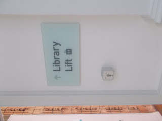
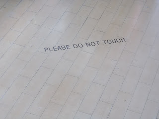
After finally visiting Leeds's biggest art taller, I've decided it is the institution I want to redesign the way finding system for as it is somewhere that has to be designed to be very clarified and legible for a wide range of audiences but can be more creative as it would be appreciated by art lovers attending (not not too overly complicated!). Throughout the two main floors I explored each creek to find its way finding and when it comes to designing these will be the ones I will include, and the design will be consistent. In terms of colour i believe neutral would be best but I have to explore different variations for a decision to be made. This is a significant amount of signto work with and am pleased I have decided.


Tuesday, November 24, 2015

What Is a Book?

Coming in many different types:paperbacks, leaflets, zines,booklets for as long back as the Bible, books are written communications bounded by covers/backs from one page to thousands. They are one of the most essential forms of human communication from education to stories, and have been ever-changing in their form with ebooks now being a common purchase, thought to be overtaking the paperback itself (although that is debated in this post digital era of print media still going strong.) Can be binded in many different ways, sewn or even stapled, which can add an effective detail upon design.

Publications I am interested in are mainly fashion/photography or music based which are usually magazine style size, glossy or newspaper prints with clearly thought out layout very visual and bold opposed to a minimal, text heavy publication. I enjoy the idea of image taking up large parts of a double page spread. For this brief I am interested in photography, print techniques, exploration of typography, pattern making potentially and the use of grids to guide and grow my professional skills as a graphic designer. Having the Vignelli Canon to read also can stop me going over the top with my designs and as this will be a small publication, i want to keep it simple. My designs probably will be quite feminine in their design agenda as you can see from my inspirations below. I don't always work in that style but as we get to choose this one, it's very likely.

Whilst being briefed, it is still very early stages of ideas but I had jotted down all ideas that relate to style eras which will be quite varied and need to be printed to be quite strong visually so would be printed on a good quality paper rather than a material like tracing paper. An idea I have is pop womens fashion patterns throughout the decades? Colour of the decades? Very vague and I need to really research these to see if the idea has backbone and if not, leave it for studio brief 2 and think of something simpler. For now though I have listed magazines that inspire me.

Examples of magazine (mainly all standard high quality paper, can look good in any standard size) inspirations in terms of their impact visually/use of colour/balance of visual and text content are

Dazed and Confused


interesting layout/balance/white space, and the sickly colours are balanced out by this. simple typography doesn't overwhelm.

Zembla/Matt Willeys style


Photography heavy but in a graceful way and interesting use of layout with block of text

Plastique

I enjoy the experimentation of the bold thick typography that is as impactful as a large great colourful image which I sometimes probably rely on

Lippy 


beautiful experimentation of art techniques depending on content, always looks bold striking and dynamic

Voir 


Unpopular use of clashing highlighter colours done well! I wouldn't want to go this extravagant at all but their outlandish unusual colour theory is inspiring to look at

Mushpit


very handmade/nostalgic 90s kid feel to its design feminist zine printed on newspaper that doesn't take itself too seriously but pushes the boundaries of the norms of design. Would be good to analyse if I take the styles of decades/pattern idea forward but make it more corporate looking.

Pop Magazine


I really admire it's quirky consistency and it explores the topics I'm interested in, in a visually interesting way in terms of typography choices and celebrities its aesthetic.

Monday, November 23, 2015

Wayfinding Initial Research

By searching 'wayfinding' in tumblr to come up with ideas from inspiration. I chose to start in Tumblr as people post mainly what they find amazing or unusual, which I wanted to seek out. Looking through I was cautious to only be looking deeper in to the ones that instantly communicated to me rather than artsy more complex wayfinding which wouldn't be easiest to understand. Practicality is key to this brief. I picked imagery and concepts I found to be practical and differing in design that looks interesting and can appeal to wide audiences.

http://retaildesignblog.net/2013/04/26/voskresenskoe-wayfinding-and-identity-by-tomat-design/


This use of gradient lines can be altered to the floor levels and colour coded routes

Different perspective, used for a very busy place/good ceiling interior place where people will be looking up a lot

Pinterest research

Bold, simple, loud but effective use of the numbers shape makes it interesting
Pinned embossed/button effect with unique pictograms
Handwrendered approach


https://uk.pinterest.com/nicholaki/wayfinding-signage/

Single column on wall which is easy navigation all in one place

Cut out effect creating raised effect. Could work very effectively with the simplest of shapes
Very classy and sophisticated sheened button-like signs that are clear and confident without being too over the top

https://uk.pinterest.com/anabolic1/amazing-wayfinding-signage-system/

To Consider: what level the signage will be (wall,floor,above...)
within a shape or freehand, or consistent alignment
pantones relation to store/trail/audience
making as universal and legible as possible (avoid complex ideas such as shadow/neon signage/bending)
will it be multi-storey, what needs to be included
include a map route?
appropriate semiotics and syntactics