http://retaildesignblog.net/2013/04/26/voskresenskoe-wayfinding-and-identity-by-tomat-design/


Pinterest research
 Bold, simple, loud but effective use of the numbers shape makes it interesting
 Pinned embossed/button effect with unique pictograms
 Handwrendered approach
https://uk.pinterest.com/nicholaki/wayfinding-signage/
 Single column on wall which is easy navigation all in one place
 Cut out effect creating raised effect. Could work very effectively with the simplest of shapes
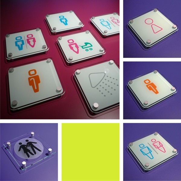
 Very classy and sophisticated sheened button-like signs that are clear and confident without being too over the top
https://uk.pinterest.com/anabolic1/amazing-wayfinding-signage-system/
To Consider: what level the signage will be (wall,floor,above...)
within a shape or freehand, or consistent alignment
pantones relation to store/trail/audience
making as universal and legible as possible (avoid complex ideas such as shadow/neon signage/bending)
will it be multi-storey, what needs to be included
include a map route?
appropriate semiotics and syntactics


No comments:
Post a Comment