My separate ideas were
Enrichment- a possible title and purpose of theme of which as well as feedback, the centre of the room can become a large wallet feature in which people can also write what enriches their life besides money. This probably starts to be a distraction from the initial purpose of our exhibition and work.
Money Tree- I particularly love the possibility of the centre piece being a large tree which can be lit in interesting ways, and which people can interact with and leave feedback on money printed notes. Ties in with us all having our ideas of money concepts brought together in one exhibition. I am going to try and discover more to this idea in depth as a result of discussion in which we have said we will go off and try and expand on. I am also going to be exploring Dylan's idea of a 30's theme in which was very sophisticated in richer areas, in which could be a contrast to our brand new ideas although this might be weird? This gives the opportunity of a massive social event and gives people an interest in attending if there were to be music, bartenders, old style fashion to match the rich lighting and vintage framing of our bank notes.
Blocks/Gold Bars- Done in honour of the buildings structure as I want to remember throughout this to try and reference LCA, bank house and first direct.

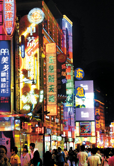
Done a lot more minimally possibly using our idea of UV lights, or subtle lighting in general? Using the idea of currency symbols from all around the world making it less plain and obvious but using the blocks of the building itself making it feel in place?
Piggy bank- didn't seem of interest as it can sound quite childish but could be a feature if one is needed towards the end. For example, an old style one can be placed within the 30's setup if that works out, as it is overlooked that this is a longstanding tradition of storing money. I envisioned a huge one being in the middle that people can place feedback into, and broken fragments being part of the detailing on the wall implying these ideas had been stored and finally broken free. Also an interactive feature being a pig piñata. Safe to say if this was aimed at children this would probably be a very strong idea but goes off the mark as we want to be taken seriously as creatives and our target audience is reaching out to all types of those earning money, working with money, but creatives who will appreciate us creatives being conceptual/our art.
Finger prints/DNA/Pattern on bank cards- In discussion we snowballed on this going on to discover a new idea of microprinting. These patterns represent our individual ideas all being separate being unique to us like these codes, and patterns in notes and cards can be used on the walls celebrating the new and upcoming ideas of money in which our exhibition work is primarily about. A popular idea is to use UV lighting which can make the patterns more subtle to allow the art to speak for itself but to subconsciously communicate to the visitors about the theme, recognising the patterns as we all deal with money on a daily basis but not being overly obvious and celebrating the patterns on currencies.
This idea is transferable and can pretty much work with all of our core themes in a way, particularly a theme that Anna will explore further is the combination of using Warhol's pop art work which is 60's the same as the buildings beginnings, and laying the exhibition out like an office but using the bright colours of the pop art work. Old and new contrast, which I am pondering on a couple of themes, which can be bizarrely fascinating to attend or people won't get it/appreciate it and find it too weird.

Rather than currencies we know, this represents the future. This could also be a basis we display the work around or how people walk around the exhibition? Perhaps too complex for that but still a possibility if stuck.
Money printing press- A way to display the work in a scroll like manner which is a unique way of showing the work. Have to consider wear and tear issue though.
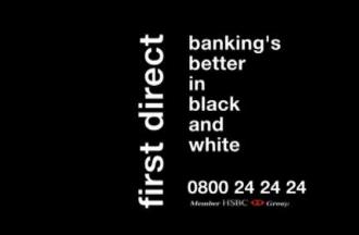
Mashup- Leeds college of art logo shape with currencies/pin pattern with elements of buildings shape done in black and white to represent first directs ad campaign.
Separating up ideas to develop individually, I chose to develop the money tree theme with the 30's style. I have had many ideas which include relating the two like the interior of a 1930's style Ritz interior

The money tree can relate to the painting on the walls of this style and be in the middle, or a fountain/chandelier/cocktail glass fountain/money spin machine. In no way would it be this extravagant and I feel I haven't come up with much that is useful for the way our groups ideas are stemming towards but this concept can be like 'Rich in Ideas' as this whole theme would be very high society. However this might completely overshadow our work and our sponsors.
So trying to think of other ideas, the money tree can be the standing theme and from the feedback tree in the middle the roots can run up on to the walls where the work is shown.
No comments:
Post a Comment