I began by talking through my rough ideas for each poster and showing the moodboard of illustration style
By using this illustration style that is bold colourful and full of shapes, it instantly communicates to the busy life of a student in an oversaturated market, whilst working hand in hand with their existing vibrant branding.
We discussed how Art fund can be...
-Bus ads, flyers, fold out concertina, choose your own design for your pass (my collaborator actually owns an art pass so we could look at their packaging in person)
-Portrait posters initially but easily adaptable for various mediums
-Use the existing typeface to keep on brand and same colour pallette potetionally
-I can create social media gifs for the campaign which will be a challenge for me but it will be easier with this simple type of illustration- can catch attention on social media apps such as Instagram and Twitter promoting the art pass and as the brief asks, to attract the attention of all students old and new generation
We went over each idea and she will have some initial images sent over within the next couple of weeks so we can agree on solid distinctive themes/designs and then I will begin editing.
Wednesday, January 31, 2018
Brief 7: Ultimate Festival pitch
Inspired by a project pitch I did for Dines one of our Creative Network speakers, came this festival idea which will compromise all the components of the best biggest european festivals which makes the music festival the 'ultimate' of the summer.
Creating 'the ULTIMATE European festival', 'the big blow out!', 'the adventure of a lifetime!!'
targeted at 18-40 year olds, music lovers, adventure and thrill seekers, the indecisive and the fun...
Can't decide between holiday or festivals? why decide!
It is very common to see festival goers with a rack of different wristbands on their arm even years after going just to show they had been...if there was one ultimate wristband which meant you had done it all, how much cooler would that be. an indestructable, crazily eyecatching and with a fun design, waterproof and awesome.Combining winning components of once in a lifetime festivals, create the best and the biggest in a spot ideal for holidays as well!
This is brand new so it needs an exciting fun brand identity to grab the audiences attention...holiday with an exciting new twist. Perhaps it could be volunteer based so you get the festivals for free but just pay for travelling? Music, art, beer, food!
FEEDBACK
Ultimately this must be branded based on existing festival design and packages whilst also incorporating elements of legendary european festivals. Also the wristband must stand out amongst others, the branding has to be strong and give off a high energy making thrill seekers want to buy!
need to create-
brand identity
posters/flyers
wristband
advertising
This pitch was so fun and the feedback I got was enthusiastic enough to make this one of my Extended Practice briefs
Being challenged on the spot can sometimes give you the biggest ideas and it was really fun and motivating to hear every one else pitch! Dines was an enthusiastic speaker who inspired me to just design what excites me wether it be for uni or outside of it!
Brief 8: Packaging Ideas
After a very inspiring and personally motivating talk from Robot Food today, I have seen how packaging could work really well with my style of design. It gives me restraints in composition and sizes whilst allowing me to come up with humorous/tongue in cheek copyrighting (which i love) and catchy concepts. For my portfolio I would really like to now include some packaging. I have this planned for my gender neutral make up packaging, but more than just one meant I took notice of brands in the supermarket (as suggested) and noticed brands that hadn't changed in along time or I didn't see a buzz about anymore, or identified a gap in the market where products looked all too similar.
Burts Bees- the BEES KNEES
student drinks
e45
my makeup packaging brief could be for existing brand that wants to be more modern
nesquik
Vienetta
happy hippos
health cereals (all look quite dull)
yazoo's
It is crucial to remember the target audiences of these products and why they are branded the way they are, but trying an alternate could elevate the product.
Tuesday, January 30, 2018
Brief 2: Creating a zine
From the feedback received through the Instagram, the collage images featuring the dolls relating to the body image topics received the most attention and positive feedback on the designs, so going forward with the zine I will create more of these as a representation of the target generations relationship with body image.
https://www.flickr.com/photos/bratzjaderox/
a flickr i have found edit bratz dolls in to real life situations, mostly vanity based, like my images will be throughout the zine as a comment on the effects of magazines/social media pressures on body image. Using Bratz dolls as a direct example of what the body positive movement generation researched what normal would have looked like, as these are the dolls we were bought. All unproportioned bodies and perfect detailing, by using these as examples of already 'perfect' dolls aiming to achieve even more unrealistic beauty standards elevates the concept of the flurry those who's comments I am using have been through thinking they are abnormal and wanting to drastically change their bodies due to these unrealistic expectations depicted.
Critics point out their heavy makeup, pouty lips, and, as the American Psychological Association put it in a 2007 report, “sexualized clothing” such as fishnets and miniskirts, as reasons why they’re not appropriate toys. Like Barbies (no strangers to controversy either), they argue, these dolls offer impossible, hyper-exaggerated interpretations of female beauty.
http://www.worldlifestyle.com/beauty-style/check-out-these-rescued-bratz-dolls-transformations
This theme of using these popular children's dolls is also a comment on their recent theme of 'selfie' bratz where the doll can hold up a fake phone looking as if they are taking a selfie- this kind of influence fuels the fire of social media depicted perfection and the pressures. I want my edits to highlight the pressures women are facing against their own bodies and the punishing rituals they put themselves through, alongside the real struggles taken from my survey. The intention is to show the unnecessary actions taken against the reader who is already 'perfect' how they are, as we see the bratz dolls.
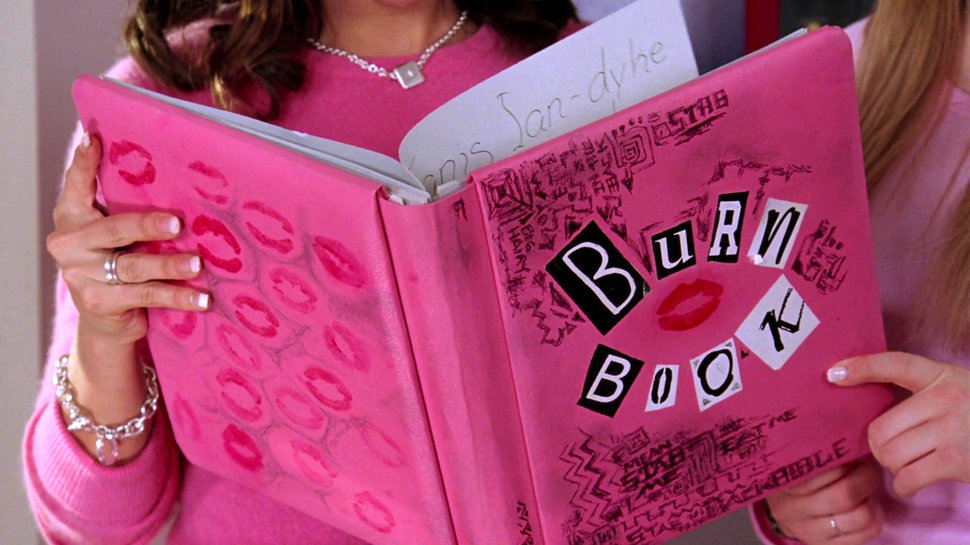
burn book is popular cultural reference of girl's talking about other girl's and commenting on their appearances. For this to be switched to discussing issues overcome, instead of the burn book it can be called 'body posi' tying it directly to the Instagram and matching the letter amount of 'burn book'. This popular cultural image will elevate the attention of the zine in it's recognizability alone. It has already been used as a boosting packaging stratedgy in an eyeshadow palette.


The zine will include the original insta comment boxes being the content on one page, whilst having an accompanying image of the bratz with a like bar on the bottom of the page.


body hair

lip fillers

botox

hair

waist training

desire to be skinny

botched boob job

When deciding between a minimalistic layout or having images as a full page, I decided for a full page as the impact is more dramatic and the closeups of the plastic dolls become overwhelming to look at and are shown as examples of unrealistic standards, what the publication aims to disintegrate with its content of quotes.
The quotes will be places centrally quite small to replicate Instagram comments but emphasize the story and it's importance.
Friday, January 26, 2018
Progress and to do's 26/01/18

BRIEF 8: A packaging brief as I was so inspired by the talk with robot food, making me see packaging in a fun and different light.
UPDATE: Within a week of doing this, my brief's have already been added to completion and changed around. 27 club and penguin will now be PPP side projects and I have introduced a Lush Campaign brief, a festival brief and skateboard designs for mental health awareness.
Brief 5: YCN Art Fund moodboard


This style for the Art Fund's existing colour clashing vibrant branding, came to mind instantly as posters in similar style caught eye back in summer whilst visiting Barcelona. The style felt new and communicated on a universal scale, ideal for communicating to all students with familiar scenarios drawn in a fun way using shapes and colour with an accompanying punchy headline. The instant communication of the shape illustration stands out amongst museum and gallery collateral and will shift the new generation of students perspectives on museums/galleries, make them want to visit and see as an opportunity for experience.
Taken from Its Nice That for contemporary illustration that is grabbing the attention of top designers and ultimately, art students the pass is primarily for. The bold new style of illustration, colourful and dynamic, will also catch the attention of students in an ever more busy world of different campaigns being aimed at them.
Saturday, January 13, 2018


Brief 2: Going online and responses


These are some of the images I will be uploading with stickered details.
The Instagram is named 'bodyposizine' as this is a popular short term on Instagram for body positive, and it's DIY aesthetic with stickers and collage stay true to zines and their 'safe space' personal style.
Over the past 2 weeks I have posted to keep a momentum going, and this is the final Instagram feed for bodyposizine (for now)
I will post a call for submissions to hopefully gain more interest and keep this project going!

I am still considering doing this as a zine if it would add depth to the project in terms of the zine diy style which would perhaps have more effect in print form.
Comments received-
Subscribe to:
Comments (Atom)