Monday, February 29, 2016

Currency Research

We all have experience with money and know money is exchanged for goods and the more money you have the more comfortably you can live, but in my research I want to explore the aspects around the main knowledge of moneys function. 

http://www.uhuh.com/unreal/moncur.htm

Point is made currency is not money but represents money and that money is imaginary in our head and represents human labour.
This is a very anti-money and anti-system website which is not the negative direction I want to get deep in, even if I explore my cynical concepts I think the negativity is unnecessary and not following the 'system' means you simply can't live comfortably in the world. I am seeing this as an artistic way of expressing the meaning of money and representing it in a visually enticing way which people will enjoy viewing.


Hungarian currency concept by Barbara Bernat which celebrates one of the worlds purest aspects, nature, which should be appreciated and perhaps remembered to be admired and thankful for in the more and more superficial world. Nature as a design idea could be good for countries that are known to be less 'Westernized' in which the system of money cannot be avoided but doesn't push false idols on to them. Smaller or third world country currency?


https://www.smashingmagazine.com/2016/01/learn-from-the-history-of-banknote-design-most-desirable-product/

'Have you ever wondered why banknotes use portraits? Some studies show that people have more confidence in a banknote that shows a human face. This principle might also apply to “About” pages that show photos of real people instill more trust than text-only pages.'- Is a very interesting quote and good to know, however as these will be created for artistic and conceptual purposes I probably won't get hung up on focusing on portraiture, and also I believe money can be more beneficial and in relation to how the media forces false idols on to us to make us feel worse/want to be more than we are, to have anything other than people on our notes can be a positive thing and a breath of fresh air.

Modern approach to American currency by Mucho, which has varied aspects current and celebrated in America. Each to their own colour and have pattern overlaid. I could combine my ideas if the concepts are all strong enough and relevant to wherever I make currency for. Am not sure if I am going to work in an as modern style, but these are very successful in what they are made for and having the notes portrait is still functional but a design alternative to consider.


A German type based 'Notgeld' shows another way of composing the notes content, and being only 2 colours would be an ideal idea for screen print. Has a clear distinctive German style which came from artistic movements of the early 20th century. It is important, if to focus on a country/continent to see their older currencies and how they have impacted todays concepts. I enjoy that this has a clear style and is very different to other notes I have seen. Will be an inspiration for if I focus on one country or content as I will have to research their art movements and styles that will be recognised.


Franc designs from Switzerland which is known as a more harmonised and happier country in general, have the approach I personally would want in money if it were still extremely similar to the standard layouts/designs of money, but with artists/nature, even a unicorn (of which I am unsure why done, to represent dreams and the possibilities of money?)


When considering also purpose of creating new notes/coins, and having reason to uplift and consider other concepts, when I saw this Hawaii note (I have tried to find current but nothing solid is coming up), countries that have ruled or invaded smaller countries appear on the notes and the notes are in the same style as the larger continents. This is an opportunity to rebrand the currencies of smaller countries to give them their own stamp and celebrate their own culture without westernisation.


Wonka's factory, becoming the items you want to purchase. Money is the 'golden ticket' so to speak. Layout can inspire and be adjusted to include the currencies, and maybe instead of the 'Admit One' standard becoming 'Admit £20' or something. Embossing and exciting printing and cuts can be included with this idea.


Studio Brief 2 Initial Ideas

As we have been briefed I am aware the main direction is to not associate the negative connotations of banking that have been increasing in recent years, and this is a chance to celebrate and predict the future and different associations of currencies. As this is still ideas stage I am going to note them all and see what directions they take and how they are discussed and reacted to in the interim crit at the end of the week.

Without initial research which I will do a different blog post on, when thinking of money and its possible different associations rather than standard monarchy/political leaders which I think are extremely outdated and irrelevant to a lot of the more modernised population, some ideas are:

-False Idols such as Kim Kardashian/Justin Bieber, highlighting the obsessions and how celebrities outdate so quickly due to their fast fading relevance throughout years. This may just remain as an idea as it is rather cynical and negative

-Blood Sweat and Tears, another cynical concept but very real to money as people literally go through blood sweat and tears all their lives for money as it is an unavoidable life essential.

-Historic Events of certain countries that are relevant to the people and which are celebrated/commemorated timelessly

-Fruit Machine style, relating to the glamorous side of winning money in slot machines in dazzling places like Vegas, and could also represent temptation with the religious aspect relating to Eve eating the apple

-Stereotypes of a country, that they celebrate and bring joy or happiness to the people rather than celebrating public figures

-Patterns/styles relating to the country/town/planet? art styles, music styles, etc

-Focusing purely on what is related to the numbers/currency of the notes or coins

-Musicians/artists that have survived all decades since they began and are legends as these are probably more relatable and admired by more people than the monarchy/politicans but would have to be true legends which may be vary so this would have to be discussed thoroughly to get it as correct as possible

-Aliens? a future currency relating to the fascination of extraterrestrial life, can link in with the new show coming on channel 4 if the content is inspiring conceptually.

-Barcodes, very modern and unique tokens that are on almost everything which is overlooked

-Golden ticket. I am already excited about the prospect of this and how it can be produced stock/method wise, and the concept if you have more money, more opportunities like Charlie winning the golden ticket that let him in the chocolate factory. Has a concept behind it people understand but is a fun positive way that could be visually very exciting, and although may seem very flashy, if this was the current everybody had it would still have the dazzle but wouldn't be fought over, although kind of ironic money is fought over anyway, which is a relating point…

-Educational subjects, positivity for working class to keep going as these are the backbone of our lives and careers and are being put down by current government which are making it harder to attain further education which puts people off, but this is a way to inspire and celebrate all the subjects and there is a variety to work with.

-Piggy Bank, slight dig at the greed of the banks and money, but also relates to the long standing tradition of storing money in 'piggy banks'. Also promotes ethics and treatment of animals perhaps? Can be coins or in shape of piggy banks in different colours to represent different values. Is a longstanding tradition than stems from storage being called 'pygg's' which then became pigs to become a distinctive and collectable thing to buy and be known for storing money.

Sunday, February 28, 2016

Secret 7" Final Feedback and Evaluation

Laying out the options for both songs I felt were strongest and most distinctive in concept and effects, feedback always surprises me. I tried to display a range of the ideas I'd explored and asking people to tally was a brilliant idea as in the past I have not had a massive amount of written feedback as I think some people grow tired of writing by the end of the sessions, but tallying is easy to do and gives me what I need to submit the right covers!


 For my Tame Impala designs peers seemed quite impressed by the candy concept and really saw this coming through in my designs, which makes me very happy. To my surprise, the dripping gobstoppers were most popular. I thought these may be a bit too obscure but perhaps thats what made them stand out, and I think the scrunched foil looking like a wrapper gave it a unique texture whilst withholding the concept. I perhaps thought my mid designs would be popular as having a relation to the members of the band/the people on covers is supposed to connect the most with audiences, but as my concept itself was eccentric in its colours and effects this maybe was overlooked.

Extremely happy with my feedback. Brought up in feedback that are important points to consider as well as all the positives, is that my styles were clearly for Tame Impala, try ambiguity? Even on my lollipop design where I tried to minimalize it is still obvious due to the colours. Also, I am aware when submitting my descriptions need to be 140 characters which was pointed out, which I am sure to do when actually submitting.


I also thoroughly enjoyed designing for Clearest Blue, and feedback was even clearer this time as there were 2 clear favourites, the last one being a suprise. I didn't particularly like this design but I wanted to experiment with different images, of which I had photographed walking to uni. It was pointed out this resembles a barcode which doesn't initially relate to the song whatsoever and 'glitching' which I enjoy the idea of. These tie in with the idea of fragments/strip downs of the worn relationship. A piece of feedback I really appreciated was that my designs were informed by extensive research surpassing lyric analysis and are conceptually and aesthetically appropriate. I always think it is important to consider human emotion in design as this is what resonates with audiences instinctively and always.

Constructive criticism, which I really value getting in order to improve, mentioning my designs would be better if they weren't too strong in their approach. I completely understand I have a habit of going quite full on with my design work as this is my style as a designer which needs to become more varied when working on designs not led to be for the purpose of a client/audience. I am slowly but surely approaching concepts and ideas trying to start with simple sketches or purely type standalone. Despite this maybe overshadowing my abilities and that I can be flexible in my designs, as this was self lead I really enjoy these designs and hadn't thought I would create covers as interesting and ethereal as these and feel they fit the song really well! I had attempted orange designs to completely contrast the obvious colour choice being blue, but the designs themselves just weren't my favourites.


Final feedbacks are crucial, and especially when submitting designs, it is so important to have other eyes look at a range of work and choose which immediatley connects with them on a visual level, as this is what will be the case if my work is exhibited and the room is full of art buyers looking for that unique piece. I can truly say I feel like my designs are one of a kind due to the layers and textures and how these combinations have created distinctive covers. Initially I wanted to also create covers for Etta James's 'At Last' as I appreciate the song and the time it was released in and how the song has stood strong through it's time, but my passion went to the other two and I didn't want the third set to look obviously worse as I didn't enjoy the ideas I was getting as much. It is true they say about quality over quantity, so I shouldn't be juggling more than I need to do but doing more than one song and having a wide range of designs is what I will always strive for. Just seeing the results reinforces this.

Music and art are two of my favourite artistic combinations in which I feel are so impactful. Just myself as a young girl getting in to music, I'd walk in to HMV not knowing a lot about music legends and artists but I remember strange, eccentric and colourful covers always drawing my attention in. This was also because, I didn't know at the time, I wanted to become a designer myself and these visuals were important in my development and love for design. But this is what I remembered when we were briefed, and importantly as they are picked for an exhibition, are un-named and picked to be bought I wanted my designs to look like a collectible and be different and distinctive and I feel I have achieved this, and the fact I have thoroughly enjoyed designing these and didn't see them as a chore/boring task has made me really happy.

The fact that in the exhibition they are submitted by the likes of students, artists, lecturers, music lovers, such a range of talents, if my designs were to be picked I would be proud of just that. It is a very important time-worthy project. If one was bought, even better! We are told not to see ourselves as just students and having this opportunity makes me feel that way.

My final feedback session was extremely useful and in future as well as asking for written feedback, if I have a range to present, tallying is very helpful and is quick and easy for people to do, of which they immediately connect with a design. The ones that are highly tallied I am going to submit; I will be in with more of a change of getting my cover shown and at least my designs will be seen!

What I have learnt throughout this brief is go with what you feel you will enjoy doing. I understand going out of your comfort zone and maybe trying to design the opposite way in which you instinctively do as an individual, but with this brief as it was to do with music I just had to go with the songs I felt had a style within them that needed bringing out visually! From the bands style aesthetics to the tempo and build up of the instruments, lyrics and song title aside bringing those to life through photography/layering etc is so exciting to me!

Despite this I have taken feedback in to consideration and with more commercial briefs will definitely try to expand my style range to become a better me and a better designer all round. Recently due to feedback in all briefs I am starting to make sure I have sketched up/noted a wide range of ideas as these can lead places you wouldn't go if you stick to one big idea. I feel to be 100% satisfied with my designs, I would need more time as this brief was quite short, in terms of my vectors being perfect and having a wider range of more ambigious ideas. Considering the amount of time and all the ideas I sketched up, I am quite happy however and the fact people really enjoyed the concepts for my designs in feedback, from talented peers of all whom I admire so much, is great on it's own.


Wednesday, February 17, 2016

Primary Imagery

For OUGD406 Studio Brief 1, I have refound my passion for fine art techniques and how they can be suprisingly good with extending your ideas further once you scan them in to Photoshop. Layering and adjusting the colours, but having the textures and ink/paint details make the edits look very fine art based which can make pieces stand out.

This brief has been so fun to do compared to other in the past, as I find myself working on them just out of enjoyment which is important to me as it reminds me why I am on this course and that designing what you enjoy is one of the best hobbies you can have and one of the more productive!

Marbling is a technique I enjoyed in college so much due to its pretty unpredictability, which has been good to tie my designs together as a layer effect.

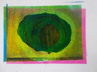
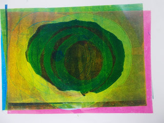
To my surprise, monoprint has been my favourite workshop so far. I was dreading it as in college we used foamboard and it never went very well, but how it was taught in our workshop and the results you get from just 4 colours is so fun I have been back a few times as I genuinely enjoy it. Looking forward to screenprinting, but so far this seems to be my favourite workshop technique.

Photography also plays an important role. My camera can be quite bad quality, but I have managed to get good enough imagery for this brief. In future I need to go and book the cameras from University but I've found I kept putting it off as when I have the idea, my own camera is with me. However, it is reassuring to know professional cameras can be borrowed.

A few examples of my primary imagery Ive used for Secret 7


Tame Impala-Less I Know The Better designs

I began working on designs for Etta James's 'At Last' but my ideas weren't transferring as well as I had in my head, and I feel i've been really passionate and in to these other two songs to design for so I have decided to focus on these.

My first few sets relate in the concept of candy. The gobstopper representing sweetness of his love for her, but the amount of time it is taking to get to her 'centre'. The circles also represent the endless cycles. So does the circles on the lollipop, and the temptation of love but the reality that it is really unhealthy and bad for him to want her. The colours and patterns tie in with their well known psychedelic style theme and I love working with this theme.


Originally meant to break a gobstopper and photograph it, but wanting to do the drip idea and really enjoying the layered circle cut out monoprints I put together, this is a gobstopper but it not so obviously. The photo of crinkled foil gives the texture of a candy wrapper that ties in with the theme while giving interesting light detail. The dripping of the gobstopper and dark matters make the candy look even more sickly and show the gruesome, falling apart side of the situation and the wear and tear as he is waiting for the girl to make her mind up.


Sets with haircuts work as a set with my Chvrches edits as does the marbling detail, and give silhouette detail defining the more crazy background still with the theme of the gobstopper and the one sided relationship going in circles


More ambiguous visuals presenting the falling apart of the bright and happy colours and patterns common with the band, can represent what the relationship is doing to his/their spirit.


Really trying to imitate the gostopper more realistically with the sides being the outer shell which are now in cracked parts representing giving up, as a lot of people do with gobstoppers as it takes so long to reach all the colours inside which is why I use this as a main theme.


Having the band members as lollipops is on its own a more minimal approach with the concept of their heads being full of infatuation and driven by the need of her love, but are blind to see her deception as they/he are so in love with her.


Image of the lollipop with subtle brush stroke filter. The shapes themselves are really satisfying along with the colours on their own and I really wanted to try a more basic approach as maybe less can be more. I can see this being a memorable, eye catching album cover and would make those who see it curious about the song.


My concept of the broken heart being barely held together by his withered tired hope of them finally being together, and the denim sleeve representing him wearing his heart on his sleeve and referencing their bands style. Reminds me slightly of the Kanye West album cover for '808's and Heartbreaks'

I tried to find a thread style typeface which would look clearer than my hand drawn threaded one but unfortunately one appropriate one I found you had to buy, but the one I used has the look of thread but is perhaps too thin to read.