
Melstringer
handwrendered balance of bubble bold text with shadow to pop off the page and script
loosely arranged, whereas mine can be placed using grids for more professional put together

Valfre
How quotes could be written/typed next to artwork. The script kind of font I would use as its still thick and clear enough to read and has the femininity + illustrative quality to it.

Sonya Fu
With having many variations of style between artists, the backgrounds of the artwork will have to be considered for layout. Also maybe small details such as the clouds in this which are an important element, can be added in the consistent tyographic theme/style theme of the publication when I decide which ones to put together,


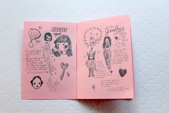
Looney Lolita
Details such as book binders/art pens could be added to edges of pages to give the atmosphere of the artist in work

Stefari
multiple images by an artist on a spread could be blended with layer effects/fitted well to have consistency within theme


As for having zines as inspo, Polyester is quite out there and loud which I may tone down to allow the art to be bold as possible but they use some interesting compositions and effects which are dark aswell as girly.

Left Out zine using borders and pattern coming off the edge add a distinctive effect to the spreads
No comments:
Post a Comment