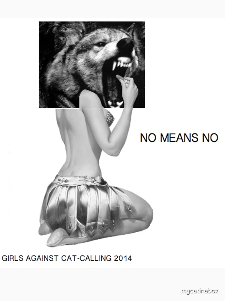
'Last year, a 10-minute video of a woman taking a casual walk through New York only to receive tons of catcalls and passes from random men went viral and set off a storm of dialogue and debate. The visual project was inspired largely by the work of artist and street activist Tatyana Fazlalizadeh’s “Stop Telling Women to Smile” campaign, which has been used to combat the culture of street harassment of women.'This street artist took to the streets of a city in Mexico with her street art. with the aim to challenge people to see something that’s often brushed off as an everyday occurrence as a problem that needs to be resolved. Placing visual language like this, in the direct and strong style is a way for the issue to not be ignored by passers by and empathise with each character used which is a very powerful method in a place with such troubles. For my design decisions to be appropriate for cities like Leeds, listening to survey feedback and knowing the locations and situations females face catcalling harassment is essential in knowing wether it will can be street art to education. The style of these are very powerful and inspiring and leave no but's for the public, however with my designs need to have more context added as unfortunately the issue of catcalling is easily ignored.The design is appropriate for Mexico city with the enormity of street gropings and the rape epidemic making reltable females of the city and being in public spaces hard to ignore in the type of landscape they are in in Mexico city. If using characters, they have to be relatable to the area and reach in to the emotional conscience of those who are causing the problems.
http://oogeewoogee.com/tatyana-fazlalizadeh-sets-out-to-combat-cat-calling-in-mexico/
https://bitchmedia.org/post/sometimes-street-harassment-isnt-just-annoying%E2%80%94its-illegal

Done in a non offensive, charming style supporting the cause to end catcalling. Although I would personally wear this kind of style, the audience it targets is limiting.
These impactful minimal poster campaigns are perfect in showing where the line actually is between normal and derogatory language focusing on. The black and white can also be in reference to how simple it is to understand where not to draw the line and the contrast makes the message more dramatic.
This is straight to the point and the symbolism of the hand pushing it away really emphasises the message, meaning I need to consider what I can add to the campaign as well as just words.


really explains everything in detail,
ReplyDeleteclipping path
clipping path service
photo editing company