Distribution
- as feedback in survey gave that education and campaigning were overall the best solutions to tackle the problem in the North of England (based on feedback sample and feedback in interim crit), distributing leaflets and poster campaigns in universities, bars/clubs and in public spaces is deemed the most appropriate as it reaches to the larger public without targeting certain groups, and placed in universities makes it educational, whilst being in bars and clubs is suitable for personal experiences and one of the reasons I want to create these as it is rife in bars and clubs.-leaflets such as one found in university but to match the campaign, meaning it can be taken away and read. Campaign posters maximised in public spaces educates and reminds as many of the targets as possible whilst not being deliberately placed in building sites for example as this could be offensive and resented which will not achieve the result and impact intended.
Message
-using descriptive/emotive words given in the survey to be unsettling and hit home, such as 'disgusted' and 'angry'-a theme supported in feedback is to use language relating to the persons loved ones such as their mothers and daughters to put in perspective the impact it has and show the dark nature of catcalling. Despite wanting to do a gender equal campaign, ultimately it can't be avoided that the majority of victims are women so this will be targeted towards them, but the message and awareness are still relevant and applicable to how not to treat strangers.
Ethics
-making the campaign for general public instead of targeting certain groups at caution of causing offence and stereotyping. this also covers the basis of educating different generations. educational leaflets can be distributed in a student union like ours, as an offering of education and awareness without again, targeting a certain group or gender.-using the words from the survey sample and facts/statistics based on the North of England meaning a fairer representation for the sensitive issue.
First image: Like previously researched images for catcalling, this guerilla sticker example is not appropriate for this brief. It is understandably angrily motivated using creep to describe the person and shows the vulnerability and concern of being watched in an uncomfortable way, but for this brief it has to be educational and apply to the general public where in this case, this visual language could annoy certain people and not get the message through in the right way.
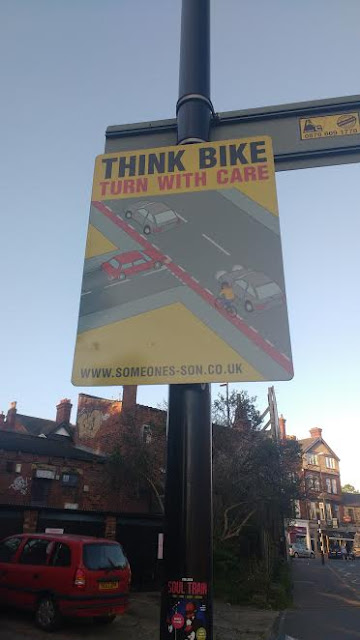
Second image: Although unrelated, the way it is displayed to drivers in a public space is appropriate in reminding drivers before the turn to watch for bikes, and is successful in using the personal emotive language I aim to use in my campaign. 'someones son' is powerful in making the message hit harder than if not used, as this language puts the message in to perspective.
More Feedback from a non-design students to gain a wider perspective wherever possible
IDEAS
black and white- is like black and white knowing consent, no 'blurred lines'
fluorescent- in your face slightly irritating to some people like the issue itself
red hand, rest is black and white- alerts danger and issue
blurred lines reference popular known reference, to a younger generation. older generations might not understand the reference. an issue with using this is from feedback in my survey people think catcalling/harassment is a generation education issue, however more people when describing who had harassed them expressed it was younger males.


No comments:
Post a Comment