


After debating the collection and development, having a consistent campaign clear and appropriate for the government sponsor and the sensitive issue was most important and having 3 different design styles was too much.
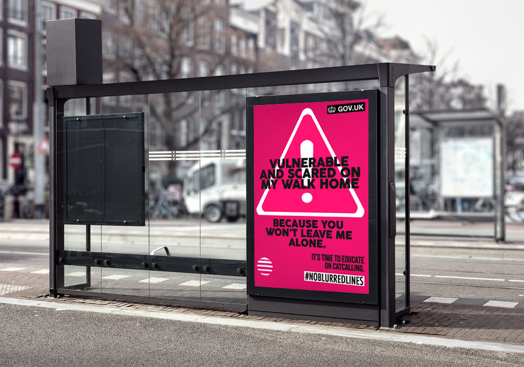
I have now chosen to keep the design consistent, being able to be displayed in all distribution locations non gender targeting (although the pink/red mix main colour combines danger and female response a well as being bold enough to command attention) and get the message across clearly and legibly.
They appear more as warning signs whilst still having a younger style appealing to the student demographic but being more subtle and clear to appeal to public audiences.
Web/social media GIFS


Totebags and fresher fair/student union merchandise to stay the same as it appeals to the demographic to be picked up and promoted, and used on nights out where harassment is one of the biggest problems.


fluorescent pinks and greens given as options for males being more comfortable with a colour suited to them incase they have issues with the pink, allowing them to still take and wear the tote sharing the message.

How badges and coasters could look
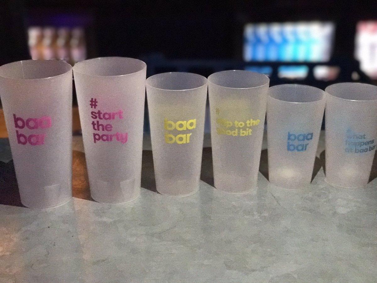

Bright coloured cup similar to one me and housemates received from Baa Bar would be picked up in huge numbers with the hashtag and context behind it being a reminder every day in the household and on nights out at pre drinks.
With this brief it was unfortunate I didn’t have solid factual research behind it but using experiences direct from victims themselves gave a strong platform on which to design and cater for. It was really unfortunate I decided the final campaign at a stage where creating extras wasn’t possible due to time.
My mockups are not at a perfected stage which doesn’t feel good but I feel the campaign definetley has a strong identity and promotes and voices how people actually feel about being catcalled and harassed.
Having the campaign look almost like warning signs as well as strong anti language make the message loud and clear and would be seen by those who are doing this and would stick in their minds as the visuals are quite stark.
This is the first time I have created gifs and applied a campaign to such a large target audience and I find it interesting how they can be marketed, such as applying the campaign to freshers freebies in which the message will be reminded multiple times.
Tackling the sensitive issue in the way I have I feel is appropriate as the words are from victims themselves and having the hashtag leaves an option to discuss the issue further which can only mean progress. While the feel of the campaign is a younger demographic, the clear and concise campaign is also strong enough to get the attention from the general public which is for issue oriented design.
No comments:
Post a Comment