

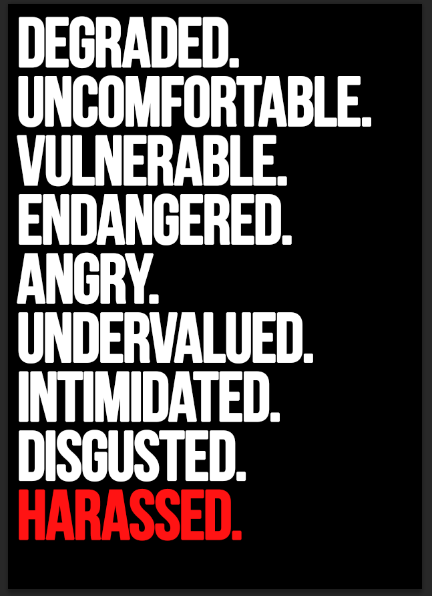


using a typeface without any fancy flairs and that allows the poster to contain all the letters in a clear and direct way maximises impact and importance of the emotive language. having all capitals also expresses the unrest and anger of those harassed and gives them a voice.
the words were taken from the survey I conducted which by asking certain questions this gave so many descriptive words of how it made the victims feel being harassed.I chose to use the word harassed instead of catcalled as it is taken more seriously and is understood to be more than just shouted at.
written in a list implies the words meant to make people squirm, like a never ending list and make the public as well realise that it isn't an issue to be ignored and to be taken seriously as this is how people feel from it.
on the example billboard, still using these emotive words along with relation to loved ones as a combination is used to make possible harassers think twice about how they interact with the public. using simple line art to express different situations makes the information being taken in more digestible and not as harrowing as using different visuals.
within the tagline I was sure to use the word 'educate' as from the survey this is what was suggested was needed more. the tag itself is in reference to the blurred lines song that caused a lot of controversy, and within the demographic of twitter being those on social media who are more likely to be aware of that controversy the hashtag can be used to raise awareness fitting the right target audience.
Feedback
-Busy arrangement of words is hard on the eyes but works if it is justified as being in your face like the harassers. if not maybe split the words up to make more posters.
-typeface is bold and in your face
-the words capture attention and having the final point in red is effective and represents danger they are in
-experiment more with line drawings/symbols used. minimal approach is appropriate, but try more such as exclamation marks using the words in the first posters to alert the viewer and emphasise the problem.
-it is good to use the words from the survey
-use quotes from the survey within the campaign to make it even more hard hitting and provoke empathy from the public
-consider the audience of feedback received in the survey and make the campaign on social media also as it is an issue amongst younger people who are being harassed and catcalled. this also will educate prolonging the message hopefully eradicating the issue present to future generations.
-promote the campaign through well known student clubs in Leeds such as Pryzm which has had issues of harassment and assault recently. Doing this alongside the public campaign means awareness can be raised to potential harassers and those not perhaps educated or knowing their advances aren't appreciated, as well as raising awareness and a voice for students/young people from my survey.
-using neon colours for a younger audience would make the campaign hard to ignore
Within this it was also raised that creating the campaign for social media would be more useful than a leaflet which is easy to ignore- with this I could try and create a GIF going through all of the words as there are so many for that opportunity and the bombardment of them will represent how those catcalled feel.
No comments:
Post a Comment