How can buying vinyl online be as enjoyable as a record store but more direct for increased user experience?
How can Discogs interface be redesigned to be more simple and less problematic for its wide target audience?
How can buying vinyl on Discogs have a more efficient user experience with a less time consuming interface?
Client- Discogs
Target audience- primarily males from young adult to middle aged
Aim- Reducing problems users experience on Discogs such as complex search results and messy confusing layout and time consuming directory, whilst adding a record store feeling to input that enjoyable experience of discovery and visual experience entering a record store connectijng the benefit of the online market place having more direct choice.
Create a website that is consistent, non confusing/messy and direct, connecting old and new vinyl buyers and the experiences combined to maximise user experience for all of the target audience of young adult males to middle aged
Existing competition- after browsing top sites directed by Google, a large majority have a very basic interface without user experience being taken into consideration as I aim my project to do
http://www.decks.de/shop
has record music player and implements themes of vinyl shops such as tabs and vinyl player, however still very full/messy.
http://www.recordstore.co.uk/
a lot clearer and cohesive design, home page outlines sections with popular vinyl covers to familiarise users and feel at ease with the experience. fast search engine that discogs lacks in very much so, due to muddles of search results and no filter. the bigger visuals of the vinyl celebrate the resonance music lovers feel when buying vinyl due to their increased cover size.
http://invisiblecityeditions.bigcartel.com/
a more slick design that others, found easy to navigate straight away
The Vinyl District powered by Shoutem

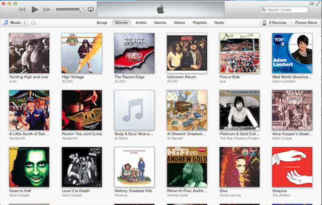
Spotify- consistency across devices,format of releases, clear and concise with your own music and then recommendations, like you would get from those working in vinyl shops


No comments:
Post a Comment