
Their humble aim as a company of wanting to 'give back' to the world which makes them different from other water bottle companies, the idea of using a subtle calm colour scheme of blue, incorporating a figure that is liked by the target audience of 18-24 and representing their main aim of charitable donations with every bottle to hydrate the world is an idea I am excited about.
'How we go about achieving it is by sticking to what we're good at and ensuring total transparency.'could be transparent cover working in ethics with this blue tint with silver/blue foiling representing to glisten of water which is so valuable and appreciated by disadvantaged parts of the world? environmentally friendly stock? would buy their bottles to contribute and also to photograph and show the results with various designs.
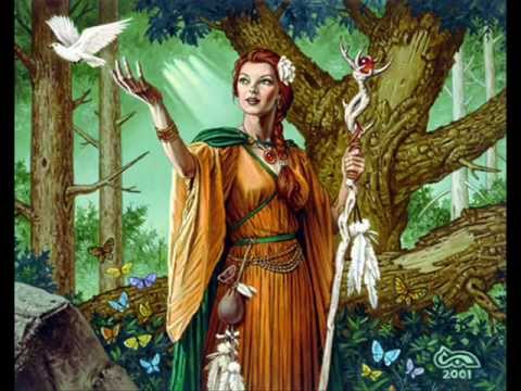
1.Research on Greek Gods as symbol for love/compassion/peace prosperity. Depicting a goddess will give the design a classic feel giving the impression the companies roots are perhaps older than 2007 when it started, adding trust. Also, would be an elegant design which is appropriate for the target audience depending also on medias used. Using blue colours can balance the gender neutrality. Would ideally want these to be illustrated.
Demeter: Goddess of grain, agriculture, harvest, growth, and nourishment.
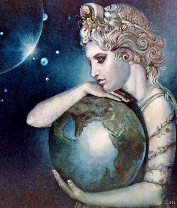
Gaia: Personification of the Earth (Mother Earth); mother of the Titans.
Depictions of her on google images, would want these to be simplified to represent the companies humble charitable aims and ethics and not be too parading. Idea comes from wanting to represent peace and humanity/compassion on the design.


Eirene: "Peace"),[1] more commonly known in English as Peace, was one of the Horae, the personification of peace. She was depicted in art as a beautiful young woman carrying acornucopia, sceptre, and a torch or rhyton.

2.In relation to existing logo of water drop holding the planet, new branding could be the world being filled up. they use a symbol of hydration, the drop of water. could be waves? Mirages of those thirsty in deserts is a tale that is said to make people see glistening oceans in the distance, and this could celebrate the fact the world is mostly water and that it is such a luxury, and that it should flow to hydrate in every country. some inspiring imagery from google. Ocean world? Blue flower/ocean as a world representing the blossoming and hydration intended by the company? A better world?


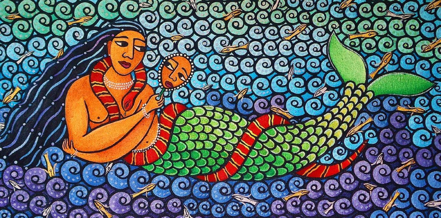
3. Similar to greek gods/goddesses, mermaids in relation to that they are mythical creatures from the water and there is a trend and selling point using mermaids that is seen recently. Nostalgic for the 18-24 generation. Perhaps too feminine however, and if related to greek mythology this would be bad as they were fatales. Can be a faceless god of the sea relating to the humanity of charity donations and representing the peace needed in humanity.
Ouzo design that was gifted to me representing Greece, and although illustrative it had a classic more mature appeal despite it being a mermaid displayed in the more light way opposed to the femme fatale classic mermaids.

One of my favourite companies Paperchase has had a trend using Mermaids which arent just aimed at younger audiences, have seen 18+ excited about these. Would want mine more mature and less flashy to reflect the companies ethics.


.JPG)


'The core bottled water market is 18 – 40 year olds, with a female bias. The target audience for this campaign is 18 – 24 year olds.'
4. stay true to their African rooted aims and use African symbols and figures to also allow the buyer to resonate with the culture they are helping.
http://www.siliconafrica.com/african-symbols-for-creative-design/

“chain link”
symbol of unity and human relations A reminder to
contribute to the community, that in unity lies strength
 “time changes ” symbol of change, life’s dynamics Source:
 Cloth AsMetaphor by G.F. Kojo Arthur


“Help me and let me help you” symbol of
cooperation and interdependence Source:“Cloth As Metaphor” by
G.F. Kojo Arthur

African rain goddess image is inspiring in terms of showing the rich beauty of Africa when nourished
Mami Wata 'the water spirit Mami Wata (Mother Water) is celebrated throughout much of Africa and the African Atlantic. A rich array of arts surrounds her, as well as a host of other aquatic spirits--all honoring the essential, sacred nature of water. Mami Wata is often portrayed as a mermaid, a snake charmer, or a combination of both.'
'...art both reflects and actively contributes to beliefs and religious practices, globalization, and capitalism. Most of all, it reveals the potency of images and ideas to shape the lives of people, communities, and societies. '
https://africa.si.edu/exhibits/mamiwata/intro.html
The snake is a symbol of divinity and divnation but am aware this could be confusing to british culture

About the Starbucks mermaid logo that uses negative space effectively which I will need to do if I am foiling...
'Let’s go all the way back to 1971, to when Starbucks was first coming to be. In a search for a way to capture the seafaring history of coffee and Seattle’s strong seaport roots, there was a lot of poring over old marine books going on. Suddenly, there she was: a 16th century Norse woodcut of a twin-tailed mermaid, or Siren. There was something about her – a seductive mystery mixed with a nautical theme that was exactly what the founders were looking for. A logo was designed around her, and our long relationship with the Siren began.'
https://www.starbucks.com/blog/so-who-is-the-siren
Although I know this company has better ethics than Starbucks is known for, and having too similar of a design could ruin my chances of winning, it is inspirational for the route I am taking. 'We undertook extensive consumer research that showed that Thirsty Planet was seen to be trusted, described as ‘earnest’ and ‘friendly’ but needed to have a stronger tone of voice, to become the authority in the sector and give consumers a single easy reason to choose it… basically, we’ve not been bold enough to communicate what we do and the great things we’ve achieved. ' YCN competition website
5. African flag colour waves and gold foiling celebrating the 'flowing' beautiful rich tapestry of African culture tying the hydration and Thirsty Planet's aim to help African countries flourish.
Can be painted/monoprinted/foiled/collage combination
Inspired walking past this competition poster in our corridor which caught my attention with its bold waves, is a mix of previous ideas integrating with Africa's tapestry which I think the company would enjoy visually and theoretically.

'has been able to provide a lifetime’s supply of clean water to over 1 million people across Zimbabwe and Malawi.' Pump Aid Website
Can use the colours of these countries flags
Malawi:

Zimbabwe:
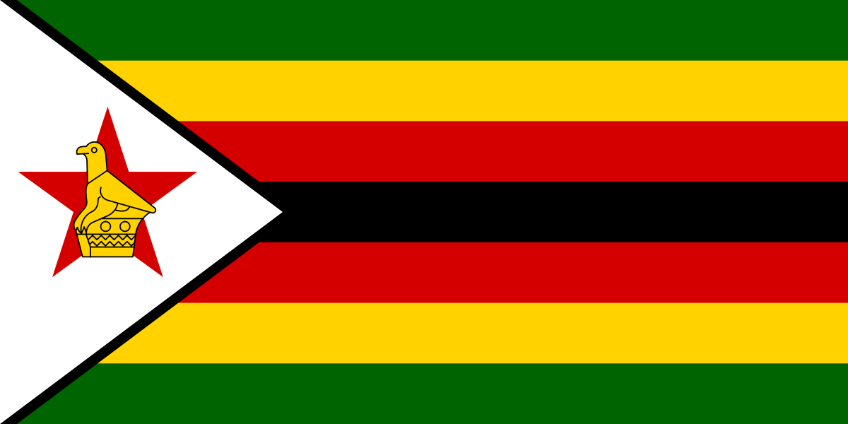

'has been able to provide a lifetime’s supply of clean water to over 1 million people across Zimbabwe and Malawi.' Pump Aid Website
Can use the colours of these countries flags
Malawi:
Zimbabwe:
No comments:
Post a Comment