Tuesday, October 25, 2016

Cover Layout


Example of where the bee will be glowing in the centre


http://blog.spoongraphics.co.uk/articles/showcase-of-creative-designs-made-with-vibrant-gradients

Decided on having a bold, striking title in a more modern or neon tube styled typefaces which I layed out to see how they would look against black. I attempted at using neon light typefaces but they highlight the tacky side of neon signage which I want to take away from this publication and illuminate the glamour and commanding nature within the dark.

After Fridays crit and feedback it was agreed number 7 was most appropriate for its bold and large lettering and its smooth curving which ties in with the function/shape of neon lighting linking a more modern approach with the reminiscence of neon signage, unjoined and not as 'tacky. PTF Nordic Rnd, the typeface I have chosen to expose on my screen is a classic curved Bauhaus typeface which is timeless as are neon signs as discussed in previous blog posts as being a dated phenomenon which is coming back in todays more youthful design.

Also being exposed in screenprint is the bee for the front cover, a symbol for Manchesters industrial revolution still celebrated until this day to be printed on book rum cloth to tie in with this, an introductory quote from the Neon book, and 'films not dead' to be on the back cover as a secret feature reiterating the method of shooting on film cameras as my photos are and that it may not be as popular but is always there.

As my design develops further the more ambigious the book itself is becoming which I think creative target audiences would find more interesting, especially due to the design decision of all black stock and glow in the dark ink. The mystery makes it more special and the typography inside will be valued as it is and up to peoples interpretations of where it is and what its purpose is.

More simple front and back cover glow in the dark ambiguity inspired by the 'Making Design' book from Vernon street which only has the title and numbers on the back adding to the mystery and speciality of the glow in the dark print feature as I want to achieve with my publication

InDesign session on setting up to print

in preperation for two print outs of my book tommorow before adding the cover these pre sets are important to prepare as it would be commercially and before perfect binding my book

print booklet allows us to reorder pages depending on binding methods
print blank pages ticked for my intro pages and to be stuck to the cover
margin on mine needs to be bigger, 20mm to be safe
trim once folded and bound
centred scale
two sidedlong edge binding
gloss stock replicating the dark glossy photo book finish I enjoyed in this book I previously researched


2 up perfect bound
standard perfect bind setup
file>print>centred>printer setup>long edge binding>two sided


print setup>pages>range
if i decide to kettle stitch and not perfect bind to seperate booklets i print 4 times ranging 1 to 8, 9 to 16, 17 to 24, 25 to 32
click preview to check

perhaps print one in booklets to stitch and one set up for perfect binding to ensure the best is taken forward?

also due to my prototype displaying the difference in blacks of indesign pages and my photographs, when printing the setting needs to be applied that matches the blacks meaning no borders

Monday, October 24, 2016

Final Setup Plans

Design
-Manchester bee in fluorescent mixed with glow in the dark ink on the front, colour yet to be decided
-Title on bind but if too small a glow in the dark bar with the title on the cover along with the bee
-full bleed images inside
-paint edges black due to unavailability of facilities to print on black stock but to mimic what it would look like 'edge painting' method using a brayer and padding press http://ohsobeautifulpaper.com/2012/01/the-printing-process-edge-painting/
-6x8 size
-quotation on introductory page from 'Neon' book
-cloth bookrum cover
-add 'films not dead' in glow in the dark on last page to add an added feature supporting that its not dead, came alive in the night on this occasion shooting neon signage
- double sided satin is very expensive although preferred stock, therefore I will continue with glossy as it adds the sheen to the images and reflects light relating to the format of neon type.
-get lit manchester title or if side is too small for this to be legible, have it all glow in the dark as a bar
-perfect bound if print of book is not thick enough
-cloth bookrum as the cover to relate to manchesters cotton industry and the manchester bee that represents this industrial revolution and the hardwork of the time
-photo size down from 8x10 to 6x8 to avoid magazine look and to save money
-continue with manuscript grid full bleed images landscape photos being double paged
-pair images to compliment each other in colour and effect
-keep pages apart from introductory quote text free to keep the ambiguity and mystery of the night time imagery and allow the text and minor details to be the focus and to keep it a photography book to allow peoples own interpretations of the words/type/location as the style of these photos adds mystery and will encourage people to look out for these or their own wherever they are


commercial considerations
-would be black stock limited by facilities here which would mean no exposed white cracks from bookbinding processes
-paper supplier has not delivered 2 sample requests for papers i intended to experiment with for this publication within 2 weeks for reasons unknown which would not be an issue for a publishing house
-smaller size of book will be cost effective

Friday, October 21, 2016

Deciding on bind


While preparing my screen for printing next week, a tutor mentioned whilst looking at my printed prototypes to look at Cafe Royal photography books as they are staple bound. This would be appropriate in relating the metal staple to Manchester's industrial notoriety and the industrial mood reflected, some literally, in my imagery. Also due to the book not being very thick which perfect binding would be most appropriate for. Something to be cautious about would be making it look too cheaply produced even if justified. Also would not be the title on the bind.
'CafĂ© Royal Books has been praised as ‘making new history’ and ‘the most important supporter of British photography’; Martin Parr said it was “a great archive of much forgotten documentary”. 'same spirit of displaying places photographically however, bind supports the easiness of producing one of these books every week whereas mine is not in that format.


Kettle stitch is a stitch I find allows the pages to be seen and can include a hardback and sectioning before taking to print would not be a difficulty or perhaps not even needed. Having also experimented with signature stitch, this is mainly used to expose the signatures threads and hardback cannot be added. I am no longer using glow in the dark thread despite relation to cotton industry and Manchester bee, however if I choose a bind that will not have a thick enough bind this could be an option that is justified.

Thursday, October 20, 2016

Typography ideas for front cover


...that neon sign - particularly that old - tend not to conform to font faces. They are subject to practical problems, back then is was the literal bending of glass tubes. A difficult and at times dangerous job.'no such font, is merely contruction'http://graphicdesign.stackexchange.com/questions/29654/identify-neon-sign-font-in-photo

perhaps I should hand wrender to support this? or find a tube typeface that is bold enough to be seen high contrast against black

'
The solution is to paint the tube black in the connecting sections, so that the letters appear discrete. Legibility is achieved by simply painting out parts of the letters, rather like tweaking your newly designed typeface by applying correcting fluid to the stems, serifs and ligatures.''Claude called his invention, which he was quick to patent and commercialize, a “living flame”. But in the very core of neon lighting is this idea of desire: light is created by bombarding, or exciting the molecules of a rare or noble gas. Perhaps that’s why adult boutiques and strip clubs choose neon.'- This quote explains a lot of the time the lights need handwrendered editing or hiding, which leads me to consider painting parts, or if parts in screenprint go wrong, that covering parts by painting them black can be justified as it relates to neon lights roots. Ofcourse it will look professional and needs to be wanted to be purchased by the Manchester creatives, but unique unclinical detail will not be entirely innappropriate if done right.

'
The decline of neon has made it a ripe subject for a kind of cult status: the famous neon boneyard of the Young Electric Sign Company in Vegas was never an official tourist attraction but was picked over and photographed by thousands of visitors intrigued by the idea of the detritus of a fickle consumer culture. '
http://designinquiry.net/contributions/neon-typography/- this reninforces my editing technique and the way the pages are assembled, with the neon signages glorified against the black in sharp enhancement, and why the book will have fluorescent/glow in the dark/high contrast design themes.

Booking and commercial printing/binding issues

Printed black pages wrinkle and when threaded and when the edges are flattened with the bone the white stock beneath is exposed.

Book would be too costly due to size so my final will be a photo size down

Myself and peers prefer the glossier digireen silk 115gsm, however it is delicate and bends and dents easily with a flick through

Solution will be using a folding machine which would be use when mass produced and fingerprints are unavoidable with such stock, which may prompt those reading it to be more careful and mindful of the production of the book and add unspoilt awareness which the target audience of creatives would go hand in hand.

Antalis 200gsm extra blanc was too thick and had indents that didn't add anything to the pristine photo finish I am after appropriate for a photo book

Attempting saddle stitch and signature stitch, finding a tutorial on attaching a hard back and seeing which stitch is the strongest and easiest to see the photographs and pages to the best quality.
Avoid Costly Printing Problems With These Real World Binding and Finishing Tips

For my publication, I will kettlestitch as this held my prototypes very well and didn't hide any of the content inside and I aim to achieve the best possible outcome so using this method also relates to the place of content inside. Perfect binding worked very well also, but I am aware this is not durable done in the way of just using PVA and if done professionally I would have more confidence but in no way do I want the book to fall apart when being assessed!


first kettlestitch, was a rough example but held the pages together as I wanted allowing all of the page to be seen. Stitching instead of perfect binding felt appropriate as it tied in with the idea of using something relatable to the cotton revolution of Manchester if book cloth is not used for the cover.

Monday, October 17, 2016

Considerations before InDesign

At this stage I have discussed my decision to allow the book to be a photo book without context such as night out experiences or being a memory book as these could hinder its target audience, whilst allowing the neon type to express itself and create this book as a Manchester edition of shooting neon type with film gives it a selling point for creatives and those who admire the nightlife in the popular city. Using the neon bee also ties in with Manchesters mark as the revolutionary industrialized city and resonates with its mark spotted all around Manchester of the worker bee, and will work in continuous line such as neon bars. Ideally I would have this in LED but would be too costly at this stage.


'The worker bee was adopted as a motif for Manchester during the Industrial Revolution, at a time when Manchester was taking a leading role in new forms of mass production. ' wikipedia


Within the crit another issue I had was deciding if aswell as a book I should try making the photos pull out of a case so it can become a storage spot for users own photographs, printing my images on photo paper to go hand in hand with my method of taking these photos of neon type. It was suggested inside this cover at the back I could have the neon bee printed glow in the dark which I don't know if will be succesful or not, therefore I have a lot of test prints to do. I am not getting certain answers from crits so I am to go with my gut feelings and try both out. It will be kept rather minimal now allowing the type to be glorified. I felt good about coming to this decision as I think the elements of glow in the dark, fluorescent, black stock combined with my images are enough to make it an interesting publication that would attract lovers of photography and design such as myself and become a project where being minimal transcends, much because of the all black pages. Within my research of all black page books the effect of enhancing the content is a definite design decision that will compliment my style of type photography so well.

Order- The appropriate way to order images will be at random or varied in finish as I want to remove a couple of very low quality images that would bring down the publications finish and photographic impact
Size- limited to being quite a small publication, pages probably only a little larger than standard small photograph sizing of 4x6 to allow the image to bleed in to the black. will have to see how this goes with test prints booked for wednesday.
Front and back/inside cover- title 'type in context: Get Lit', manchester bee. need to experiment with fluorescent or glow in the dark inks screenprinted which will determined the stock. also the typography. need to decide on an introduction, ideally want a quotation like in the Neon book which introduces the images in an upbeat admirable nature which serves its purpose in wanting to get people interested in neons craft and impact
Layout of images-ideally like photo books mostly left or right aligned, will try double page spread but dont think this will work due to scans of photographs
How binding implicates outcome- as the book won't be that thick perfect binding could be an option but want to avoid this. aim to try signature bookbinds this week.
Colour profile/spot colouring- choose the most appropriate high impact profile for heavy black printing.
Choosing of images- only using the best quality images
Commercial considerations- is it tricky to create or easily mass produced?
Stocks- have ordered 3 stocks and aim to test print on photo paper to establish best outcome for finalisation

Tuesday, October 11, 2016

Stock considerations

photo enhancing stock smooth,durable wont bend, not a high gsm, crisp white to keep the contrast of my images sharp and for black to become really black on (may have to print black twice? need to test print and order stocks)
coated stock

soft matt heaven 42 150gsm GFSMITH
170gsm

Xenon PheniXmotion 170gsm


I considered one of the pearlescent Gmund action papers but from past experience, textured papers arent the right choice to get a high finish print on to as parts are left unprinted.

thickness as if holding/flicking through the photographs themselves? print on photographic paper?

https://photographylife.com/guide-photographic-photo-paper

Photo Paper Finish

The first aspect that consumers often evaluate is the photo paper finish. It is a translucent chemical coating that is designed to improve the appearance of the print which otherwise may appear dull. The problem lies in the inconsistent terminology that brands use to describe their finish and the headache of making sense of which is which. Common options include matt, glossy and satin, but when consumers come across terms such as semi-gloss, pearl, luster and other finishes, confusion is likely to occur. Here are the most common options you will come across.
  1. Glossy – The most widely used finish is the glossy finish which comes in degree of glossiness from normal to high glossy. The shine from the chemical coating helps distinguish the smallest details of the photograph, however the resulting glare makes viewing the print from certain angles challenging on occasion.
  2. Matt – Depending on the brand, you will come across this finish as Matt or Matte. It is situated on the other side of the scale with zero glossiness. The lack of expensive finish makes the photo paper slightly cheaper to produce and more affordable to buy which helps explain why it is commonly used in brochure and flyer printing. It is also commonly used when printing black and white photos, as glossy finish can diminish from the photo’s credibility.
  3. Satin – The satin finish is situated precisely in the middle, between the glossy and matt finish. It benefits from a level of glossiness, but nowhere near that of the actual glossy finish. Certain brands such as Epson call their range of satin finish “semi-gloss” so the best description will be a toned down glossy finish.
  4. Pearl and Luster – These are offered by the more professional manufactures and represent a type of satin finish with a textured feel. The normal satin or semi-gloss finish is flat, but these two include a delicate texture to make the print feel more special when held.

Deciding Context of publication and print methods

Potential questions:
how does neon make you feel?

quotes on how neon makes them feel/opinions on neon
literature on neon to provoke feeling when looking in to the photo
no added context, allowing the photos to be their bold selves
quotes on manchester night life near the location

http://www.neonidea.net/neon%20nostalgia.htm
'liquid fire'

personally find the history of neon/production quite boring and want to enhance its aesthetically beaming attraction to become the focus and inspiration for the design production and the target audience of creatives/photographers/manc partygoers

printing

coated stock allowing the ink to sit on top without losing its pigment
fluorescent inks instead of glow in the dark, spine will be quite small as my publication is now going to just include my photos and perhaps an introduction.
after binding experiments using glow in the dark stitch i could try a little glow in the dark powder for the spine to add the light in the dark feature
neon manchester bee edited on the front in fluorescent ink depending how the inks work on certain stocks?
bound in a way that doesn't hide any part of the photo

first of all various feels of stock such as a rubbery, matte and glossy to test print need to be ordered and test inked on to find the most appropriate

In summary, there are many design aspects that need to inform and allow the audience of the central focus being on bright neon in Manchester at night.

Monday, October 10, 2016

'Manchester: looking through the light in the pouring rain'- Kevin Cummins

I picked this book up not for guidance on production methods as it is very different to the smaller way I want to produce mine and is badly bounded, but if I am going to celebrate Manchester and aim it at Mancs who enjoy the nightlife aswell as creatives and eccentrics alike, I want to see how this was produced to celebrate and aim at the celebrated captured Manchester moments. Despite this not being a typographic theme either, I have quotations within that celebrate this spirit Mancs have about the city and its culture and is very nostalgic, whereas this can be for new memories new perceptions of manchester (good or bad thing?). Personally, i absoloutely love looking at photographs from the 70s/80s/90s era and wish I could have been within those moments more than the nightlife and styles of now, however, if I make this a journal/memory book, it becomes personal to the one who owns it which can be a unique selling point added to its aesthetic and topic. It can be wrote in according to memories of any time of nights out, it could be shared with others.

Positives
large glossy pages and double spreads and single frames of the photographs/nice layout composition not afraid to leave space and doesn't try to overfill, photo heavy apart from singled out full body text pages
double spreads of huge manchester quotations about the types of people and the ways they perceive and live their lives, very upbeat
brilliant use of black stock when fitting image

Negatives
Side text is annoying and hard to read
text and images are lost in the bind
pages have to be pressed apart due to bind


These are the kind of quotations that would fit my books nature, after struggling for context and deciding on a photo book having such quotes make the reader empathize with the city and those who wander noticing these signs and appreciating the context of Manchester


The glossy flick through and addition to images special reminiscence along with the black space which makes the viewer focus even more on the image makes the best use of using black pages and in which the spreads priority is the photograph which has added impact


Night out book concept

-audience being people who go out at night in Manchester to these places and see these signs, aswell as neon lovers and creatives alike
-my signage is very diverse like the people who go there, are put together due to the neon
-seedy glamour/tacky connotation can be disregarded with the design production, gives it a purpose, to celebrate the craft and reason they are lit
-night out diary/memory book that allows personalisation
-small publication like a diary
-like the way i used a disposable camera, like life and memories those moments cant be redone, gone in a flash apart from in memory and in writing
-bright side of the dark night
-'flash'backs
-because of the editing the reader pays attention to the typography and the craft as the contrast is so crisp, may have missed them and not paid attention on nights out

I need to find similar publications 'diaries/memory books' which can aid inspiration in doing this as I don't know if the market for these is prevalent enough to inform my design. throughout books i have already researched, having photo heavy pages in black is a certain way I want this to be done but I have been struggling with text/content to include so maybe the right way to do it is to have it personalised? I will also consider going to these places and asking people what they think of manchester at night if possible, as the way the Cummins book i just read spoke of the place was a way in which i relate and is a reason I love typography, it takes you back to that place and makes you feel a certain way

After crit aims

Being honest i felt not splitting the groups in theory sounds like itd be good and youd gain heaps of feedback but it is quite the opposite. I only got suggestions or praise of what i had mentioned and I asked people if they enjoyed neon and nearly everyone nodded their head but this isn't really valuable for my production. Therefore, I am still quite confused and unsure of which direction to go in and am trying to ask various people their opinions...
I was aware that although I don't want to be conventional and have text directing those reading to the location of the neon type itself, I need to remember to mention the text and not get swept away with the night out concept as the brief is what I need to achieve.

Solid elements
-Type is illuminated by the editing and the fact it was approaching night time, and also the effect of disposable camera method
-are all taken on a wander in Manchester city centre
-limited to small publication/small photo size
for best quality of image, due to being taken on a disposable
-target audience of Mancunians/creatives/lovers of the tacky and eccentric, photographers or photography enthusiasts probably 18+
-celebrates the electric feel and way cities are lit up such as new york and tokyo
'Neon signs create iconic landmarks in city centres, such as New York's Times Square (Rex)'
http://www.bbc.com/culture/story/20140711-bright-lights-big-city'each sign handcrafted'
'
Neon will long spell ‘downtown’ in bright, emotionally uplifting and hugely popular firework light.'

-neon light bars are continuous due to the liquid inside
-can be used on all black stock/printed black ideally as research in to this has encouraged me that this will illuminate the letter forms even further and celebrate the night time style
-variation in distance and clarity in some cases, of the letter forms
-location is actually quite ambiguous so a directory wouldn't be appropriate
-i want the book to be as attracting and valued as neon signage which informs my design production

I would be happy to create a photo book as the design would make it stand out anyway, but I am currently wondering how I can add context and what to add to make it even better. Also, which production method to use in terms of binding or having a sleeve.

Thursday, October 6, 2016

My two concepts

Night out concept disposable drunk memories, flashbacks of what theyve seen in manchester,
-glow in the dark features on the cover representing the experience of the nights different perspective
-light altering glasses come with


Photo book focusing solely on the neon text
photo album style, can have quite a vintage feel to it
-'there is a light that never goes out'
-celebrates Manchesters growing trend of loving all vintage music and eras, especially as many of the photos were from the Northern Quarter and admires the high value of old american neon signs.

Fluorescent detail celebrating neon but allowing the photos to emmitt their energy
-fluorescent sprayed edges
-all black pages
-case with inserts of the images rather than a bound book, more of a collection

in terms of other binding methods I have considered a stitch bind so i am able to use fluorescent or glow in the dark thread especially against a black spine would relate to the continuous bar of a neon sign, and is a feature celebrating the textile industry that spurred Manchester in to being the prime of the industrial revolution producing cotton.

my ideas do slightly overlap but after the crit I am hoping to see an idea become more distinct and i feel that my edited images are powerful quality but i need to remember it is crucial to not completely wander away from the fact this is about the typography aswell as the context.

Inspiring designs from 'Neon' book

My favourite quote of the introductions, written in a soft tube typeface is "Neon colours are alarming but also seductive. I want to create works that look better than reality. Neon represents another state of mind and consciousness. It's the trick of alienation.'"- Jiri Geller 


 A clever and intricate way of implementing neon or glow in the dark inks wether spray painted or not, this can be painted on. a limitation of using glow in the dark is it is more costly and only works on exposed stock due to its need of light to charge so it would just be the sides glowing in the dark and perhaps the cover. using fluorescent inks would be a better option as this kind of detail can be seen in all lights while celebrating the focus of my publication.


 I was attracted to the contrast of neon to dark which encourages me more to do the pages black as it literally lights up the detail and colour of type which should be the main focus.


this cool idea instantly caught my attention! the use of vinyl and foiling combined by the fluorescence adds the lit edge effect I enjoyed used for the casing of the cover and I haven't seen an effect like this before. Quite a simple effect but an eccentric one. i'd consider this for the cover as it wouldn't work in balance with my imagery and would distract. The cover and outsides of my publication are the best opportunity for me to use wild design techniques as I want it to be something someone can see straight away on a bookshelf.


Vibrant fluorescent combinations would make the publication stand out for sure, all depending on which typeface is used with this can work quite well. However, although this is succesful on this example and for the book these are found from, my nighttime theme perhaps should be continued on the cover being primarily black to keep an elegant dark theme continuously but fluorescents can be used in places. This would be succesful as a series which mine would be implemented as by the titles second part ':Manchester'.

Book Research


Having fluorescent edges adds to the speciality of the publication and connects with the theme. This personal and intricate touch to the publication is a way of going crazy with colour without effecting the viewing of the tyography in the photographs.


Terry Richardson- 'Mom/Dad'
in the collectors cabinet in the library, i was seeking out all black paged books and was fooled by its case style containing two seperate all photography/note books one for his mum one for his dad. as he is one of the most famed photographers, it was valuable to see how he presented a very dear publication and it has made me consider other ways a book can be produced rather than standard bound. an idea I have had is to have it in a similar case with my photographs perhaps double sided and all seperate with the edges of them spraypainted like i noticed in my 'neon' book. this celebrates the neon in a way that doesn't overpower to viewing of the photographs themselves but adds an exciting detailing on the side of the case which would look electric next to all black cover stock. this is a way of incorporating fluorescent inks which i want to experiment with, or perhaps even glow in the dark ink but I am unsure of how to do this well.
Its large size and simplicity display his work to its best detail as the titles are so small you can't wait to open and see whats inside the huge pages. My project will be limited to a smaller publication as I can't really blow up my photographs but it is still interesting to see how I feel about covers of photo books and the effect their design has on the viewer.


Gareth McCornell- 'Close Your Eyes'
another collectors book, which appeals to my design inspiration due to the admiration for neon signage at its peak in America between the 1920's-1960's and collectable value. I was drawn to the bursts of colour on the front of the cover and the psychedelic framing editing I have been drawn to producing in past publications while exploring zine styles. Being on black stock enhances this style beautifully and allows the light to be so crisp, which it would do for my neon letters. Also, the glossy sheen works in expressing the photography to its best potential. only containing matt black sheened text displaying the title on an inner page, with full blaring pages full brimmed photography, this ties in with one of my ideas of having any annotations or quotes in glow in the dark making it interesting to discover, while not interfering with the impact of the imagery. this book was also very large fit for its purpose, but drives me to making a perfect bind as with these sorts of books even with ones smaller it was quite hard to turn the pages perfectly without hiding some of the images effect. It suits being a coffee table book as it is all imagery, but perhaps with mine as some of the type is further away within the image I want it to be produced so it can be stared in to and get lost in the glow of the type and words. Having a small publication would also support this and would add a special feel.


Nan Goldin- '55'
one of my favourite photographers, i picked this up to see how she allows her work to be seen and to explore how a photographer is happy to display their publication as it was curated by a close friend giving the images brief explanations. Although I don't see mine as being text heavy at all or having descriptions for now, the sizing of the book is what attracted me to it,
photograph size friendly, square for breathing space/text, focused on photographs, handy size, not a very thick book,some double page presentations of the photographs, some single page landscape or portrait,perfect bound easy to flick through.


Jonas Bendiksen- 'Satellites'
looking at a book with no subject relation, i picked up this book due to its glossy saturated displays of photography printed on all black pages on which the images are in gloss, and the edges are matte black seperating the two which I can see why it has been done as it is a visually pleasing contrast between the two, but I want my night images to be fully immersed to get the full effect of night time wanders around Manchester. this book, also rather large and heavy, has so much of an easier reading and viewing experience due to perfect bound production and the colours blare within the black pages.


I was directed to Vernon street library to check this glow in the dark book out, which interestingly also had the edges darkened but wasn't black stock inside. Glow in the dark was used sparsely and it was hard for it to glow as it was snuck in a bookshelf majority of its time and I didn't really like the design of the book, just that aspect which was quite underwhelming to how id have imagined.

After asking about using glow in the dark powder, I realised its limitations in colour and that the consistency can run and get quite messy so this spurred me on to go for fluorescent inks which aren't as expensive and have an eccentric eye-catching effect in all lights which is ideal for the reader.


Also on my wanders of Leeds, trying to see examples of the effects that neon/lights/fluorescent colours had put in the everyday world and see how they distinguish apart from everything else which is undeniable and what initially attracts my attention towards such other level colours/sights.


This feature of Light Night was a small installation but attracted a large crowd due to its otherworldly mystical neon light combinations creating ethereal gazing and is most high impact in the dark supporting my idea to use black pages. The others commanded attention before even walking past the long line of event posters in Hyde Park, almost eye watering in how much fluorescent ink has been printed but they instantly attract the bypasser in to looking even if the events arent in their taste. Would not use so much block fluorescent as I believe less is more but even a little stands out amongst the ordinary which my publication intends to do by using glow in the dark or fluorescent on the bind and cover so it stands out on a book case to those who aren't even searching specifically for neon typography, due to its design they will want to pick it up and flick through maybe opening up their enjoyment from the subconscious in to the conscious by seeing them on pages in another perspective as I believe is true with a lot of people, the crowd on light night for example. People seek other perspectives and out of ordinary sights. The two opinions picked up from asking people on nights out were either that neon was tacky, or that neon reflected glamour, which are both very viable opinions. My publication intends to reflect the beauty and glamour of the typographic form illuminated by neon.

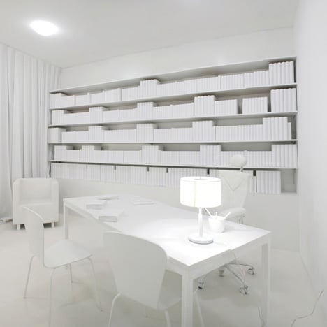
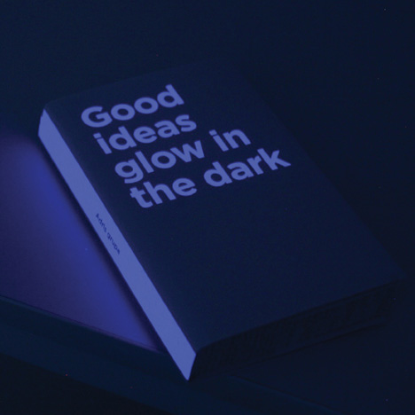
http://www.dezeen.com/2011/08/05/good-ideas-glow-in-the-dark-by-bruketazinic-and-brigada/

In addition this article supports that a book featuring glow in the dark attracts a lot of attention for its unusual spectacle and the mystery of what is there


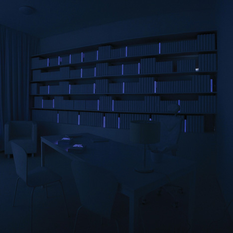
has the effect i want to achieve of glowing in the dark and standing out amongst the rest of the books as it is a likeable and unusual feature


ideally get lit manchester will be on the spine however if the pages added up are too thin, a glow in the dark bar would have the same exciting effect