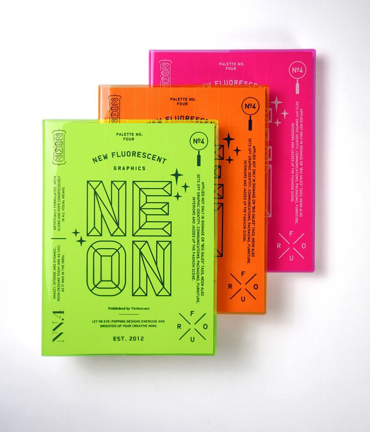
To really get in to this project as neon signage is a feature I gravitate to due to its electric energisation of any word or line image and how it lights the dingiest darkest places, I went to the library to find books focusing on Neon design and came across this zingy book! Straight from noticing the electrifying spine and geometric large lined text simply reading 'NEON' I had to grab it! This is the kind of exciting effect I want my book to have from an initial look...
The cover itself is simple and works best as it, as the green colour is so fluorescent and in your face adding other colours or too much imagery wouldn't let the title state itself as strongly as it does. The small text accompanies for if the reader wants to read it, but if you are looking for Neon as a style you know you've found it due to its bevelled hard line structure of the letters.
The use of a fluorescent translucent cover over geometric indented white stock gives the edges a lit effect giving it a glossy feel when holding which is relatable to neon and a more interesting eyecatching detailing of illuminated edges and effecting the shadows of the geometric indents within allowing light to add effect against the bold colours, as does neon! The sparkle details also add a zap of neon's mood altering energy which is discussed in the book which I find beautiful as I couldn't have worded why I enjoy bright colours myself.
-Target audience is for those looking for neon design inspiration
-very visual limited text which mine will be as it will be solely celebrating the different forms of neon lit type in manchester.
-simple layout to allow the work
-modernised text considering the new era neon came in to from the 1920's onwards and to be legible and clear against the busy imagery. I have to carefully choose a typeface and it's colour that go hand in hand with the imagery, while mine aren't as colourful choosing a body text type that is relevant to Manchester or the print production is important.
-purpose is for inspiration for ones creating fluorescent graphic design, which is stated on the cover so I need to make the purpose very clear and engaging
-a lot going on due to the fact neon is very in your face anyway, relates to the style itself
-glossy pages to tie in with the reaction of light to neon and to give sheen to the photos which i would like to do, and it can give that physical photographic effect back to the image after print.
-'eyepopping designs to energise and stimulate your mind'
-little highlights of neon within the more text heavy serious pages, which I would like to do using fluorescent inks in parts of text or even as the page numbers/any titles which would be more striking on black stock.
No comments:
Post a Comment