My research was informed by exploring Leeds after the briefing and seeing what typography caught my eye. I was sure I wanted to pick something I really loved and enjoyed to snowball on and make in to a piece of work I was very proud of and something that related to practices i'd be interested in improving and expanding in my future years of work and study as we are encouraged to start finding out own style and interests.
I very much enjoyed grafitti and often find myself photographing and spotting independent grafittis with words of inspiration or quotations that reach out to the public in either an empowering or radical sense. Another interest of mine which has been touched on by a tutor and I also find myself taking pictures of was neon typography. Much like my style, these are bright eccentric and immediately command the viewers attention like no other type unless it is huge, whereas neon does not have to be. I enjoy the fact it is so versatile in its usage of promoting brands, wayfinding, decorative, I knew just from walking around how many different types of type and imagery I could get and that there is more neon signage than I may have thought.
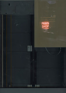
When I had moved back home, I was then inspired to take my photography in a different direction as I didn't want to just use my digital camera again. I hadn't ventured out in to using film, which was unusual as I love the vintage other-wordly/unpredictable effects these cameras can have on your images before even editing. This was definetley the case with my results, I bought cheap disposable cameras and went on a late evening walk around my hometown of Manchester and was fascinated at the places I was lead to with neon signage and explored parts of my hometown I hadn't been before. These were all began from the Northern Quarter which is popular for its bars and nightlife, and there were many sidestreets with small bars and restaurants which I hadn't ventured to before. This was a brilliant experience, and even though I only had 27 shots both times I went to take photos it made me more careful of my shots and considerate of the angles.
A huge consideration was the location the signage was placed. I wanted to capture a piece of Manchester in each photo, wether this would be its street, the architecture, or the reflections of the city, having the signage placed in location was really important to me and I enjoyed playing around with having reflections and signs on the window slightly overlapping neon texts inside which may not be beneficial in the type being clear in many cases, but due to the neon light theme the letters stand out against pretty much any of the context surrounding them.


My developed photographs came out very eerie and darker than it was that summer night, but in pretty much all photos apart for a few that were more blurry or oddly exposed/saturated, the signs were illuminated even more and had an interesting sinister/curious/mysterious overlay to them which has prompted ideas for my direction for my publication already, one being a night out experience or another focusing on Manchesters love for vintage clothes/objects/music...but a lot of thorough and varied feedback is crucial to this and this year I aim to ask all tutors for their thoughts on my project as it is something i am proud of. The effect of the photos, the variation of typefaces, the link between them all.
High contrast levels adjusted versions which increase the crispness of the neon tyography and could lead on to the theme of a night out...
I have began editing and starting to knock the levels of the images scanned in to photoshop and in my presentation will discuss which way to take them, as peers quite like the curious effect a disposable camera has given to my neon based pictures, while others pointed out they loved the high contrast high saturated ones the most. This is something I need to experiment with whilst developing at least 3 solid themes.


No comments:
Post a Comment