One tutor suggested the night out adventure kind of experience, while saying to embrace blurriness and oddities of some of the outcomes to enhance the night out experience of maybe being rather merry. From the others it was suggested to look at a book called 'New York neon' which I havent yet been able to get hold of, but prompted me to use our resources and I found an amazing book on Neon type which I will blog and take inspiration from. Also my style of photographing was praised and the continuity.
I then began to get excited on ways I could take the publication, going full blown on embracing the neon theme using glow in the dark or fluorescent inks to experiment with or embracing the vintage effect. I am aware we have to understand and explore the limitations of print in the modern age as it could be very costly using such inks...
At this stage however, imagining and experimenting with different printing methods is very exciting and motivations and will all lead to a successful outcome even if one aspect can not be used in the finished product. Searching for similar works and analysing the target audiences/purpose and printing methods is also an important aspect, as is reading as although I love neon typography I don't actually know that much about it apart from its dazzling alarming effect on grabbing customers eyes and that neon bars are continuous (which could be a design aspect of my publication....?)
I had some ambitious ideas thrown at me such as having some sort of glasses that allow you to read the text in my book? or include neon light diffraction glasses which seem very exciting and full on to me which is one way to really make the publication a crazy colourful experience going full pelt with the theme! they enhance colours in a psychedelic, night out kind of sense if thats what i go for...
https://www.amazon.com/20-Pairs-Diffraction-Fireworks-Glasses/dp/B005JT5P7A
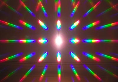
Effect of glasses on one lightbulb, could make the book more of an experience which would attract a more diverse audience
One I had was making illustrations such as the Manchester bee celebrating the cities identity, in a neon fashion, or to celebrate the industrial history of the city considering bounding or the materials such as having the book clothbound that which is something i'd have to learn.
Other wacky aspects I have noted are
-using glowsticks to bind the publication
-glossy stock to illuminate the neon theme even further and give the photos a high class finish
-using neon/fluorescent colours that work alongside the images which due to the dark backgrounds of the images could contrast well and not be too overpowering
-glowing manchester map of the trail i went on or nights out an electric night city vibe
-industrial approach celebrating the town itself using typewriting text and clothbinding
-use lyrics of celebrated manchester bands relating to light as Mancs are very passionate about their music heritage
-readable type with glasses?
-glow in the dark ink used for the text but would have to be put on the images to be able to see them together
-book cover could be glow in the dark so it doesnt affect the clarity and readability of photos and text
-quotations about nights out in manchester (ive heard some questionable ones, would make a brilliant read...)
-types of people on a night out
Many of these small ideas are making it a fun piece which I feel I would be so happy to create, but I need to consider the more vintage or heritage related production methods and styles.
Limitations
-size of photographs
-if using glow in the dark, wont be able to see the image properly alongside
-some type isnt as clear due to how far away they are
No comments:
Post a Comment