Having fluorescent edges adds to the speciality of the publication and connects with the theme. This personal and intricate touch to the publication is a way of going crazy with colour without effecting the viewing of the tyography in the photographs.
Terry Richardson- 'Mom/Dad'
in the collectors cabinet in the library, i was seeking out all black paged books and was fooled by its case style containing two seperate all photography/note books one for his mum one for his dad. as he is one of the most famed photographers, it was valuable to see how he presented a very dear publication and it has made me consider other ways a book can be produced rather than standard bound. an idea I have had is to have it in a similar case with my photographs perhaps double sided and all seperate with the edges of them spraypainted like i noticed in my 'neon' book. this celebrates the neon in a way that doesn't overpower to viewing of the photographs themselves but adds an exciting detailing on the side of the case which would look electric next to all black cover stock. this is a way of incorporating fluorescent inks which i want to experiment with, or perhaps even glow in the dark ink but I am unsure of how to do this well.
Its large size and simplicity display his work to its best detail as the titles are so small you can't wait to open and see whats inside the huge pages. My project will be limited to a smaller publication as I can't really blow up my photographs but it is still interesting to see how I feel about covers of photo books and the effect their design has on the viewer.
Gareth McCornell- 'Close Your Eyes'
another collectors book, which appeals to my design inspiration due to the admiration for neon signage at its peak in America between the 1920's-1960's and collectable value. I was drawn to the bursts of colour on the front of the cover and the psychedelic framing editing I have been drawn to producing in past publications while exploring zine styles. Being on black stock enhances this style beautifully and allows the light to be so crisp, which it would do for my neon letters. Also, the glossy sheen works in expressing the photography to its best potential. only containing matt black sheened text displaying the title on an inner page, with full blaring pages full brimmed photography, this ties in with one of my ideas of having any annotations or quotes in glow in the dark making it interesting to discover, while not interfering with the impact of the imagery. this book was also very large fit for its purpose, but drives me to making a perfect bind as with these sorts of books even with ones smaller it was quite hard to turn the pages perfectly without hiding some of the images effect. It suits being a coffee table book as it is all imagery, but perhaps with mine as some of the type is further away within the image I want it to be produced so it can be stared in to and get lost in the glow of the type and words. Having a small publication would also support this and would add a special feel.

Nan Goldin- '55'
one of my favourite photographers, i picked this up to see how she allows her work to be seen and to explore how a photographer is happy to display their publication as it was curated by a close friend giving the images brief explanations. Although I don't see mine as being text heavy at all or having descriptions for now, the sizing of the book is what attracted me to it,
photograph size friendly, square for breathing space/text, focused on photographs, handy size, not a very thick book,some double page presentations of the photographs, some single page landscape or portrait,perfect bound easy to flick through.
Jonas Bendiksen- 'Satellites'
looking at a book with no subject relation, i picked up this book due to its glossy saturated displays of photography printed on all black pages on which the images are in gloss, and the edges are matte black seperating the two which I can see why it has been done as it is a visually pleasing contrast between the two, but I want my night images to be fully immersed to get the full effect of night time wanders around Manchester. this book, also rather large and heavy, has so much of an easier reading and viewing experience due to perfect bound production and the colours blare within the black pages.
I was directed to Vernon street library to check this glow in the dark book out, which interestingly also had the edges darkened but wasn't black stock inside. Glow in the dark was used sparsely and it was hard for it to glow as it was snuck in a bookshelf majority of its time and I didn't really like the design of the book, just that aspect which was quite underwhelming to how id have imagined.
After asking about using glow in the dark powder, I realised its limitations in colour and that the consistency can run and get quite messy so this spurred me on to go for fluorescent inks which aren't as expensive and have an eccentric eye-catching effect in all lights which is ideal for the reader.
Also on my wanders of Leeds, trying to see examples of the effects that neon/lights/fluorescent colours had put in the everyday world and see how they distinguish apart from everything else which is undeniable and what initially attracts my attention towards such other level colours/sights.
This feature of Light Night was a small installation but attracted a large crowd due to its otherworldly mystical neon light combinations creating ethereal gazing and is most high impact in the dark supporting my idea to use black pages. The others commanded attention before even walking past the long line of event posters in Hyde Park, almost eye watering in how much fluorescent ink has been printed but they instantly attract the bypasser in to looking even if the events arent in their taste. Would not use so much block fluorescent as I believe less is more but even a little stands out amongst the ordinary which my publication intends to do by using glow in the dark or fluorescent on the bind and cover so it stands out on a book case to those who aren't even searching specifically for neon typography, due to its design they will want to pick it up and flick through maybe opening up their enjoyment from the subconscious in to the conscious by seeing them on pages in another perspective as I believe is true with a lot of people, the crowd on light night for example. People seek other perspectives and out of ordinary sights. The two opinions picked up from asking people on nights out were either that neon was tacky, or that neon reflected glamour, which are both very viable opinions. My publication intends to reflect the beauty and glamour of the typographic form illuminated by neon.
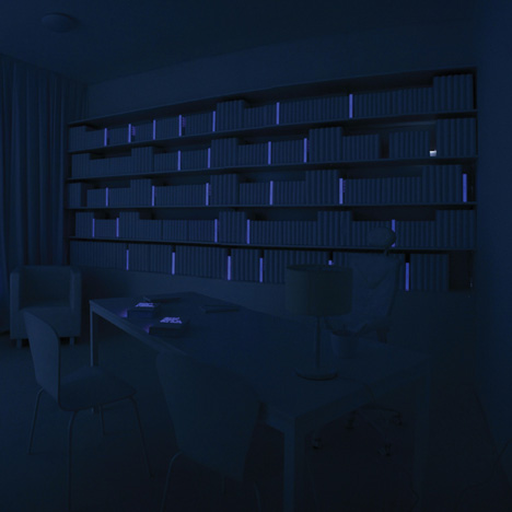
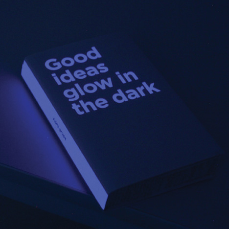
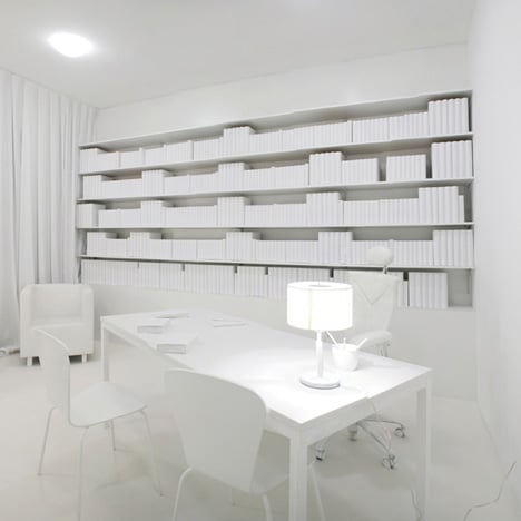
http://www.dezeen.com/2011/08/05/good-ideas-glow-in-the-dark-by-bruketazinic-and-brigada/
In addition this article supports that a book featuring glow in the dark attracts a lot of attention for its unusual spectacle and the mystery of what is there

has the effect i want to achieve of glowing in the dark and standing out amongst the rest of the books as it is a likeable and unusual feature

ideally get lit manchester will be on the spine however if the pages added up are too thin, a glow in the dark bar would have the same exciting effect


No comments:
Post a Comment