Tuesday, February 28, 2017

Feedback for studio brief 1

Studio Brief 1

When presenting my ideas which included the carnival, first film and unity day, instantly the most talked about with my partner was the carnival.
This year happens to be its 50th anniversary, and as it has been running since the 60s it has definetley shaped Leeds in the sense it gave comfort for those of 'west Indian home sickness' and is a theme celebrated in other citys too, proving its significance. It is a beautiful celebration which has every year had huge turnouts by people from all over Leeds and the country; with beautiful celebratory visuals and tribute to West Indian culture which is especially in a strange time like now where immigration is one of the most talked about topics in social and political debates. For me personally, and as discussed with my partner, working on a celebratory piece full of colour and rich historical references would be amazing to work on and exhibit, to celebrate integrating other cultures in Leeds and showcasing its colourfully happy contagious festivity!

Main points made to go forward with the Carnival-
-50th anniversary this year
-Long standing Leeds event
-Can print make using textiles used in the events costumes possibly
-Costumes can be a primary focus, using its shapes and colours with traditional print methods
-Celebrate cultural aspects traditionally represented such as 'jaw-dropping costumes, infectious tropical rhythms, mouth watering food and entertainment for everyone.'  (http://www.leedscarnival.co.uk/about-us/)-The infamous Notting Hill carnival was inspired by this event, which supports the carnivals significance
-Creating a liberating piece for the exhibition incorporating my love for colour and shapes, mainly when done with lino and mono print for me, leaves so many exciting options for experimentation. Creating something truly unique to applaud 50 years of the carnival means I can get in touch with the founder and event organisers and even send them my final piece, as at home I attend the annual Caribbean Carnival of Manchester and the themes and purposes of these carnivals mean a lot to me and I relish being there!
-Community driven, which is useful to promote Leeds as

My partner also suggested using 60s inspired design as it is the era the Carnival originated in, which will be a look back to its beginnings but having the contrast of modern costumes used. This is an amazing contrast that is exciting to ponder, and my love for 60's design fits perfectly and taking inspiration from modern images and matching with 60s artworks could make a very quirky piece for the exhibition.


Record shops are a constant souce of inspiration, and seeing the Hendrix cover got my mind going on how I can arrange the carnival performers and how the composition can be represented. This cover is one of my favourites of all time and inspires me to bring in my love for bright 60s artworks to blend styles for the Carnival piece. As it is traditional print, the CREAM cover below (which I know isn't 60's) has more solid shaping which can be achieved by screen printing or lino easiest- it is a way I can seperate colours and shapes using these print methods which is essential to this brief.

However, with further feedback with tutor, it must be remembered not to make this in to a 60s hippie style piece as that has no association with the carnival whatsoever and wouldn't be true, so need to be very careful with the semiotics. Was suggested I look at how one of my idols, Kate Moross, makes gorgeous striking colourful designs but appropriately. Printing with textiles can be done, but this needs to be a very refined piece of design for our exhibition. I feel lino print and screen print have the most control but if I want to work with monoprint I need to do a lot of experimentation.

Collab set work for the week

Start designing rough ideas either pattern focused or on cute unusual animals
chinchillas, axolotyls, etc...as the market uses the same animals a lot to attract the caring soft side of people to grab their attention to product, such as kittens for digestives which doesn't relate. This is because, according to their market director; 'The smile-inducing cuteness of each animal is used to convey the sweetness of each McVities biscuit. Sarah Heynen, United Biscuits marketing director, told The Drum: “We wanted a big fame-driving idea and no one has ever seen any advertising quite like this.” “The new advertising builds on the idea that McVitie’s biscuits really do make the day go that little bit better,” she added.'

We want designs that are going to pull on the heartstrings and bring a smile to the buyer and whom they are buying for to cheer up. Along with dazzling colourful patterns, a unique quirky illustration of cute animals not as often focused on would give us a unique selling point which we aim for. Our styles combined and discussions thus far have shown we want to be quite daring and stand out amongst other cards in the similar market that I have photographed in shops such as Joy and Urban Outfitters with the more indie/quirky market of greeting cards which we want to transfer and expand to gift wraps and wrapping papers like ones in Paperchase.

Adrian Mole initial sketches


With designing for younger audiences and illustrating being aspects of design I want to expand in, for this brief I really want to use a graphics tablet for the first time as I feel it would make the process so much easier and aide my illustration as I struggle using illustrator when transferring my hand drawn designs. These are a few initial hand wrendered type experiments inspired by looking at the book 'Hand Job' which I picked out to help elevate my illustrating skills as this brief can be fun and exciting, and now with a lot of market research I drew from going in to the young adults literature section in a famous book store I had a lot of ideas for the cover, wanting it to be hand drawn and playfully designed to fit the target audience.

Although very basic and unrefined, getting a graphics tablet and beginning to expand on parts and combine letters or ideas, using fun colour and maybe mini sketches of events from the book or having lined paper backgrounds or diary aspects will help it begin to form. Am very excited to get started and expanding my illustration skills is something crucial to me at the moment as I enjoy it and it produces some of the most unique work.

Friday, February 24, 2017

Presenting Research study task

Pitch research taken from chosen response issue to brief 2- 20th march
no longer than 5 minutes

Monday, February 20, 2017

Studio brief 2 ideas EVALUATE

For studio brief 2 I would preferably be thinking in terms of guerilla style/posters or merchandise as these are distributions I would want to practice further as they are of interest for my design preferences.

Student fees protests


It is shocking to see how much student fees have increased over the years leaving students riddled in more debt than ever, just for wanting to make a decent start for their careers and as a student I find it so daunting we are in debt already. For whatever reasons that are disputed for the increase in tuition fees, it isn't right. A very DIY approach would be appropriate with independent, student groups or ones such as Anticuts rebelling against government proposals to increase tuition fees further. Very passionate from the heart/anti establishment, young adult appropriate visual language.

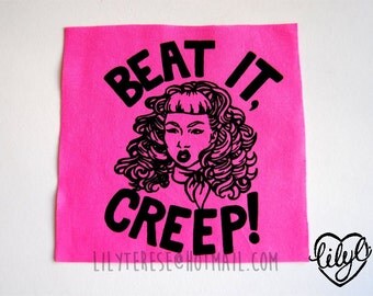
Sexual harassment/catcalling

guerilla style


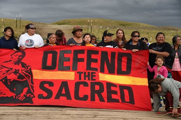
Dakota Access Pipeline


Male suicide awareness
Homelessness in Manchester


Lack of womens representation in design industry

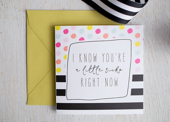
Uplifting greetings card market research


As my partner isn't in today to discuss moodboards, researching our theme of spreading joy and uplifting incentives to loved ones to gain knowledge of how popular they are, what designs are already out there, and how to stand out is important to know if we have a chance of winning.


All are colourful, with engaging hand written typography which commands attention in it's style. the phrases I am going to work on need to have the same uplifting character. I want to hand draw the phrases accentuating the genuine, heartfelt message as handmade comes across as more sincere.

Leeds event research and ideas

Unity Day- since 1996, a huge event in Hyde Park in the peak of summer that is intended to create a positive social diverse day which 'everyone' can enjoy. Prompted by the devastation of the 1995 riots, this non profit event which has live music tents and a pantomime. As I went to this last year I know it is a well known event that brings in thousands who go to enjoy the music and sunshine, the space being the famous Hyde Park.


Nelson Mandela-


'The original Hollywood'-Louis Le Prince is film royalty and Leeds is where it all began. He filmed the first motion pictures at Oakwood Grange and on Leeds Bridge in 1888. Though the likes of Thomas Edison and the Lumiere brothers have been given credit for their roles since, it was Le Prince who set the ball rolling.


Leeds west indian carnival-

Leeds Light Night dandelions-
Olivia d’Aboville comes to the rescue with this thought provoking art installation that highlights our consumerist society and its impact on our environment.

Thursday, February 16, 2017

Collaboration moodboard and inspirations


Instagram


Gaining inspiration from Instagram ensures you are seeing fresh trends emerging and what styles are popular.


Discussion
Can either go down the typography route as it is so popular, or avoid and focus on pattern work.
Both enjoy the bright colours and pattern.