A novel that reminds me of one of my favourite books, The Curious Incident of the Dog in the Night, an incredibly charming '13 3/4 year old undiscovered intellectual' character has writings in a diary that are witty and funny. An imaginative, bold concept for this cover will have to make the book stand out as much as the story does and live up to it's best selling status.
The classic covers represented on the brief are all non serious, display bold visual language with illustrative design to support. I believe they are keen on an illustrative style as it fits the fantasy of the book and the personal diary scribblings aspect.
I chose to complete this small brief as I enjoy doing covers, gathering a collective of informed elements in design to represent the story, in others cases event, tracklist, etc. I am also fond of bold colourful artistic designing and working for younger audiences has appealed to me due to the more fantasy, colour based, fun attributes of designing.
'a lot of the book's humour originates from the unreliable narration of Mole, who naïvely, yet confidently, misinterprets events around him.' based on this, I would really want to create a light hearted colourful adaption for this brief.
Covers for further inspiration
One of the most loved young adult novels with the matching theme of a diary, these designs are well recognized and come in a range of colours for each book, making an eye catching display with the torn out of diary looking illustrations, bringing the hand written/drawn aspect to a strong background balancing well with the various typefaces used to be a mix of serious/emotion and fun playful lettering for 'of a wimpy kid' which is the covers' signature line. Although very simple elements, the combination is appropriate for the audience as it is a humorous cover.
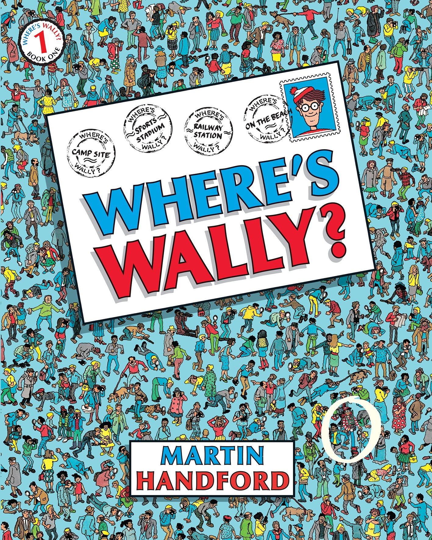
The most detailed of the bunch and perhaps most recognizable, the fun of finding wally makes the young audience pick up the book in anticipation which is a very unique and beneficial quality to a cover that will increase even more interest than already has been since the 80s

Famous for Blake's illustrations, the balance between the drawing and block coloured lines draws in attention for legendary childrens author.

More detailed and instantly recognizable, involving the character and theme within the title is very clever and indicates what the books has to offer
This was one of my favourite books when i was younger, loving the hand drawn mixed type and wanting to know why there is a fork in the dog! having clues like that draws you in as you want to know how it got to that
There is a great opportunity to screenprint for colour combinations, but however due to experience, screenprinting covers is a risky business.
Handdrawn type gives the cover a brand new identity with opportunity to allow character to flourish in the letters along with colours and imagery included. I definetley feel aswell, a handdrawn character of Adrian Mole is more appropriate for fantasy effect as the story is an escape for young readers aswell as his character in the book. Furthermore important is to keep it relevant to the story and the time of the story (no mac books and ipods in there), be an eye catching cover, and to be legible with relevance to todays youth.
Using diary aspects such as handwritten writing or lined paper, the wire of a diary could be structural components.


No comments:
Post a Comment