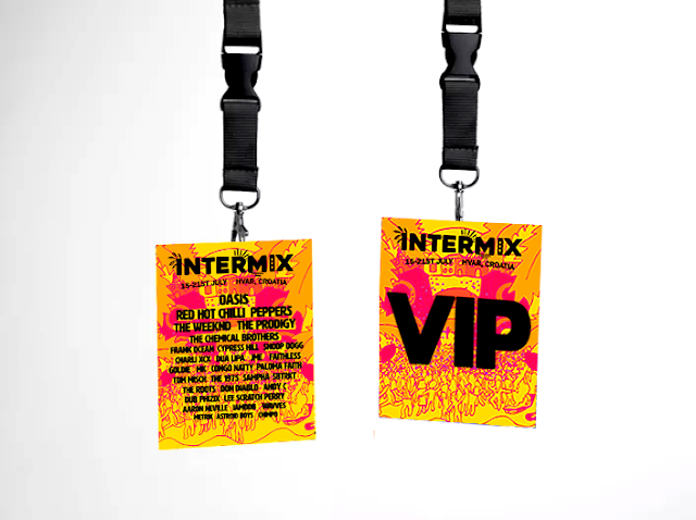
As this was inspired by a business pitch, I wanted to make this as exciting as I tried to pitch it as a business idea. Creating my own festival branding has always been of interest as combining music, experience and design are key interests of my practice. As well as this, creating exciting design that attracts a consumer. Making this festival a special 'ultimate' holiday festival experience required implementation of this in the brand identity most importantly.
I incorporated the features of the sea, island, sunshine and cultural aspects of the island festival and through feedback suggestions, turned these in to little icons on the wristband. Intermix was created as a bespoke brand identity that would stand out amongst the most popular European festivals researched.
Looking at elements of successful festival branding was crucial, and through all were excitement driven design with strong bold branding. The aspect of this missing is photography- therefore, as Parklife have successfully done, illustrating a concept of the festivals strong points and fun energy were transcribed through my illustration.
As well as the illustration and logo being bespoke, the colours used had to revolve around holiday and party/contemporary/fun colours. I started working with a colour pallette, however when each part of the illustration was coloured individually it brought down the quality of the design and reminded me more of local festival posters I had seen, so using a gradient map gave the festival a more defining colour pallette to remember and from yellow to pink, gives the fun energy shown through the illustration as well as the prospect of being under the sun on a beach!
The people dancing on the beach, confetti, overemphasised speakers and palm trees/buildings/sunshine are intended to grab the attention of a festival goer looking for more than a festival. I feel the magnitude of the festival is shown through emphasized illustration and using popular musicians on the lineup. However, I really wish I would have considered this for a collaboration opportunity but left it too late in the year. To really get across the big idea as I did in the pitch, naming it the ultimate festival holiday, bringing other designers and animators on board would have been extremely beneficial.
Would have gone further animating my illustrations and logo- and creating a set of more posters, but I feel as I chose to work on this closer to the deadline and it isn't a collaboration, I was worried of not completing this to the standard I would want it. Ofcourse I would love to create a Parklife like mammoth ultimate set of the festival pack but as it is just me I worried. Despite this I feel I have achieved a unique brand identity which is contemporary, using a bold sans serif typeface including icon elements of the festival which makes the branding unique.
This brief has emphasized the importance of collaboration for my practice. An aim of mine is to work collaboratively in a studio, as ideas like these can be taken so much further with different skillsets. I used my illustration and graphic design relatively well to get the brand identity off the ground but would have collaborated if I could go back.
Monday, April 30, 2018
Research brief 10- Frazzled Cafe aims
The pull up banners will coincide with their existing branding and any information given in sessions.
Frazzled Cafe is not just for the one-in-four of us who will suffer from diagnosed mental illness at some point in our lives; it is for the four-in-four feeling frazzled and overwhelmed by the stresses of modern life.
They have guidelines briefed to everyone at the beginning- i could coincide their branding and this design with that sheet. Also a register for 18 people.
Frazzled Cafe Guidelines
To help ensure that these sessions run smoothly and in line with the values of Frazzled Cafe we ask that all participants agree to follow these guidelines:
To act with integrity. Please respect one another’s confidentiality and anonymity. You are welcome to connect with one another outside of this meeting if you find someone who’s story resonates with you but please do not name anyone or discuss anything you may hear in a meeting with others who have not attended.
To let everyone have a voice. Please respect one another by giving everybody the chance to contribute without interruption and by not dominating or disrupting the conversation. The facilitator will show a white card after 3 minutes to signal the end of each speaker’s turn.
To listen without offering solutions. Please focus your contribution on personal experiences and not political/thematic concepts. When speaking please focus on what resonates with you personally, not on providing answers or solutions to others.
To be kind to ourselves and each other. This is NOT group therapy and no-one should feel under pressure to say anything. We do hope that in hearing others’ experiences you will feel encouraged to share your own. Whether you speak or not, please treat each other in a supportive and considerate way.
To welcome people from all backgrounds and points of view. We have no religious, political or commercial affiliations and ask that participants refrain from promoting any that they might have.
To be present. To benefit fully from the session and stay present in the room, please try to avoid distractions from phones or other devices.
http://www.rubywax.net/frazzled-cafe-guidelines.html
Research brief 10 - Linoprint experiments

'In many cases a mix of media will be the best solution. Effective print ads will drive digital purchases. '
https://www.neurosciencemarketing.com/blog/articles/print-vs-digital.htm
Although this is not intended for a buying service, I want the colours and feature of the pull up banners to affect the group in a positive way, making them take note of the intended relaxing addition to the environment. Testing print is a way of attempting this.
1. relaxing getaway, not too about plants, subtle, blends too much blue. could be sad
2.beach, pool, floating rings in pool, beach balls, good colours. although holiday connotations because of the leaves could seem strange, holidays or exotic places with pools/seas are very relaxing to people
3.more calming than all blue, tactile with whites. combination of digital and handwrendered gives it the honesty of print
Feedback was great on these experiments and I have figured not to use all blue, and seeing which layers go together. I feel like number 2's soft shapes really work in creating almost bubble like shapes along with the underlay of leaves which peers said could transform the room in to calm without looking too much about nature, or looking to rigid as digital.
Wednesday, April 25, 2018
Research brief 10- Design Development
In feedback these soft shapes were most popular due to colour balance and relaxing association with the leaves. I will try the leaf pattern in linoprint to give it a tactile feel whilst still giving off the relaxing feel. Feedback was that the branding ties in very well with these and the colour palette.
In feedback, plants were a huge majority of what people said would de-stress them in that situation, as well as ocean blues and pale greens. As a result of this I will experiment with my linoprints and with leaf designs and get feedback on the most successful.
Research brief 10 - Initial banner designs and feedback
Tuesday, April 24, 2018
Research brief 10 - Discussion points from Lush employee
Whilst in Lush, I enquired about the design of their giftboxes especially as they are named positive moods, and also other products. I know Lush staff are trained quite rigorously in company ethics and have training on why designs are made.
Especially Lush spa, everything is specifically designed to relax uplift the customer. Using lighting, effects, sensory interaction and mood lighting specific to each customers needs.
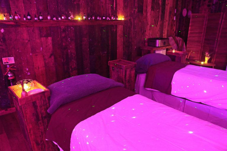
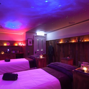
The lady I spoke gave me an email to contact the head office to get archive research on research done to choose colour, and older tests for other products such as beauty products (which were trained and taught to be empowering to customers) etc.
What I learnt-
In their own study around 96% of customers chose a blue shade for relaxation
Purple/lilac can be successfully used for calming
Natural colours, textures, visuals are usually most popular
Emotional Brilliance Range
Especially Lush spa, everything is specifically designed to relax uplift the customer. Using lighting, effects, sensory interaction and mood lighting specific to each customers needs.


The lady I spoke gave me an email to contact the head office to get archive research on research done to choose colour, and older tests for other products such as beauty products (which were trained and taught to be empowering to customers) etc.
What I learnt-
In their own study around 96% of customers chose a blue shade for relaxation
Purple/lilac can be successfully used for calming
Natural colours, textures, visuals are usually most popular
Emotional Brilliance Range
'Lush has worked with renowned Strategic Behavioral Therapist Lady Kennedy, who specializes in changing people’s behavior and attitudes, for the list of words to correspond with each color. They are words she uses in therapy sessions to alter perceptions and change behavior...The Emotional Brilliance range brings this form of exclusive mind therapy to consumers.'
'We began by looking for positive and encouraging words such as 'happiness', 'calm', 'focus' – all things I know people are looking for and come to see me about'
'We then asked people from all over the business to choose from a colour chart the shade they felt best represented a particular word. Time and time again, people would go for similar colours for each word. The final colour chosen to become the make-up was invariably one that was picked many times over.'
https://uk.lush.com/article/how-colour-and-feelings-are-connected
Sunday, April 22, 2018
Research brief 10- design ideas
Cheese plant leafs, greenery and blue (related to research and art therapist answers)

Soft shapes pastel colours (research from visual and support worker)
Mandalas- symmetrical, and a very popular theme for adult colouring books which have been successful in being stress relieving. (market research)


Soft shapes pastel colours (research from visual and support worker)

Mandalas- symmetrical, and a very popular theme for adult colouring books which have been successful in being stress relieving. (market research)

Saturday, April 21, 2018
Brief 7 - Poster design
Most festival poster colours are - orange, yellow and pink
Holiday associated colours- yellow, orange, blue
Creating a gradient map seemed more appropriate for an international festival, with the colours making it instantly recognisable with branding. When trying everything coloured inidividually it made the illustration look less mature therefore cheapening quality of it being a brand new huge festival.
Friday, April 20, 2018
Research brief 10- Feedback points
On Tokyo’s Yamanote Line, blue lights were installed on platforms, starting in 2009, in response to a spate of suicides. There are several theories about why blue light reduces suicides (as well as crime, littering and anti-social behaviour) including its biological impact on our mood, the association with the emergency services, and simply the effect of something new and different.
‘After they installed the blue lights, suicides fell by 85 per cent,’ says Denyer. ‘They’ve also used them at level crossings, and anti-social behaviour and vandalism are down. They’re now looking at using it in motorway service stations.
http://luxreview.com/article/2014/11/can-blue-light-make-britain-s-railways-safer
Perhaps incorporating a blue hue on the top of the designs can add a hint of this effect
Considering the feedback point to print these banners and photograph them in the situation, due to the time left and costly sizing of the banners I will mock them up instead. It was suggested I sent the designs to frazzled cafe to see if they want to use them at all!
Wednesday, April 18, 2018
Hospital Rooms CINHS Mental Health ward research
Directed from Phill's answer on artists to look at, I came to a page that showcases artists work used on a mental health ward in hospital to create dementia friendly, artistic environments for patients! Perfect for this brief!

'We have commissioned a series of dementia friendly, artistic environments for the 14 bed unit for older people (65+) with dementia and other challenges. We have combined the expertise of arts and health professionals with dementia care residents, carers and staff in the design and implementation of this project.'

'We have commissioned a series of dementia friendly, artistic environments for the 14 bed unit for older people (65+) with dementia and other challenges. We have combined the expertise of arts and health professionals with dementia care residents, carers and staff in the design and implementation of this project.'
'During my visit to the Garnet Ward, I could see how important art and creativity was to the residents and how much the quality of the art was admired.
Thank you for all the work that you do.'
Jeremy Corbyn, Leader of the Labour Party visited the Garnet Ward in January 2018
https://hospital-rooms.com/cinhs-garnet-ward/
https://hospital-rooms.com/cinhs-garnet-ward/
Monday, April 16, 2018
Delft Institute of positive design research
'There are multiple ways to design for happiness. One way is to (re)design the experience evoked by human-product interactions with the ingredients of pleasure, personal significance, and virtues in mind. This is also applicable to everyday products and services such as a coffee maker, a booking system, or driving a car. Designers can also aim – on a kind of meta-level – to coach people in living their life in a way that fosters well-being. Such solutions go into the direction of design for behavior change or coaching methods, like finding ways to express gratitude, reflecting on what went well on a given day, or doing good for others.'
http://studiolab.ide.tudelft.nl/diopd/
This suggests images of positive interaction on the design will influence and 'coach' their well-being. Having words that reinforce this would work as well.
http://studiolab.ide.tudelft.nl/diopd/
This suggests images of positive interaction on the design will influence and 'coach' their well-being. Having words that reinforce this would work as well.
Feedback crit
Will ask for brief 7
Does the logo represent the festival?
Go over sketch for poster, having a beach at bottom then rising up?
What illustration style?
Are the components exciting and get the message across its a music festival/holiday?
Fake line up or real line up?
A trend currently is a minimalistic but fun use of shapes on events and festival line ups


If i were to do it in this style but using festival components to make it more specific for the holiday/festival experience this would be appropriate.
FEEDBACK
Try both, as long as the 4 components come through. Illustrated would be more exciting and the lineup could even be around instead of covering the illustration as it's exciting.
The logo was agreed to work well with the design inserts to represent the festival- was even suggested these letters could work as icons for the wristband.
Will ask for brief 10
Anyone experiences of waiting rooms, group sessions relevant, what art was up?
Do they agree with current research being that pastels, soft shapes, symmetrical shapes would be appropriate?
How could I take this to next level?
For my last research brief I am aware I am in need of more primary research- those I emailed haven't all got back to me yet and I need to get more data to get the best results. This will be a great opportunity to get others opinions on the subject of design soothing those with mental health issues, and also a chance for them to come and talk to me if they have or know any experiences.
Going to post in mental health online forums for feedback internationally which will strengthen the outcome of the design.
Posted on- mentalhealthforum.net
FEEDBACK
-Look at existing themes
-Mockup interiors of a space or print/photograph the banners as they'd be
-All ideas work-perhaps create 3 different designs? Or make the leaf shapes soft in pastel colours to combine the findings of research
-Perhaps these designs can transfer to other components such as poster hand outs for the group, art therapy handbook/adult illustration
-Was given a research point made in Glasgow that showed in train stations, when they introduced a blue light, suicide rates were down 90%
Saturday, April 14, 2018
Brief 7- Colour pallette
Variety is important to represent different stages, music, audience and holiday features
Previous visual research has shown festival posters are bright and full of energy to create a buzz for the festival, and holiday branding and adverts often use colours of the sea and sunshine to represent the ideal.
Sunshine Pantone- happy optimistic sunshine colour
Hawaiin Ocean Pantone- represents that it's an island holiday festival on a beach
Pantone 376- represents natural beauty such as palm trees, of the resort
Pink Glo pantone- the young, charismatic fun vibe of the music festival
Fiery Red pantone - the more serious culture seekers
parisian night pantone - nightlife aspect of the festival
purple- energises palette
flame orange pantone- energises palette
Brief 4- Evaluation


Eager to design and learn to work in a variety of formats, I wanted to produce pieces of design that were a collective identity and were a positive campaign. I was surprised wearing mink fur eyelashes weren’t as protested so I envisioned this as a similar project and demographic to Lush’s protest merchandise which allows the sharing of protest through clothing.With this project, initial sketches were crucial as there were different compartments to the pack. I struggled a lot more with designing an enamel badge than I thought! Working with typography in specific shape formats is hard at first, but this again taught me that simplicity is key. Through visual research this became especially true also.
It was important to recognise the main elements of protest through type and imagery- easy to digest, legible enough to see from a distance/moving. All slogans were typed in thick type in red to alarm the audience. Then a feminine pink was added along with cuter visual references to make the pack wearable, as this is important with the wider audience.A huge aim of this project was to get all of these individual pieces created, but I could not find anywhere that would make one or two of each as samples. Seeing the mink as a pin, the badges, patches would have definetley made the project better as there are material considerations (which I tried to incorporate through mockup). Although I mocked the products up I am not at my happiest, not having them actually made. This was due to large quantities I would have to order which wasn’t practical. In future this would be a consideration, if I could actually produce physical products
Subscribe to:
Comments (Atom)


