Thursday, March 29, 2018

Brief 5: YCN Submission and Evaluation


As I did last year, working on YCN brief's are great practice for me personally as I enjoy following brief guidelines and the challenge of taking an existing brand and creating a concept for their target audience. I chose this brief as the target audience was students, so there was a lot I assumed you could play with in terms of bold and exciting design which is my interest.

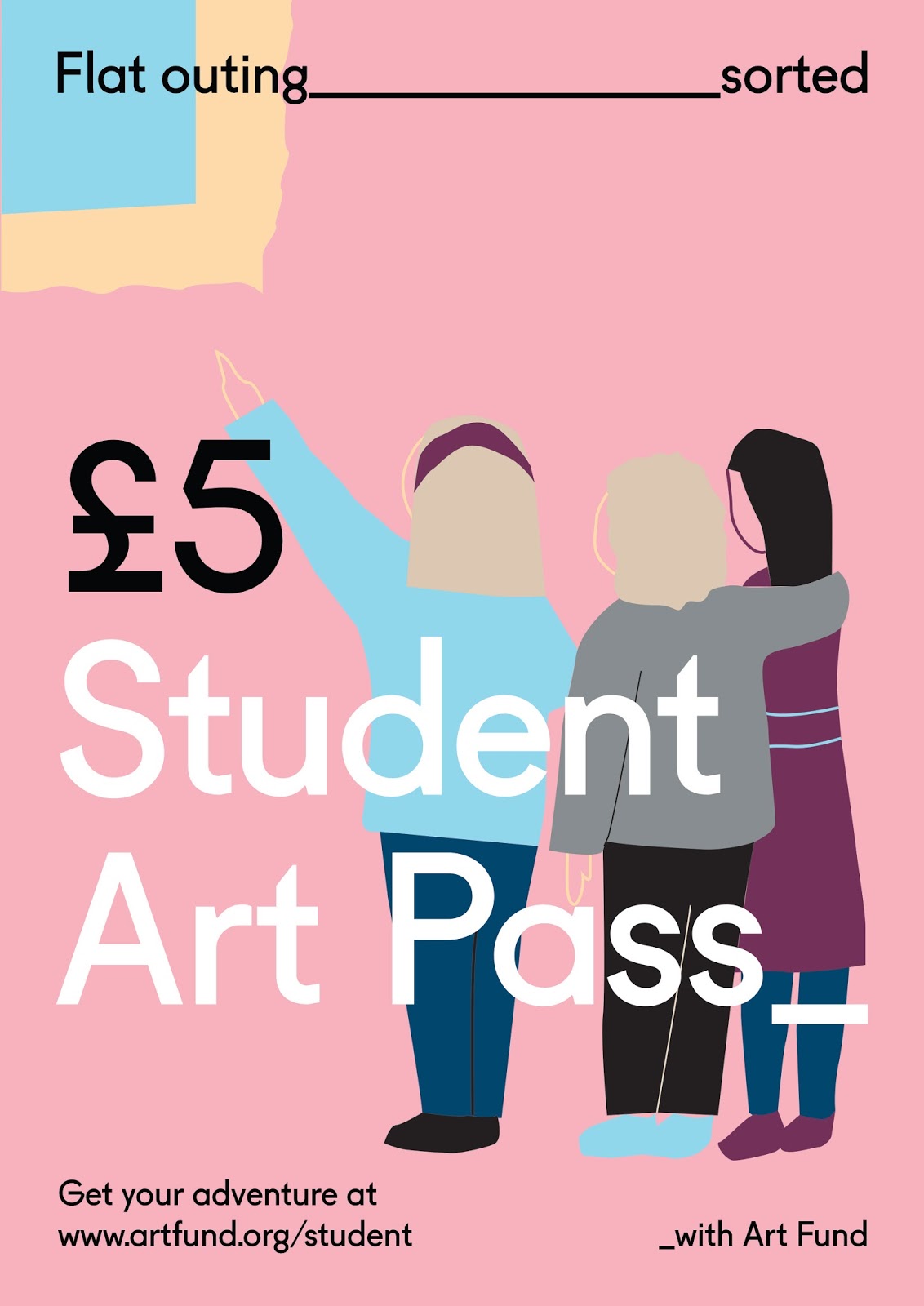
I chose to contact my collaborator as she works well creating shaped illustration, which I envisioned for this campaign as it is a popular illustration style I have seen targeted at students in the local area and allows a narritive to be portrayed in a simple eye catching way! Getting my moodboard together to show the collaborator was important, as knowing the direction from the beginning and keeping in contact is a must that I have learnt whilst working in groups over the past 2 years.

The communication was initiated by myself by meeting my collaborator in person- knowing we were both excited and on board for the idea motivates me to push it forward. Having these shape illustrations creating a new story for a student to relate to, to further the campaigns aim, meant a strong use of copyrighting was needed. Recently I have realised I really enjoy coming up with slogans and copyrighting for campaigns so I came up with many of these and discussed through feedbacks which aimed to use a student tone of voice and be relatable to draw students in to buying the pass, the aim of the brief.

This collaboration project is one of the strictest brief's I have worked on in terms of guidelines, but also the most cooperative of a collaboration. Despite this, this helped in terms of gridding and keeping consistency and I feel like I would now be more ready to be given briefs with strict project packs like these where information relevant has to be sourced out!

Compromise over colour pallettes was a huge part of this design campaign after illustrations were refined and I created the structure and design of the posters. Her pallette was more true to brand, whereas I wanted to go for bolder and louder which I had seen through my research was more in the student market. However after discussions from both sides I came to the conclusion that I could see the pastel colours may encourage a more appropriate tone for galleries and museums, and the brand itself so we went for the pastel pallette.

Ideally I wanted 6 posters as this gives a stronger scope for the campaign and shows a lot more of a concept but due to timing issues with collaborator, and her tutor saying more weren't essential, we stuck with 4. I still feel the concept is clear as the layout stays the same and illustrations follow a pallette. However, as I really enjoy copyrighting, seeing two more of the headings come to life would be more exciting.

Again with lack of confidence and wanting to get the project submitted, I didn't create social media banner mockups/animations which I think really would have uplifted the campaign and make it come to life to judges and students alike. This is a regret of mine, however I know that I want to work in a collaborative studio in the future and that when I make projects like this with the right team with the right skills these kinds of ideas will be amplified absoloutely.

Brief 3: Evaluation

Following from talks earlier on in the year about creating your own projects and work to show initiative, and always having loved working on music design such as Secret 7 competitions, this project was created from discussing this with a graphic designer friend in Bath. Both from the same city of which we love the music it is famous for, why not do a poster project like secret 7 for it's music?

His plan was to create a publication of his and my poster 'personal design interpretations' to discuss different graphic design styles and to show a range of design work as our styles are quite different. Unfortunately, due to his work load he hasn't been able to create the publication yet which isn't the best but he still intends to do this. Therefore, this set of posters remain for now A4 prints.

This project felt like it had a lot of freedom as his directions were to follow the same idea as Secret 7's creating my own artistic interpretation to express my design style, however this is not always the easiest way! Throughout creating these I found I was wanting the try my design out more polished and in terms of typefaces used, more classic looking. This was inspired by music prints seen on online marketplaces such as Etsy. I combined this with using my more experimental colours/layering/grains to make the print have more of a story or an experience imagined whilst looking at it. This is inspired by my love for experimental album covers which are more psychedelic in terms of editing and mood.

Being able to create these 10 posters in my own way challenged my perception of 'my own style' which throughout allowed me to think about how they can be more polished looking, but then not feeling restricted colour wise etc. It helped me learn about the way I used my design process- imagining a scenario or representing a feeling when listening to the track.

With it being songs from our hometown and ones we have grown up with, this felt even more personal and I realised more that throughout growing up I had taken in a lot of design inspiration from these artists, posters/flyers in the city centre, music videos etc. In a lot of the designs grain is added to reflect the nostalgic air to the song and my perception of them. This also helped when I felt the design looked too flat which I hope to avoid.

These prints would be sold in shops such as 'On The Wall' and specialist print shops. Also, independent music stores as fan merchandise prints. Aimed at those who buy for decoration and for gifts for music fans. I hope to one day have both our posters when he finishes, to be exhibited which I had initially hoped to do. It is disappointing that this wasn't as much as a collaborative project as proposed. This however has taught me valuable knowledge about how others you work with might not have the same time management as you and that projects can change in timeline. I always aimed to have them finished in time with my collaborator and always will as meeting deadlines is crucial to me as a designer and professional.

Wednesday, March 28, 2018

Brief 8: Final Swirls brand identity/mockups and evaluation


New typeface is softer, reminiscent of old ice cream brands and ads on ice cream vans. Also goes with the softness of the swirled ice cream flavours.

Although in feedback it excited me to try and come up with mr whippy esque packaging and dispensary for Swirls, as a competitior in the ice cream market in supermarkets where this would be sold it would be tricky to stack the product on shelves and making it a dispensary would be more specialist for ice cream vans themselves, which is a possibility of this concept. However, for the main competitor market, keeping it as a tub and letting the nostalgic yet clean contemporary branding, and classic flavours be the attraction feels the most appropriate.

EVALUATIONAfter being inspired by a visit from branding/packaging agency Robot Food, the idea of rebranding something outdated was so exciting to me! Coming up with the list of initial ideas and taking notice of old products when out and about was always enjoyable to me, but this stepped it up another level.

When I go in to an environment I am always noting the designs around me, and for this initially I was going to rebrand Vienetta as it seems like a childhood memory but still exists! The play on childhood nostalgia and the unique structure of the ice cream seemed like an enjoyable concept to work with my design taste.

The idea struck to create my own brand whilst designing the Vienetta box itself and through feedback (which is always so crucial in design process) where a whole new brand started to emerge when designing. Vienetta is recognisable and 'classic' as some expressed in feedback, whereas the initial designs I was showing had a ice cream van esque charm and already had it's own 'swirls' identity emerging from the swirl illustration I used. Through this feedback I felt empowered to go for it and come up with my own brand identity as for portfolio it would show a bit more initiative perhaps.

The brand became 'Swirls' to give it the nostalgic but simple and honest swirled affect in the concept ice cream, in which I chose to give classic and unusual supermarket flavours such as Blueberry to still give it a quirk in the market. The target audience remained the same (teens to old) and so did the place on the market, against competitors such as Ben and Jerrys and Cornetto etc.

The design throughout was intended to be contemporary, simple, yet have the exciting flair that the images you see on ice cream vans have which add excitement to the brand.

The most challenging part of this was accepting the true feedback that the original logo looked too rigid and 'Nike' ,and changing it to a softer typeface to mimick the ice cream, and also product mockups.

As far as product design, I know it isn't my strongest point but through my design I feel the concept and idea strike with the target audience as through my work this year I am continuing to want to build on designs that stands out and has a quirk to it. I aim to learn how to make brilliant mockups as the mockups of these don't enhance the brand identity as i'd like them to.

As well as this, within the last feedback session was a really exciting discussion about how 'Swirls' could be packaged differently to amplify it's nostalgic element, coming in a mr.whippy esque dispenser. Although envisioning this was spot on and I would want to experiment with this idea further if it wasn't just a concept, for my aim for this to be a supermarket contender trying to think of a way this would stack on shelves against competitiors with ease, as I am not strongest at product design anyway, was difficult for me. Despite this, I am happy with the ideas the brand identity gave people which indicates it has impact on consumers and the idea of the ice cream is clear.

Brief 7: Existing festival research

Ultimately as well as the ingrained research aspects, the brand identity has to make it look like the best ultimate festival in europe 

Within feedback it was suggested I take inspiration from the top 4 festivals in Europe, looking at their branding and what makes them unique. As well as this I will incorporate travel experience in to the branding as this is what makes this wristband different. I wanted to pick festivals which have a unique feature to them.

Posters, brand identity, location


Image result for primavera festivalImage result for primavera festival

Primavera Sound

Held in the heart of Barcelona city


Image result for tomorrowlandImage result for tomorrowland

Tommorowland is famed for its out of this world and outlandish/psychedelic stages and displays


Image result for outlook festivalImage result for outlook festival
Related image
Famous for its beach outlook and location of an abandoned moat in which one of the stages is in.


Image result for sziget 2018Image result for sziget 2018
Image result for sziget 2018
https://www.st-christophers.co.uk/travel-tips/blogs/2017/the-top-10-festivals-in-europe-this-summer

All strong contrast colours, bold text, relating to landscape. If these 4 can be incorporated with promo and branding it makes the pass look extremely exciting for music and travel.

many names are already in use so changing a letter could work to make the name memorable and more modern?
venture festival pass
mystix festival pass
kosmic festival pass
revibe (made up)
intergroove
intervibe

Wristbands


Looking at wristbands I had saved from festivals, their branding is used on them with the logo/year/timescale/sponsor (can use a holiday firm sponsor for the concept, creating a more engrained trust?) and detailing such as glittered wool or embroidery.

Tuesday, March 27, 2018

Brief 5: YCN Final campaign posters

After speaking to both course tutors me and my collaborator decided to submit the more toned down version of colours which are more on brand for the Art Fund. Her peers agreed the pastel tones seemed more focused and would be more encouraging to get the art pass to learn and travel, which the colours are more suited for so I agreed with this- 'some people were concerned the brighter colour scheme may be a bit too loud, and that it's often more accessible to be slightly more 'open' in colours. (Some people said that the vibrant colours wouldn't really make them want to 'switch off'/relax and engage with art, so might be going against our message!)'. We are submitting the other set to show versatility of the campaign design.


Keeping to 4 as the designs are consistent and easy to the eye, expresses our concept well enough we feel. As for creating social media banners, I feel that I wouldn't be able to animate them to the standard I want for submission.

Ideally I would love social media banners to have features of the illustrations moving, and asked my collaborator to include a page in our submission outlining this possibility with our transferable design.

'This versatile and transferable design can be applied to social media banners, with the illustrations can be animated to bring the adventure to life enticing the student audience to engage with the campaign amongst saturated social media feeds.'

Brief 9: Own references for girls magazine design

This project is so fun to work on as I used to love the types of magazines Erin has shown she wants for her photography. Refreshing my memory on the design when actually starting to put it together is useful. Common themes and to work with are...

-Shapes such as flowers, hearts and stars
-Handwriting type and then big bold emphasized shouted words
-mixtures of typefaces

Image result for sugar magazineImage result for girl magazine quizzes
Image result for girl magazine quizzesImage result for sneak magazine

These are all nostalgic reference points me and Erin both share from experience and for this project.
I discussed the similar style of combining the young girls magazines with sarcasm and tongue in cheek humour like Erin's writing and direction for this go in, and we agreed her text and images would make the combination and the outcome would be similar but a lot more pink as her images are very bubblegum 90's nostalgia.

Sunday, March 25, 2018

Brief 10 research project- flyers up for mental health in waiting rooms


I wanted to note what kind of design was presented to those in an environment where they have come to feel better. Poster/flyer designs were soft, soothing, calming in terms of subject or colour pallette.
Not many seemed specifically designed to make the user feel calm or directly relate through design apart from this booklet below


The title jumps of the page with the sense of wanting to grab your attention to alert it was there to help you. The colour pallette was very calm, using blues purples and whites with shapes relating to medical symbols to pieces unassembled. This was the only example I had seen which was designed specifically to try and ease the user and reach to their needs in a stronger graphic design way.

Brief 10 research project- Own research in CBT therapy rooms/waiting rooms

Having had a stint recently in CBT myself I was curious to see what the environment looked like, and was decorated. I noticed most strongly that they were all white walls with framed photography of peaceful/solemn of plants, black and white landscapes typically, and then in the bathroom- framed images of sweets?!' In the waiting room, contemporary fine art abstract piece.

Unfortunately I ended my treatment after two sessions and didn't get round to asking my counsellor why these were put up on the walls but came to my own assumptions

-Peaceful, thoughtful photography to make person being councelled calmer

-Unrelatable to problems, therefore no emotional response to the images

-Something to look at as everything else was just blank

Being the patient, to me these

-Felt quite depressing and solemn
-Looked misplaced and confused (especially sweets in the bathroom)
-werent uplifting or inspiring
-didnt give a positive environment experience.

Brief 10 research project- Contextual and accompanying visual Research in to colour

'There is something different about the Park Royal Hospital. The typical, white walls are now filled with bright, geometric shapes and colours; their bold, cheerful design bringing a sense of comfort to a place where people can sometimes feel lost.'' “Colour and light and design have a direct impact on mood,” Nick continues, “If people are saying (the atmosphere has made them feel) uplifted then you have made a difference already.” '
“This one was a bit of a challenge,” says Camille. “My work is normally intense and full on – very joyful. I get a lot of inspiration from African tribal patterns and Memphis Design from the 80’s. I normally produce bright colours with black and white contrasts. However, for this project I looked to the artist Sonia Delaunay whose shapes and colour palette are much are softer. I also took inspiration from the Russian artist Malevich.'
'“Even while Camille and her team have been working at the Centre, we have been very struck by the number of patients and staff who have said 'Wow! This is uplifting!' or 'This makes me happy!'” adds Nick, “So we think Camille’s work is having the desired effect. NHS hospitals tend to be institutional, old-fashioned and drab, and Camille’s work is anything but that – (her designs are) fresh, contemporary and optimistic, so for that reason she is a good fit! We want our hospital projects to be life-enhancing.”'


https://www.cnwl.nhs.uk/news/graphic-artist-camille-walala-adds-dash-colour-park-royal/


'Aggressive attacks on stigma such as vivid colour and the strong typefaces are becoming a common approach to tackle mental illness stigma in current society.'

'
Blue is a quiet, shy colour and therefore reduces the amount of people wanting to stand out and speak about mental illness, unlike Time to Change (2007) whom use a daring pink to encourage bravery amongst stigma.'

https://medium.com/@rebeccasweet/how-graphic-design-is-successful-in-challenging-mental-illness-stigma-17dcdeb95e28
Graphicdesign-and-graphic-design-itsnicethat-7

Studio Myerscough is well-known for having worked in a number of hospitals in the UK, working with architects and artists to transform environments, often in children’s wards. Led by Morag Myerscough, the team’s distinctive murals incorporating oversized lettering, brightly coloured abstract patterns and eye-popping motifs, cover walls, floors, ceilings and furniture for life-affirming effects. 

https://www.itsnicethat.com/articles/graphicdesign-and-graphic-design-world-mental-health-day-101017
Hospital-rooms-art-itsnicethat-5
Hospital-rooms-art-itsnicethat-3

The Care Quality Commission’s (CQC) recent State of care in mental health services report found that the physical environment of many mental health wards is inadequate. Existing older buildings are not designed to meet the needs of today’s acute patients. Our ambition is for mental health care to be valued in a radically different way, so that the physical environment of all mental health hospitals can actively improve health and wellbeing, rather than undermine it. Key outcomes of Hospital Rooms’ projects include a more therapeutic environment as well as better understanding of how physical environment impacts upon mental health.

https://www.itsnicethat.com/articles/hospital-rooms-art-world-mental-health-day-101017

Research Brief 10- Interview with support worker on young adults psychiatric ward

Sitting down with one of my close friends who works as a mental health support worker on a psychiatric ward, I wanted to know if there was any consideration of design inside.

I had wanted to undertake my research by visiting the institution but there are ethical issues regarding this so I asked her about the inside and why it is like it is, and what impact does this have on patients with mental health issues. As there are some severe cases their reactions may be more extreme than those meeting up at Frazzled cafe for group therapy, but it is an interesting look at further down the end of the spectrum and if environmental design factors are implemented in their recovery.

-Walls are painted bright (orange, green and purple) but the colours together are quite brutalist and dated, not very light quite heavy which isn't useful. This does show there has been an attempt at ridding white plain walls however the colours chosen may not be ideal.

-Different wards have different coloured walls (based on risk factors of each ward) and added coloured furniture to make more 'homely'. This suggests more detail/layering/added objects make the environment more homely.
-The patients have expressed they dont like the colour scheme as the colours 'don't match'

-Disorders with addition of autistic spectrums or OCD in particular struggle with the fact the interior isn't symmetrical and dislike the colour clashes (a very insightful piece of research in to catering design to those with these issues in particular)

-Emphasising the patients much prefer symmetrical design as it doesn't give them something to be agitated about or add frustration/stress

-Look at sensory rooms (designed specifically to soothe those with mental health issues through design and interaction)

-Blackboards are up for self expression on her particular ward

-Inspirational quotes

'Organisation and structure soothes them'

Friday, March 23, 2018

Brief 5: YCN Deliverables and colour experiment feedback

For this brief mandatories are
-for text and logos, follow guidelines
-include price of the art pass
-emphasise the art pass can help student audience unwind and relax, be inspired

Submission requirements
-written descriptions supporting work
-submit in a pdf

Megan has already began writing whilst I am experimenting with colour just to see how it can elevate the campaign in terms of standing out in a saturated student market, and looking to digitalising the designs.

Ways to use colour- like the pass, use blocks using colour palette but not for illustration?
Experiment using contrasting colours

This is the first pallette I have put together including rich pantone colours which compete with the student targeted bright colours expressed within my moodboard, but with more a more classic theme.


With collaborating it was really hard to choose the colour pallette to use as we were of different opinion, and when asking peers there were favours for both colour pallettes. The determining factor was that this is aimed at students in particular and from my research it showed bolder contrasting colours were more popular with a student audience.

Have emailed collaborator for the last 2 illustrations for 'stop swiping start seeing' and 'a pass for inspiration'. I will then mock these up in to social media banners to give the judges a fuller picture of how this campaign can draw students in.

Brief 5: Feedback from collaborator for Artpass


After showing the idea for basic grid layout for us to both use as the framework for further editing and illustration, she got back to me with the suggestion to amp up aspects and a way to include £5 aspect they want included, which I was unsure of.

When analysing their project design pack for rules about the art pass campaigns, it was allowed as long as the art pass sign was larger and not too close to the art fund logo at the bottom it can be bigger. She sent example mockups of the set.

Having this bigger emphasises their pass and makes the image less washed out using more space. My only worry is the tagline at top is overshadowed.

As a collaboration team we are doing really well in keeping in communication about each aspect and both having an input in all aspects!

Thursday, March 22, 2018

Brief 5: Art Pass initial designs

I followed one of the grids in the project pack which allowed a full image to be worked around with the text on the edges. The titles I have come up for I felt were important to be at the top to grab the attention of students and fit with the content of the illustration by my collaborator, following strict guidelines on text size and distances of their art pass and art fund logos at the bottom as well as directing the viewer to the website where the artpass is available.

This stage tests the continuity of the images and the chosen grid layout. As my collaborator chose colours used within their campaigns for illustrations, being able to follow the colour pallette grid was a lot easier and following the primary colours to allow the writing to stand out was not too bad.

For continuity of layout a couple of illustrations were changed in size or flipped to allow most of the space possible to be behind text to not cover any illustrated detail. These will be sent over to my collaborator for possible movement of illustration vectors to suit the layout and colour changes?

I found that once the text had been placed and the title could be easily changed this set up an easier task of knowing where the image behind would flow best and colours can amplify the campaigns art direction and stand out in the student market.

These are with the grid in slight opacity to show where I am coming from with compositions of text and images.


I have forwarded these to my collaborator to let her know what framework we are working within and to experiment with colour slightly more to help them pop off the page a little more as I'm worred about them looking washed out in comparison to student led campaigns.