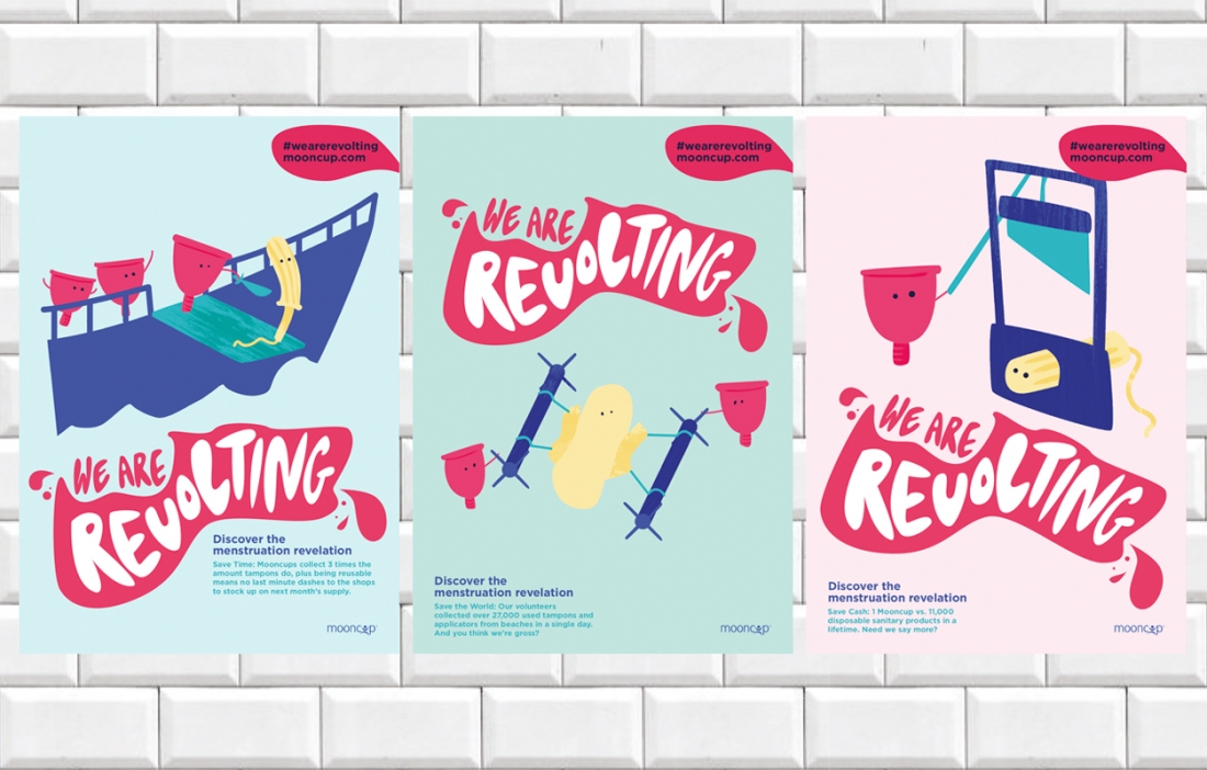
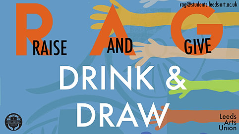
via universities campaigns/posters put out by student unions etc, targeted at students of all subjects.
Current trends are bold shapes and contrasting colours and some using illustrated scenario/sceneries which is our direction
 via web research
Graphic Design campaigns that are directed at a student audience to highlight and express knowing that they go for more contemporary, bold designs that me and my collaborator are working on for Art Pass.
Although an art pass seems very traditional, showing the experiences it can give in a fresh contemporary light in these kinds of styles catapults students views of museums/galleries in to the present.
As the project pack is very strict on colour and type limitations, the illustrations are important to catapult this style. I will rework colours to make sure they contrast and pop. A modernist composition is important also to give a strong brand image and keep it very current and get the information to the viewer as instant as possible as students have a lot of visuals aimed their way in student areas.
Referring to our own universities student aimed and created campaigns and branding, this is a strong lead to design reference. However, it is about specifically targetting those who dont do creative subjects as well so combining the two styles is important.


No comments:
Post a Comment