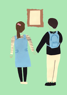
Based on the themes we discussed for each poster (date, adventure, inspiration etc) my collaborator has sent through the first 4 initial images to see if they are right for what I'm envisioning.
She added textures which could add a lot more depth to the designs and very soft illustration lines. I'm really happy with the images and asked her to keep going and just soften them up a little while I begin experimenting with composition. She has had these discussions with her tutor as well so they are getting another look.
Keeping the illustrations soft colours and with no faces keeps the campaign relatable to a mass audience and the illustration style is a very contemporary and current popular illustration style which is why it will draw in attention from simplicity and bold shapes!
I may speak to her about making them bolder shapes and less detail, and adjust colours, when I have seen what they look like with the text.


No comments:
Post a Comment