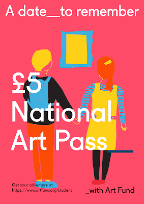
-for text and logos, follow guidelines
-include price of the art pass
-emphasise the art pass can help student audience unwind and relax, be inspired
Submission requirements
-written descriptions supporting work
-submit in a pdf
Megan has already began writing whilst I am experimenting with colour just to see how it can elevate the campaign in terms of standing out in a saturated student market, and looking to digitalising the designs.
Ways to use colour- like the pass, use blocks using colour palette but not for illustration?
Experiment using contrasting colours
This is the first pallette I have put together including rich pantone colours which compete with the student targeted bright colours expressed within my moodboard, but with more a more classic theme.

With collaborating it was really hard to choose the colour pallette to use as we were of different opinion, and when asking peers there were favours for both colour pallettes. The determining factor was that this is aimed at students in particular and from my research it showed bolder contrasting colours were more popular with a student audience.
Have emailed collaborator for the last 2 illustrations for 'stop swiping start seeing' and 'a pass for inspiration'. I will then mock these up in to social media banners to give the judges a fuller picture of how this campaign can draw students in.


No comments:
Post a Comment