Thursday, March 30, 2017

Caribbean typography and poster inspiration


A background monoprint experiment of these subtle outfit wing detailing, as other animal prints in feedback were suggested to be involved would be too much and take away from a strong typographic design style, such as the shapes used on this background
Gradient experiments just colour and one from a feather lino print from these colour palettes to mimic the painted gradient style noticed in a few of the caribbean style images, incorporating different colours in a seamless style.


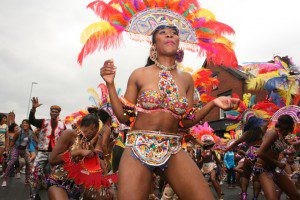
The gradient will also represent a sunset often shown in Carribean style photos and often with connotations to people's associatons with the Caribbean in England who will be viewing the piece. Despite this, stereotypes aren't followed from stereotypes and are informed by images of the carnival only as appropriation wouldn't be what I'd want to create. Also not focusing on certain islands like Jamaica in style is important as it is about uniting the Carribean in unity with Leeds. Basing my design decisions off the outfits is a strong lead without risk of appropriation as it is their traditional showcase of celebration and is the forefront of the Carnival.

Want to do as many experiments as possible, but if I am not paid this month it may be difficult to buy certain materials. It is a breakthrough today by being really excited to experiment and create this piece, especially in it's method as I said I would avoid screenprint at all costs but my mistakes from last time have taught me a lesson!

Traditional print is a test of time management and patience, but this week I am determined to make a lot of backgrounds combination of gradients, some monoprinted with shapes of the outfits, and incorporation of the feathers as I feel they are a huge element of the carnivals history, with the first outfits being to hard to obtain feathers for the founder had to pluck chickens to get them for the outfits and is symbolism of how much the carnival has kept growing and uniting Leeds. Having the phrase '50 years of unity' showcases the celebratory aspect we need to achieve with our piece and focuses on the milestone.

A lot of experimentation with these ideas needs to be done to make sure it is celebratory, and instantly communicates it is for the Leeds Carnival. Type has been chosen to be central as the carnival has reached a milestone that needs to be communicated, along with a mix of what the carnival brings to Leeds in the right exciting energy of the carnival.

Tuesday, March 28, 2017

Feedback on OUGD505

Amazing self arranged crit with a lot of important topic discussions in which I could speak directly to some guys in our class to get a non bias gender opinion which is really important to my research.

Carnival

-pattern of the costume with '50 years' as focus
-'leeds'- each letter in a different pattern and colour of the carnival
-can encorporate marbling inks, collage and paint with traditional print techniques of lino and monoprint as I want to branch out of just using screenprint as I spent a lot of time doing it last term and really enjoy lino and monoprint
-Lino of '50 years' with monoprinted shapes mimicking costumes behind it
-find the 60's identity for the carnival to tie in with piece

Catcalling
-despite survey results, make gender neutral especially as existing material is very feminine
-dont come across as patronising or man hating in visual language used
-posters for public places, near but not within the stereotypical places assumed such as building sites as this may anger people
-use the words obtained in survey describing how it makes victims feel

Monday, March 27, 2017

Carnival print design concepts


Could be based on the route taken, making it easier to follow and join in for new people viewing the print


Caribbean sun over the top to represent the sunshine over the homesick rejoicing and uniting together to celebrate their culture with leeds.


Using the costumes as inspiration, combining textures and elements most important including colour and glitter to best showcase celebration of Caribbean culture.

Type based-focusing on 50 years title celebration of the carnival, in which it has united homesick cultures together with the people of Leeds and even further than. Longest running Caribbean carnival in Europe. Leeds' economy is set to be boosted by the weekend event, showing its undeniable impact and attention it bring to the city.
Carnival Founder and Chairman Arthur France said, “When visitors come to Leeds Carnival from across the region, the UK and overseas, they don’t just take in a great day out, a glittering parade and a phenomenal atmosphere. Visitors spend money at the stalls, on transport, on food, on accommodation and more. That’s not only good for Carnival – it’s great for Leeds.”
"We wanted to make sure that we stamped our footprint here and we left something positive for other people.
"I'm very close to my African roots and a part of me that most people might want to forget, that we are African.
"The carnival is a celebration of emancipation."
Put more simply, in the words of Mrs Wenham: "Carnival is in our blood."http://communityhighlights.co.uk/blog/carnival-boost-leeds-economy/

A brand new part to the carnival in honour of the 50 years is an introduction of ballet to the celebrations!
Carnival Chairman Arthur France said; “The Leeds West Indian Carnival partnership with Phoenix Dance Theatre is a perfect match, reflected in our shared heritage and beginnings in inner city Leeds. Carnival Ballet will be an incredible centrepiece of our milestone 50th anniversary celebrations and will share the stories behind the phenomenal spectacle which brings people together every year”.


Fortunately, a family friend I recently met actually works at the carnival every year as she has long been working in the music industry for reggae and dancehall artists and is dedicated and experienced in the sector- and when mentioning my project she offered to take me backstage at the carnival! Unfortunately, knowing the deadline is way before the carnival this opportunity can't impact my design decisions but I may still go, as I enjoy the Manchester carnival and the whole purpose, celebratory atmosphere, flashes of colour combinations of the outfits! Thus makes this project very enjoyable, and when discussing how to approach the design, Helen agreed the outfits would make sense to be on the print as they are the forefront and are unmissable, with so many to choose from. They also represent the individuality of the different countries being celebrated and the variety of people attending the carnival for the past 50 years.

Friday, March 24, 2017

Research pointers from sources given

Design Good- experience'Forget all those stereotypes about creatives: We’re really organized and live by processes, timelines and constant communication. We’ve honed our methods through of experience.'
Choosing catcalling as my research topic opposed to others such as male suicide or successes of designers was appropriate as I have experienced it myself and am passionate about researching ways to tackle it and supporting others who have experienced it. Chose this as sexual harassment was too broad- knowing the horrible feeling and the anger I feel at those catcalling me or my friends, having the experience and being able to educate and expand on my own experiences and based off others is a brilliant opportunity, along with my ethos as a designer to be part of positive change.

Lush: “we reserve the right to civil disobedience” 'Mark Constantine, co-founder of Lush, doesn’t shy away from his company’s association with such campaigners. These small, grassroots groups are in line with Lush’s values—protecting the environment, preserving human rights, and promoting animal welfare, he tells Quartz. They are “concerned citizens” who are “absolutely central to what society is all about.”'
There are huge companies that are starting to work differently in their ethics as a brand and also have the ethos to create a positive change which I can research in to, to link my work with.
'Lush has taken such campaigning in a new direction. The Body Shop supports campaigns that are hard to disagree with, such as stopping sex trafficking. Lush is not interested in having “easy conversations” with its customers, Hilary Jones, Lush’s ethical director and herself a long-term environmental and animal-rights activist, tells Quartz.“I think that if we’re not careful, we end up preaching to the converted. I prefer to be raising issues with people who ought to be thinking about[them],” Constantine explains.'
Lush would be an unique company to link my work to as they have such a huge platform, yet want to challenge consumers rather than being obvious, always wanting to support 'the small grassroot groups.'

Studio Brief 2 Research: Catcalling


https://www.surveymonkey.com/results/SM-CD3DYJCH/

Primary Research
Within previous experience of gathering primary research, I have found that offering a survey that keeps the contributer anonymous is more successful than posting and asking for feedback.

My survey on catcalling required the age, gender (to get a clear understanding of the balance of it happening to those I know and around me) and asking how they felt, how they feel it can be tackled and leaving room for other commentation. To get answers for this often sensitive issue, leaving room for comment and concerns is crucial as I am unaware of how the public (or at least those around me) would approach tackling the issue. I want to make my project with the spirit of eradicating catcalling, and finding out how the public think this can be done even with a small number gives me a decent indication and increases the justification of my outcome.

Secondary sources


Video research

There are many videos shared on social media and platforms such as Youtube, all experiments concluding predominantly women are catcalled walking down the street minding their own business. Two videos I found most interesting were when fathers and boyfriends were made to sit and watch videos that showed their daughter/girlfriends getting this harassment. Valuable exerts include:
'Thats so messed up. Yeah those people are scary...i'm glad that people are making it an issue and like, taking a stand for it'
'You've got to think, that's somebodies daughter, somebodies sister...like their mother their cousin or something, they wouldn't appreciate it'
'I'm getting pissed off...i'm not happy with this'

https://www.youtube.com/watch?v=oWEKD493IxY#t=123.253219

'Have some respect, you know? just have some respect'
'you have to respect a young girl walking on the street not come on so strong to her...that's upsetted me now- the way he talked, with no shame talking to her like this on the street without even knowing the young lady'
'our daughters and wife and mother are to be treated with respect'

https://www.youtube.com/watch?v=ud3DLjREV34&spfreload=5

These support my idea to lead the campaign in a way that grips the men like these videos show, referring to their loved ones. 

Thursday, March 23, 2017

YCN Submissions

Collaborative work of me and Nanami for UK Greetings


My big brief for Thirsty Planet


Wednesday, March 22, 2017

UK Greetings collaborations final feedbacks and final designs


When getting the illustrations sent through to be my by collab partner, we had different tastes on the styles as she preferred the left side style which I found brought the age range down, and I preferred the more delicate intricate style of the right. We compromised as others viewing these images did prefer the style on the left. I do agree that it is a bold cute style which is beneficial in our aim. Within feedback we all agreed the text I was working on was too powerful and strong, therefore needed to make it not bold and we thought perhaps coloured backgrounds clashed too much so the colour scheme assigned by Nanami could be converted to the type making it less harsh and still fitting for each character. The wreaths added consistency and harmony of the designs and gave the opportunity for the text to be consistently placed and less like a motivational quote and more balanced as a card/notebook.

To then continue my editing, I circled the text around the wreaths for a stronger composition and harmony of the set which is important for a collection.


After deciding on our composition, I kept the pattern detail to see if this was preferred to more simple.


Although compromised, I added filters that toned down the brash colours of the illustration to work more in favour of our age range being young but not child females which still has the style of cute we are going for. This is a surprise for me as a designer as I struggle with toning colours down in design, must be a benefit of collaboration! Also taking charge of typography is new for me and has allowed me to know having ideas change is useful development and they all need to be tried. Being less stubborn with my design has been aided a lot by collaboration.


With slight changes with the originals as we would prefer to keep the colour scheme consistent, these were the finals I showed to Nanami. This typeface is slick, with the hand written effect being used in a strong feminine way supporting the positive power these cards are meant to give to the consumer, and due to the style, likely to be put up on walls by those who do that. In research the message inside was the ignition of keeping cards, and with the blank space inside and the nature of the cards they can be kept and work as a heartwarming package. Circle text was challenging as I had to move the text at the bottom with the mouse as in tradition circle paths the text goes upside down as it moves down the circle, so this was something I learnt.

We have agreed these will be mocked up as greetings cards and notebooks as the design is transferable in this sense. My partner will work on repeat pattern as she has the skills to do so and we are using the illustrations for the gift bags and wrapping paper which are hers anyway and we agreed to work to our strengths and balance the workload fairly whilst being in tune with eachothers changes.


Greetings cards- last is the example of how the back would look with clear link to Act for Wildlife and the UK greetings logo.


Variations of notebooks, coiled or uncoiled with smooth edges. In colour as this gives more motivation to buy due to colour set, and white note books would get too dirty and don't stand out as much.


Set of notecards matching the greetings cards, will come with a pack of 4 to display the whole range and give option to choose on subject or mood. Want our collection to be consistent as possible.

Feedback

before submitting to YCN, last minute feedback would prepare and benefit us in our confidence that we had taken the right style and concept route.

-'very cute!'- which was one of our aims that would convince users to buy and is a trending marketing technique of late
-'the colour scheme and design represent each animal the best, such as blue for the otter representing water'- I assigned the colours to it's most likely match which has been noticed through feedback
-'attractive, bold typography ideal for the target audience'- with punned catchphrases this needed to be the case to make the consumer read the phrase whilst looking attractive and appealing to a young female.
-'design is easy to digest, memorable'- this was really good feedback as our development was in aid of stripping back a lot of our initial ideas to implement the colour scheme, animals, phrases in a consistent composition.
-'a lot of people wouldn't know what an axolotyl is'- however, I dont see this as a negative, as it makes the card more intriguing and more popular with those who know what one is. Raises awareness of endangered species also.

Sunday, March 19, 2017

Animal Charity for our greetings cards and final collab meeting

An animal charity that supports many animals internationally, with a charity not has controversial as PETA or as famous as RSPCA, working for this animal charity would be a huge incentive for buying our greetings set and an amazing connection for UK Greetings, and through research of the company I know they like to help where they can and have good hearted ethics as a company and are '

are proud of their corporate social responsibility.' http://www.ukgreetings.co.uk/csr/

Our Responsibilty

'It’s really important to everyone at UK Greetings to have a good relationship with the community we’re part of. We support lots of charity events – there’s almost always some fundraising taking place in one department or another (bake sales are our favourite!) and we try to do all the right things to protect our local environment.' If so, this is another level of how they can use their brand to do good not just in local areas but across the world and goes hand in hand with their ethos. With our set, making people happy and helping to save animals across the world-win win!

Looked in to UK charities specifically, but due to the amazing cause of charities working for the protection of animals and variety we have in our collection, why restrict to one country when there are needs of aid all over the world.
- would be at back of card


UPDATE: after talk, we are going to want an endangered animals charity to be part of our collection as we have chosen animals all endangered and this is a cause consumers would, we feel, be very empathetic towards and appreciate the link. This organisation is also put together by Chester Zoo, giving it the UK link with UK Greetings and an association close to home and well known for consumers.


Echoes a similar style done by this designer, but with a stronger more confident animal focus with more empowering visual language which is the energy we want along with our colour scheme

Final talks aims
-now focusing on 4 endangered animals from our idea, will work with an endangered species animal charity and there is then more than one motive of buying cards and with animals trending on feel good cards, people can take for granted finding them cute and not have the realisation they are real animals facing dangers.
-Nanami will set the colour palette as I get too carried away putting many colours together
-My hand drawn typeface gave the design overall a child like look which isn't our aim. New typeface is feminine, hand drawn and thick enough to grab attention and elevate detailing on the card but sophisticated.
-I will put together the cards/notepad covers, Nanami will work on gift bags and repeat pattern wrapping paper as she can do repeat pattern

Overall, at this point we are quickly wrapping it up. We have had many discussions and ideas, and now they are going in the better direction which needs to be done before submission in a couple of days ideally so I can try to get designs printed and photographed. We are still undecided on making patches or pins with the card as feedback has been extremely mixed, but would be great to have something that makes us stand out from the crowd. Ideally would prefer work to be moving faster but for collaboration to be a successful collaboration, people need to be aware of the same information and directions headed.

Keep It Bright and market for spreading love and positivity through design


Postcards, greetings cards, prints, books
Badges/patches


Wednesday, March 15, 2017

Type for UK greetings and Thursdays discussion

My mission is to create a vibrant, expressive, happy hand drawn style phrase for each card that oozes good feeling and motivation.


My experiments


Concluded as my bubble type is the one I am most successful as I am unsteady copying some of these similar typefaces, we will go ahead with these being at the front of the cards with inspiration through patterns or additions like those above. Using a unique typeface I have hand drawn will appear more honest and thoughtful rather than using a typeface like above's that appear on so many cards in the market. although it was important for me to try and create my own versions, the bubble type is bold, attention grabbing and makes use of the space on the page whilst being easy to use with different colours we will decide on and isn't like the front of any cards similar I have seen so far.

The juicy style of this large hand drawn type also appears full and happy, which supports our theme of cheering a loved person up with one of these cards and along with the blank space for the thoughtful message inside which is all over one of the most important elements, the cover for this is also important and needs to embody our aim. The fact I enjoy doing this style so much as well and that is is done is sharpies adds honesty and humble-ness which is a positive addition to the all over concept.