
Update: now with project pack inserts to support the companies new project guidelines. When showed to the marketing director, it wasnt pointed out that the new colour scheme absoloutely needed to be adapted by suggestion of the clothing. Final hand ind files will have inserts from project pack.

Colours and patterns inspired by combination of the flags colours from my previous developments, and as recommended by Thirsty Planet's market director, the colours and patterns of the women's celebration clothing in Milawi, their country of focus. Their are 5 posters and a 3 set of postcards/wallcards which would be smaller as they dont have body text, and would be advertised inside a place selling the Thirsty Planet product whereas the posters are for outdoor public spaces. featuring the new logo which fits hand in hand with the elements of the campaigns visuals, and the bottles placed on the bottom can be adapted to the whole new product range but I knew when creating this there is enough space and the new look will work completely, depending on what they want if it gets to shortlist. The glass bottles are used as they are their sleekest most upmarket bottles from the collection which look very different to standard bottled water on other adverts and again sets them apart from the rest.
These are a distinct set of advertisements for their fresh new campaign aimed at 18-24 year olds standing out from the standard water advertisements, which use heavenly visuals of water, moving on to vibrant colours giving off good feeling and exotic such as the Fiji bottle appeal. The colours are 'mouth-watering' (as said in feedback) and the lino prints are used to comply with their aim to elevate the self success of the people of Milawi being able to carry on the work given by the donations, and a hand wrendered style matches the ethical self direction of the Harrogate companies decision to create a charity water bottle. The colour palette also represents the celebratory visuals worn by Milawi's women in celebration, and the campaign is a celebration of all the amazing charity work donations have given to places in Africa.
The core typeface imitates a hand drawn type with energy and drips shaking off. Tried the drops in blue but didn't work along all of the sets colours. This typeface boosts the energy of the campaigns nature and look honest yet exciting, grabbing the attention of passers by and the attention is put on the good work being done. They are set to be intriguing to the target audience and appreciated due to their fun style which sets this campaign apart from any other, which for the core audience is needed and fits the brief. Also from speaking to the market director, Harrogate are looking for something outside the box which showcases the outcome of the donations from every bottle and want this to be the main focus of the campaign.
Water adverts are most commonly advertised in public spaces, appealing to audiences on the move wether it be travelling in buses and cars or walking, who may be thirsty. Mocked up, I find these ads to be slightly ambiguous but due to their unique style and bright colours they look nourishing and intriguing to a thirsty passer by who will wonder who Thirsty Planet are and notice they are making such positive change, which will come to their minds when looking at water to purchase: they will remember the striking, bright ads theyve seen and recall the memorable eye catching phrases that go with the body text of all the good work they do, which are fitting to each phrase directly off their website.


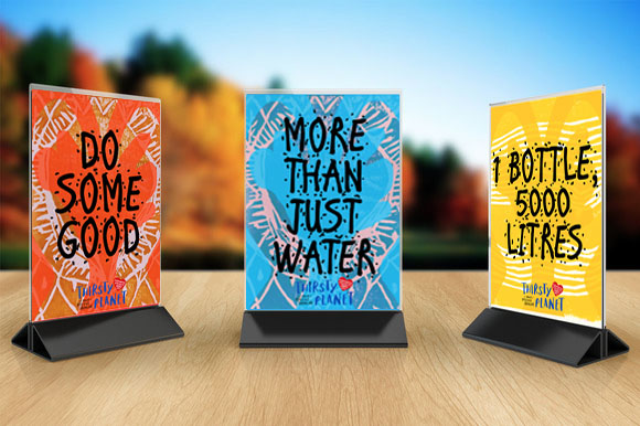
Plaques that can be stood or hung up in restauraunts or canteens selling the water product.

I have arranged to work with a Visual Communication student who reached out to everyone by email wanting to photograph products and projects, in which I replied for this brief. My test posters and postcards will be printed and photographed professionally in the following days.
No comments:
Post a Comment