

When getting the illustrations sent through to be my by collab partner, we had different tastes on the styles as she preferred the left side style which I found brought the age range down, and I preferred the more delicate intricate style of the right. We compromised as others viewing these images did prefer the style on the left. I do agree that it is a bold cute style which is beneficial in our aim. Within feedback we all agreed the text I was working on was too powerful and strong, therefore needed to make it not bold and we thought perhaps coloured backgrounds clashed too much so the colour scheme assigned by Nanami could be converted to the type making it less harsh and still fitting for each character. The wreaths added consistency and harmony of the designs and gave the opportunity for the text to be consistently placed and less like a motivational quote and more balanced as a card/notebook.

To then continue my editing, I circled the text around the wreaths for a stronger composition and harmony of the set which is important for a collection.

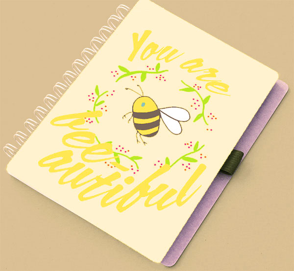
After deciding on our composition, I kept the pattern detail to see if this was preferred to more simple.


With slight changes with the originals as we would prefer to keep the colour scheme consistent, these were the finals I showed to Nanami. This typeface is slick, with the hand written effect being used in a strong feminine way supporting the positive power these cards are meant to give to the consumer, and due to the style, likely to be put up on walls by those who do that. In research the message inside was the ignition of keeping cards, and with the blank space inside and the nature of the cards they can be kept and work as a heartwarming package. Circle text was challenging as I had to move the text at the bottom with the mouse as in tradition circle paths the text goes upside down as it moves down the circle, so this was something I learnt.
We have agreed these will be mocked up as greetings cards and notebooks as the design is transferable in this sense. My partner will work on repeat pattern as she has the skills to do so and we are using the illustrations for the gift bags and wrapping paper which are hers anyway and we agreed to work to our strengths and balance the workload fairly whilst being in tune with eachothers changes.


Set of notecards matching the greetings cards, will come with a pack of 4 to display the whole range and give option to choose on subject or mood. Want our collection to be consistent as possible.
Feedback
before submitting to YCN, last minute feedback would prepare and benefit us in our confidence that we had taken the right style and concept route.
-'very cute!'- which was one of our aims that would convince users to buy and is a trending marketing technique of late
-'the colour scheme and design represent each animal the best, such as blue for the otter representing water'- I assigned the colours to it's most likely match which has been noticed through feedback
-'attractive, bold typography ideal for the target audience'- with punned catchphrases this needed to be the case to make the consumer read the phrase whilst looking attractive and appealing to a young female.
-'design is easy to digest, memorable'- this was really good feedback as our development was in aid of stripping back a lot of our initial ideas to implement the colour scheme, animals, phrases in a consistent composition.
-'a lot of people wouldn't know what an axolotyl is'- however, I dont see this as a negative, as it makes the card more intriguing and more popular with those who know what one is. Raises awareness of endangered species also.
No comments:
Post a Comment