Monday, October 30, 2017

Brief 2: Body Image Collage/photography research

Beauty Standards by Laura Karklina


Various found artworks


Issues raised through collected responses include issues such as:
Scars, moles, stretch marks, being ginger, hating their hair, size of their nose, body weight, stomach, legs, vitiligo, height, freckles, round face, chest hair, small boobs,

Using images entirely from printed collateral will represent the information we take in, but also if I collage using visuals from social media as this is now the phenomenon, this could have stronger results. This also reinforces the mixed up views and thoughts on our body image, which is why I chose to use collage to represent this project idea.

These examples are all serious reflections of people's body image issues which I will work on within my collage, but also explore the avenue of using body positive images without negative connotation. These would come more from zines and social media positive accounts as they bear a different perspective and aim than corporate magazines.


These kinds of images give off happy nostalgia using positive colours and non judging language, and would stand out amongst the standard instagram feed if following 'model role models' etc. Tumblr can also be used as a tool to use modern imagery young people may have seen. Tumblr is known for having various 'triggering' page followings so turning this in to something positive would be important.

Brief 2: Getting more stories for series

Although my survey got 29 responses, I still feel I do not have enough content to start up a body positivity Instagram/social media page which will need more to gain momentum and turn in to a continuous page where hopefully I can take submissions regularly to post. This will create an online space which is positive rather than comparisons to others on social media.

I have found a charity called The Mix which is well respected with so many diverse advice pages, representing under 25's mental health struggles which are profoundly on the rise. Have posted in the discussion boards in hope I can get more stories from a wider range of my target audience.

'Hey guys,

I'm wanting to create a positive space online where so much self comparison happens constantly. Mental Health issues are on the rise and social media is the most likely culprit as we look to others for how to be and how we want to be which can have so many pressures.


I really would love stories from you all on something you didn't love about yourself, why this was, and how you've overcome this. By sharing these stories we can help others love themselves. We need more positivity on social media! If you could get involved and share without your name being used I want to create accompanying artworks/photographs that represent your story.


Thank you,

I have also contacted a variety of collectives/empowering groups on Instagram with no response so far.

Working on projects relying on other's inputs has proved very difficult and makes me reconsider doing this in the future.

1/11/17 One response so far: 
Great idea! Mine's a bit of a funny one. I used to have a 'friend', growing up, that would always mention how massive my hips are (cheers, 'friend') - looking back this is pretty bad, but she used to play Shakiras song 'hips don't lie' to me all the time thinking it was funny  I was pretty self conscious about it while at school. When I went into 6th form and uni and didn't see her anymore... No one mentioned it anymore and actually I just completely forgot about it. I'm laughing looking back at it!

I overcame that by just focusing on other things (life's too short!!!!) and I realised over time there was and is absolutely nothing wrong with my hips 

- Lucy

Brief 1: Final Social Media Advertisements and Evaluation


-Being hand-wrendered represents brand's homemade vegan values, and Etsy's ethic of independent, handmade, bespoke products.

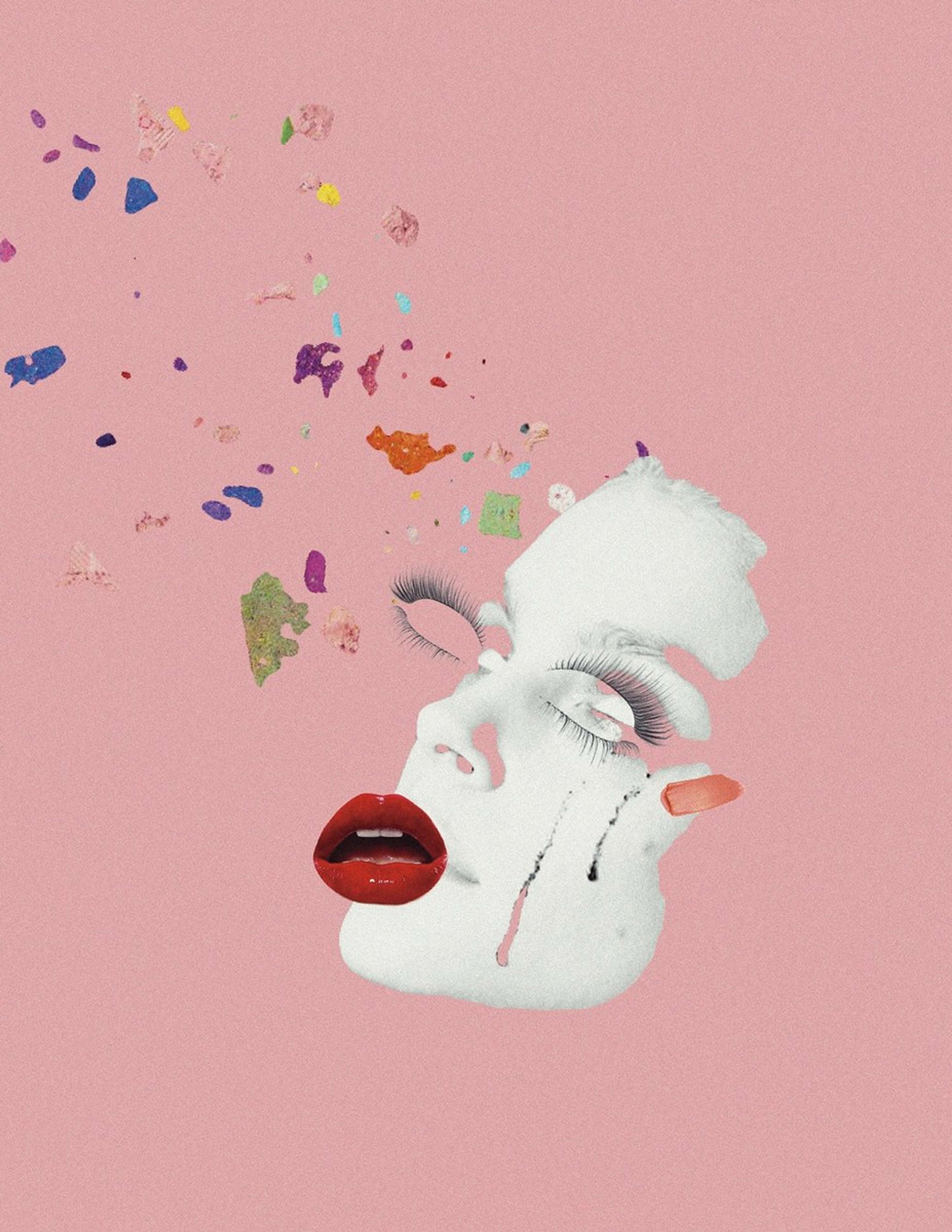
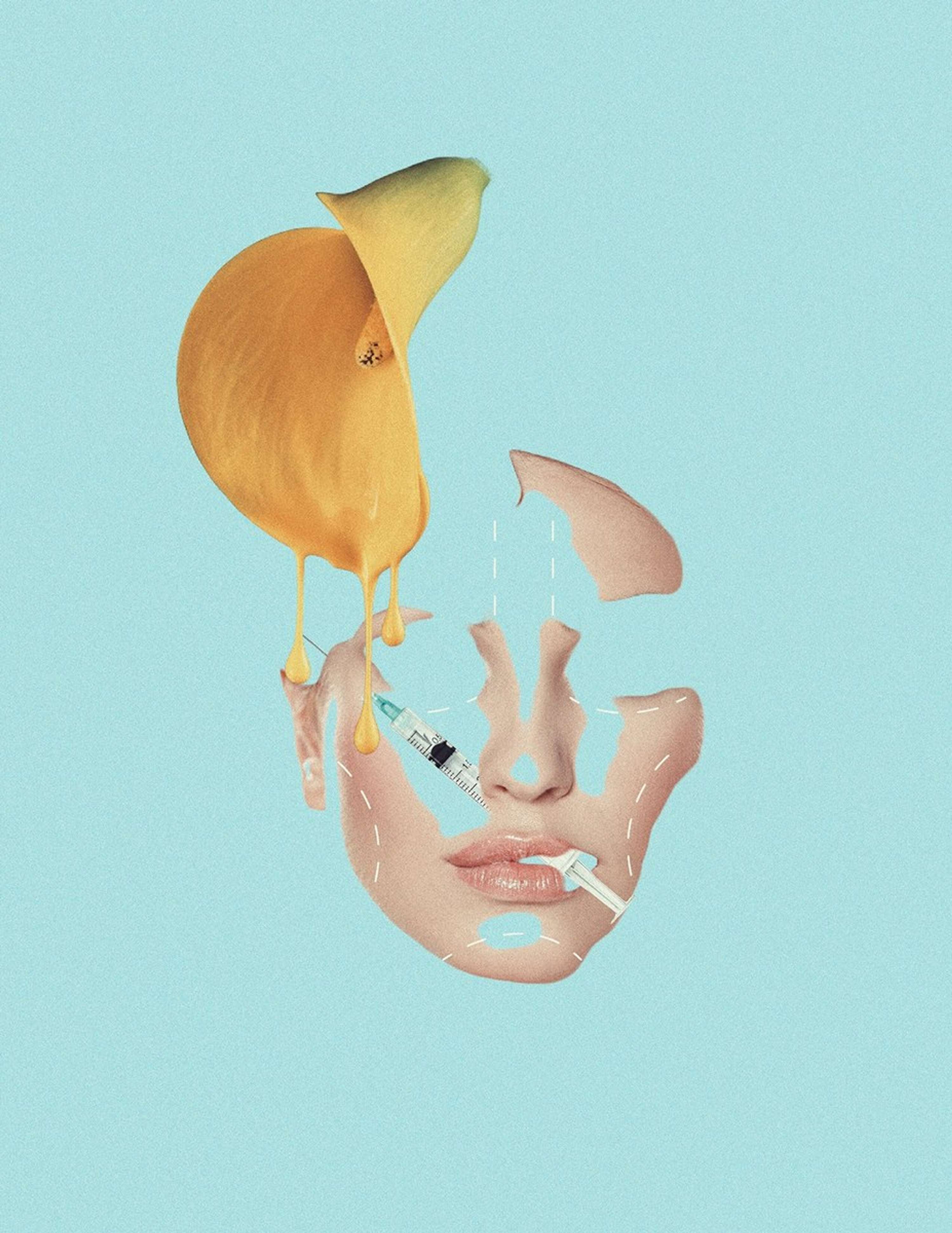
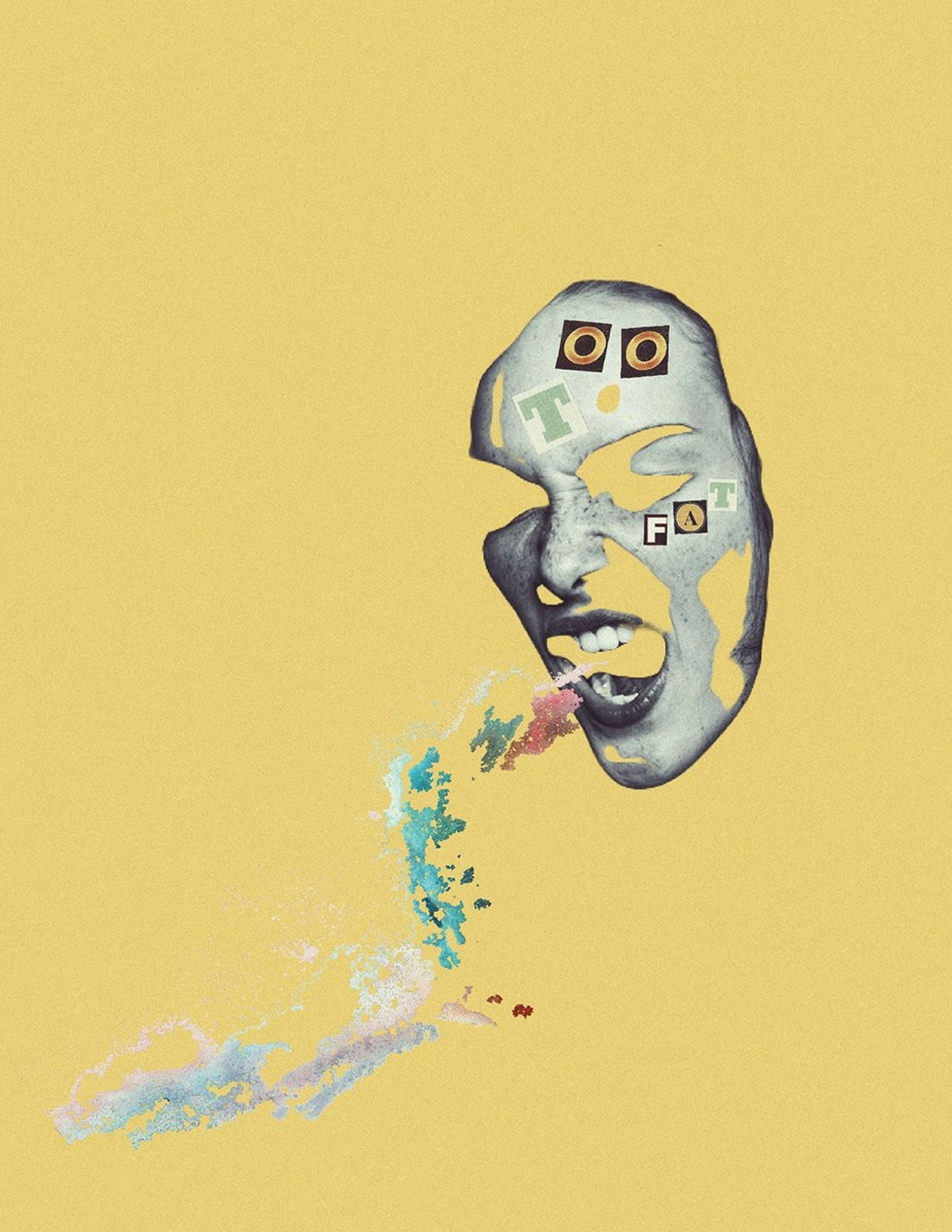
-Digitally drawn vivid colours represent scent's ingredients and smell going hand in hand with the brands fantasy aspect (use of Fairy's within the branding)

-Using real food would resemble/appear too much like an actual cocktail or meal ingredients opposed to a scent, this is why that was not used

-Would have added sepia filter to resemble existing ads but this would have dulled intensity of the scents advertising and lower impact/purpose of design.

-Rustic style represents ethical selling focus of products being vegan- honest and handmade.

-The illustrations were done in a way to give depth and tone, along with the mimic of mist in the heart of the image. The restriction on size meant I wanted to give as much depth and fill of the square to emphasize the visual smell of the ingredients.

EVALUATION

Within this project I feel I have achieved my aim of creating perfume advertising without using models, focusing on the ingredients of the scent itself to allow the consumer to choose correctly for themselves. I wanted the advertising to be more exciting, give more away about the scent and have a bespoke design. I was lucky enough to get such an interesting set from reaching out to Natalie on Etsy.

Whilst this was intended as my client brief, it wasn't what I expected in terms of negotiating and agreement. Although these designs were sent and the client was happy and ready to use for social media advertising of her products, I expected more constructive criticism of the designs, or wanted more of a challenge?

This has shown me that when working in a client led world, I expect to be challenged and don't feel a design is it's best as soon as that which is a positive.

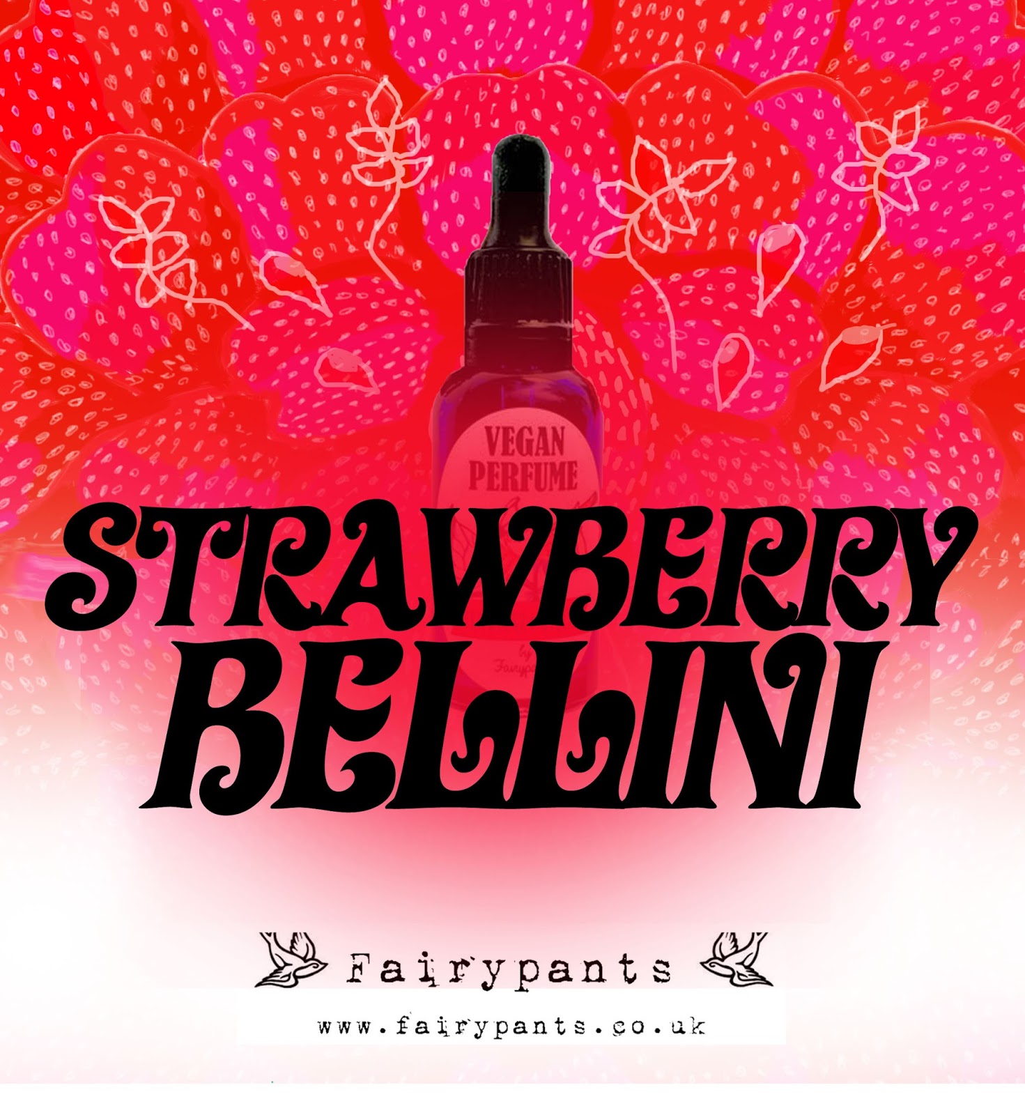
In terms of matching my project brief, working for Natalie was great in terms of her being on board with wanting an illustrative, colourful design which I outlined to her would be the use of ingredients and her own scent tested descriptions, making it as true to her own testing and brand itself. Taking into account her existing retro brand and the ads she had sent me, the pattern style inspired by the 50's prints and typeface experiments were important in getting the right brand vibe.

In the future I look forward to working with clients I get to work more closely with as it has left me with an underachieved feeling.

A challenge I faced for the first time was realising commercially, typeface usability is very different as the majority need to be bought to use commercially- as this wasn't a personal project. Although I enjoy drawing digitally, with type I need a lot more practice as being able to create your own bespoke lettering is highly beneficial. Working in a square format wasn't what I had envisioned, but these were requested this size to be used as social media advertising for her cocktail range so I wanted to include as much as I could that would give off the scent and it's ingredients in vivid appealing style.

The visuals I feel are very packed in and are all different and specific for each perfume which I made sure of, and have an exciting feel to their compositions and detailing. When I got the feedback that the initial designs were rustic this definetley made me feel more confident in the designs being truer to the brands ethics themself, as her brand is also popular for being a vegan brand, which is on the rise.

The process of getting from initial to final designs included consideration of the function of these ads- to advertise the perfume bottle, the name and scents with the visuals, and fairypants brand.

Although the communication was more limited than I would have liked, this was a very exciting project to use my project idea with and I am humbled she was great enough to let me do it. It has given me an insight in to designing for clients and shows perhaps how varied the world of work is. In terms of time management, I completed communication with the client and had the designs approved and finish by the end of October as intended in my brief plan which I am determined to stick to! I work best to deadlines otherwise I get stressed, so this was completed on time which is important to get in to habit in, working with clients. Unfortunately, Natalie didn't really give a deadline and I was happy to tell her when I would have each stage done by and stuck to it.

When choosing this client I didn't know my strengths as well as I do now and which styles I need to work on before working on for a client. Despite this, I feel like with stronger communication and constructive criticism from the client my work would be better and would have been developed a lot more. In future I will do more research of my client if I'm the one approaching. Part of my development this year has also been using Illustrator a lot more which I would have done instead of freehand.

These are examples of the style I would have gone with if I had developed more-


The typeface is more appropriate and mature/clean for advertising the self made brand, with a retro signature look to the names of the scents.

Brief 1: Response from Natalie on initial designs


When sending over my designs I saw them as initial, hoping to get more constructive feedback from Natalie herself as it is for her company. However, even offering suggestions she seemed more than happy with what I had sent over and was ready to use them! Although I would have liked to be challenged a bit more, she enjoyed the 60's feel typeface even though I was unsure if it went with her branding- perhaps she liked the idea of something completely new?

Despite this I am happy to have completed designs for a client relatively quickly and not have to re edit them entirely.

Sunday, October 29, 2017

Brief 1: Design Feedback

In university tommorow, I am going to print out/display the designs I have initially done without the names and ask peers to give any description or scent they get from the design itself so that I can test wether they represent the perfume accurately/to description. It's always vital to get feedback on designs as you could miss something.

Results
Strawberry Bellini:juicy and sweetfreshness irish Cream: sweet, creamy candy Pina Colada:tropical and refreshing. Cuba Libre: warmth and a bitter feel Moscow Mule: bitter again alongside fruity

General feedback
-You know what products are in just by looking
-Looks organic, healthy
-Illustrative rustic style that promotes the vegan benefit of the company
-The mist represents the smell and makes text even bolder, not as flat
-Type is classic/vintage, 60/s 70/s era
-Distinctive set
-Integrate the brand a little more in to the designs- will try and use similar typeface as existing to give it more of a brand look
-Try different typefaces (it had been difficult to find a free typeface that was consistent use in this format for all titles, format is hard to work with)
-Not sexist like other perfume ads- this was my goal in using the elements of the scent, not featuring models (although the bottle had to be included)

Thursday, October 26, 2017

Brief 1: First design variations


Not happy with the format, I began to experiment with different layouts and using a rustic paint sample effects of the colours associated with the flavours and ingredients of the perfume.

However, due to consistency issues, sticking with an all central format would work the best.

I prefer this style but could not work for all perfume titles consistently, and doesn't represent and give impression of scent as much.

Tuesday, October 24, 2017

Brief 1: Experiments for Fairypants

Type needs to represent retro/handwritten style existing in current branding which also supports the brief's aim to look enticing and desirable along with the design. Type can't look rigid/stiff.

Started with Strawberry Bellini


The drawn pattern emphasises the flavour and colours give it it's theme. Tried other typefaces but this one has a boldness and character to it, and is a retro style typeface with flair appropriate for this project. Will show Natalie when a design is finalised if she disagrees. Not very sure as there is a lot going on, very bright.


The typography experiment version is exciting and represents the perfume as full of flavour but I really need to brush up my digital drawn type skills as the letters are badly drawn. This has been a lot more challenging than I expected!

Monday, October 23, 2017

Brief 10 Research Project-'Spaces For Healing' extract from 'Sister' Magazine for mental health project

''The therapeutic space offers a site in which to unearth what has been concealed by performance. It is a space to explore our inner worlds with another person and to shine a light on the things that bother us in quiet moments; before sleep and even in real sleep.
The line between the theatrical and the real in society is becoming increasingly blurred and this is having  a hugely damaging impact on our collective mental health.
It is vital that society creates spaces, outside of our bedrooms, that can be free from performance. Spaces for the difficult bits to be explored and to be tolerated by another person.'-

'CBT has become a one-size fits all quick fix that looks good on paper and while I do not doubt it can be helpful for some, it cannot become a replacement for those that require long term (talking psychotherapies and creative psychotherapies'-

Article 'Space For Healing' by Art Psychotherapist Kirsty Robson

Reinforces the relevance and importance of the surrounding space of therapy, allowing the person to ease up from having to 'perform' day to day and switching off to open up. She uses the example of bedroom space as it's where people can feel completely switched off and themselves.

Brief 1: Project Disrupt

Seeing how they reinvented room air freshener gave another insight in to how designers want to update visual concepts for scent. They keep it very simple and minimal, using natural surfaces to give off the scent and the scents themselves very simple images of the fruit itself. Mine needs to work well with Fairypants's already existing retro inspired branding so wouldn't be as clean looking, but it is good to see other perspectives.

Brief 3: Meeting with collaborator for Manchester Music Posters project notes


Today's crit 23/10 and current brief plan

I arranged a small crit today as I had questions about projects that needed other valuable feedback and perspectives

Self Empowerment series: Making this in to an ongoing instagram sharing the stories and asking for submissions continuously could turn in to a really great platform for body positivity which is seen on Instagram pages and are praised. This means this can break between all the images we see comparing ourselves to 'picture perfect' models of Instagram, as Instagram is one of the main platforms people aim to look their best through angles and editing. This will also include collages and other art that can be submitted as well as stories therefore taking a different collective approach rather than one person.
Through my comment box survey I have obtained 29 answers but not all as whole an answer as I wanted perhaps due to my wording. I am going to try and ask people throughout the next few days in person as I can gather more detailed answers and will promise anonymity. This is also more environmentally friendly using a digital platform rather than printing a publication which won't have the same impact anyway as they need to be chosen to be picked up.

In the future when collecting data like this using a comment box allowing the person to write as much as they want, I should split the question up so it is clearer as I think this held the answers back abit having one large question and one comment box as I wanted the past experience/how they overcame together as one answer.

Perfume Series- create main typographic piece using vintage type and pattern, and digital illustration for the other to give to different approaches as words can be made very enticing and the buyer can see the features of the perfume enhanced. The other can be titled and whichever the client likes can develop further. I aim to have this done by the end of October so I have started a pattern already.

Manchester Music: Now the songs have been arranged with my collaborator after meeting to discuss our direction, those in the crit group liked that we didn't choose too obvious songs and suggested just to approach like Secret 7 and to draw out as many sketch ideas as possible before starting an actual poster. Instead of an exhibition, another peer suggested Twenty Twenty Two's, a popular spot in the Northern Quarter of Manchester which instead of an exhibition will display work over a long period of time for their establishment and could possibly sell pieces which would be amazing.


BA (hons) GRAPHIC DESIGN
OUGD603
THE PLAN

Name: Hannah Rottger

Manifesto:
I want my portfolio to showcase bold, engaging, vibrant graphic design and illustration that makes a positive impact socially and looks at cultural issues. Helping others and involving the community are the best ways in my opinion to create valuable, versatile and unique graphic design projects.
Brief one Proper Perfume Advertising:
Generally speaking, we associate big perfume brands with the celebrity they are endorsed by rather than the scent itself. Within this project, I want to work with an independent perfume maker and elevate their brand and work with them discussing the ingredients, smells and colours of their products to create a true visual representation of the perfumes makeup to give consumers a true idea of the scent. As these are bought online also, the information listed is the only way to imagine the scent or if they get the chance to go to independent fairs.
This project will support my aims to make scents identifiable and delicious whilst giving an independent business designs to use for their brand and within promotions of it.

Time frame: Until October 31st

Brief two Self-Empowerment Series:
Obtain feedback from those I engage with on a day to day basis and from social media, on their own struggles with self image and body positivity and see how they overcame these to create a digital platform in which their self empowerment stories can be shared with those who may be secretly suffering, which according to research is a staggering amount due to social media use. Having this on a digital platform means there can be a part of their browsing that promotes positive self image. Using photography/illustration/collage based on their stories can visually express people’s mixed up perceptions of themselves etc.

Time frame: Until end of November

Brief three Female Artist Zine:
To accompany my critical writing piece, speaking to female creatives through networking and interaction with upcoming artists I can find out the current state of the gender gap within the creative industry through their experiences, and share these stories in a very 90’s riot grrl style zine in ode to the movement I have been researching for my writing piece.
The style itself is bold and exudes power and revolutionary visuals. Can include photography/mixed media.
Time frame: Until Christmas Break

Brief four See Red inspired traditional prints:
Contemporary versions of See Red style posters based on research from my critical writing and zine. I aim to improve my traditional print skills this year and through this that can be achieved.
Time frame: Until end of January

Brief five YCN/Penguin Competition Briefs:


Time frame: End of January

Brief six SECRET 7:


Time frame: Mid February

Brief seven Frazzled Café Leeds/mental health in graphic design Research Project (Unknown):
As there is so much to research about the relation of mental health and graphic design, I want to explore whilst working on a campaign for Frazzled Café, the ways graphic design can be used in spaces for therapeutic affects and the psychology of certain colours/type. Will get an in depth insight in to how graphic designers achieve this to create a powerful campaign that can help people suffering with mental health related issues.

Time frame: Until end of March

Brief eight Exhibition Collab and others
Time frame: End of year


Tuesday, October 17, 2017

Brief 1:Pinup/Retro Design inspiration

Even though pin up girls within design are one of my absolute favourites, the project is convert using a model to sell in to using the components of the individual perfume itself so therefore I want to look at ways visually I can incorporate vintage influences such as her new advertisement for her nail polishes. Within this sector it is actually hard to find designs not containing pin up girls as they are the forefront of the style.

Looking at 50s retro design patterns- many come from fabrics but are an enticing combination of colour and shape which can inform my designs for Fairypants cocktail perfume range


Soap and Glory's brand focus their look completely on retro inspired imagery and typography that supports this and is very visually strong making the brand stand out on the shelves amongst other packaging.