Wednesday, February 28, 2018

Brief 6: Penguin Submission and Evaluation


As a designer I enjoy working on posters and designs that are a forefront, so book covers are very exciting to work on as I believe consumers do judge a book by it's cover, as I do, and the restricted space is a chance to tell a story and set the tone.

To challenge myself a little more for third year, I chose to do adult non fiction instead of a fantasy title or a children's book cover which I gravitate to as I enjoy non serious/minimal design in which I can illustrate or use bright colour for typically. This drew me in as a more formal design to do, but yet having such a fascinating author and subject to focus on.

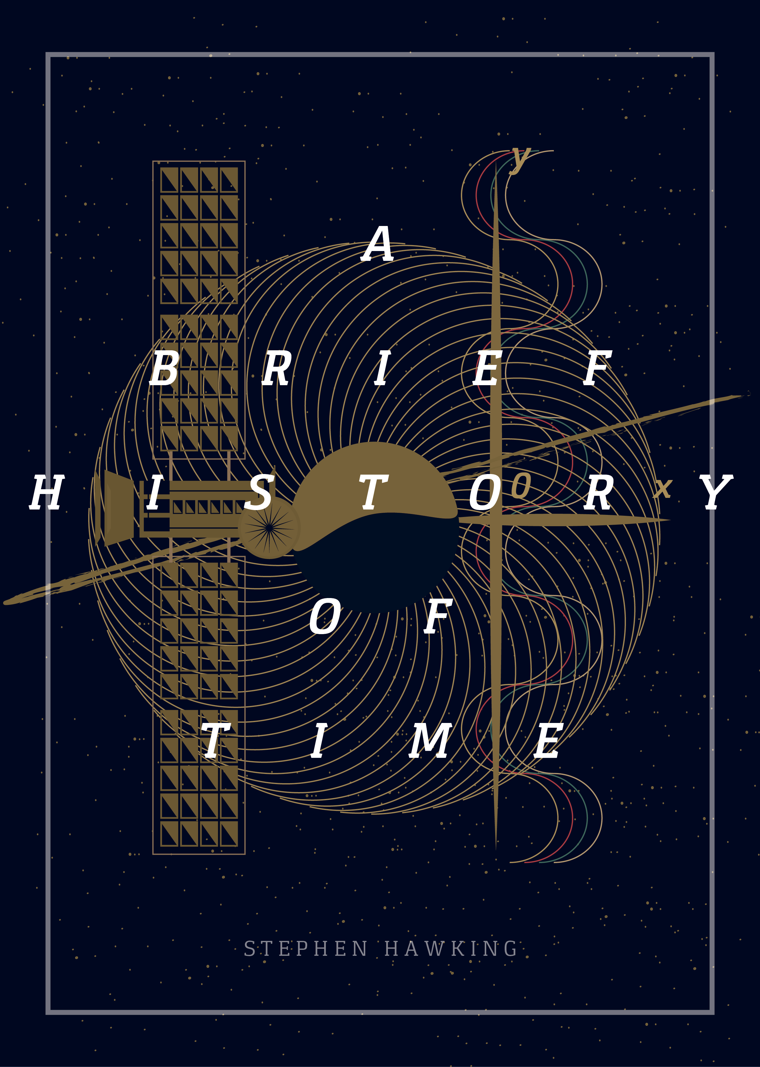
The brief asked of bold typography which I wanted to focus on instead of a loud image. The design is inspired by market research of similar titles and it's photographs inside. Images of our universe are often used as the covers when not portraits of Hawking, so creating a subtle universe image only using darks and highlights, along with shapes/illustrations of diagrams related to physics as a subtle but recognizably related and relevant would be an easier background to add the text to.
Using white which contrasts the most with this really thick and modern typeface brings this best selling edition in to the future from past covers. The contrast means this contemporary design would look strong in it's book section whilst instantly and easily communicating the physics theme, as the book is favourited for doing. It is a best seller for giving the information on such a complex subject simply and I wanted the design to reflect this.

I am really happy with the result and having more of a modernist, clean design for my portfolio. There are still a lot of details but a lot more subtle which I am going to take forward with future designs as I try and polish them more for a professional looking portfolio. I am glad I challenged myself by picking a category out of my comfort zone.

Brief 6: Penguin book award primary research


Going to keep the design more serious and not go forward with a Cavalo inspired illustration- although this would be taking a creative risk which can pay off, the book is one of the most highly respected by one of the most respected authors and if the cover looked too immature as a result, it would not fit the category.


Primary research shows adult non fiction's to do with space/physics are usually dark backgrounds with a cosmic image central with clean bold type with strong legibility

Brief 6: Penguin book award cover research

As this is an adult non fiction, I want my vision to come off as professionally as possible, as previous covers didn't rarely leave a very conservative look. I gained inspiration looking at favourite book covers in recent years/of all time.

'...his covers were chosen for their ability to “lure in” the reader, “by posing questions that I don’t want to ignore.”
- luckily the topic is extraordinary in itself, questions about our universe and being, which means having the cover express this mystery of the galaxy will create wonder and excitement/hopefully rush.
https://www.itsnicethat.com/articles/new-york-times-best-book-covers09cover-imperium-blog533-v209cover-librarian-blog533-v309cover-oconnor-blog533-v3
All mentioned in this article have a spark and flair to them without being too conservative. Still simple, which emphasise the main theme of the cover and book which the reader in inevitably looking for.
 
I like the idea of a surrounding detail, the galaxy/sky surrounding the title maybe.

Previous winners of this award went for the very simple but bold design too taking one idea from the story itself with hand-wrendered detail which is to be considered.
Kids of the Black HoleStars.The Universe in Your Hand cover design by Jim Tierney (Flatiron Books / 2016)
Ben Pieratt"Los secretos que jamás te contaron: para vivir en este mundo y ser feliz cada dia", de Albert Espinosa. Los secretos que jamás te contaron no es un libro normal, escrito para ser leído sin más; está pensado para que cada persona lo inspire y lo haga suyo.Destellos de luz : la nueva ciencia de la memoria / Charles Fernyhough ; traducción de Joan Soler. -- Barcelona : Ariel, 2013. http://absysnet.bbtk.ull.es/cgi-bin/abnetopac?TITN=496040
Looking for covers science fiction/space themed that lured me in to various styles I had loosely imagined, which have inspired me to experiment with a variety of layers/segments/effects and composition! The overall idea I want to portray is Hawkings wonder and love for the universe, represented as a sky.
Target Audience The book has great critical acclaim and commercial success since it's release two decades ago, which highlights it's need to be designed in a very high professional way that will be respected by the readers.

The core audience for this book is a large span of ages, as it is written in a way that can be understood by beginners in science. Not young high schoolers, but from college to senior, both genders. Mostly those interested in or studying/working in science who would undoubtedly have been used to very traditionally designed science book covers and also a fantasy element. Due to his high status within the sector, and this having been a best seller this would be distributed to a huge audience continuously, also as he adds when there is new science to support. It is important to consider the new generation of young adult readers and styles of the time.

This would be an audience of self learners, students, and teachers and those who want to know more about our fascinating universe, perhaps more as time goes on due to decline in religion.

Questions explored within this book: How did the universe begin—and what made its start possible? Does time always flow forward? Is the universe unending—or are there boundaries? Are there other dimensions in space? What will happen when it all ends? With exciting images and profound imagination. Themes Cosmology
How things work in the universe
How we see the universe
How the universe exists
Space/time
Black Holes
Origin of universe
Forces of nature

As I have not studied physics it's important to look at the illustrations that have been in the book through various editions for a reflection of these through the cover.

Stephen Hawking Illustrated Brief History of Time
This page gives an insight in to different visualisations of themes of the book that could be incorporated- cannot just focus on one as these are all the themes explored so if they could be combined in some way to summarise the book visually

Initially when picking the cover, a galaxy image like this came to mind as we are all familiar with this type of imagery and is an insight and wonder in to topics of the universe, and represents an exploration of the unknown which makes the concept appear not as scary and more mystical which could be a positive outlook which is exciting to the buyer. Encouraging people who wouldn't have normally bought the book to consider it by the cover is the aim (targetting a new generation of readers as required in the brief)

This illustration is very different to what you would expect which could make the cover stand out.

This imagery makes you want to know what is happening and what causes the colours/reaction.

Other covers I found

Related image

Within this cover the designer has incorporated structures shown in the book with a galaxy background. It looks well structured and professional, as the author is.  However, the typography doesn't really lift off the page and is lost slightly within the lines. As the brief wants strong typography I would avoid using type in this way.
Image result for stephen hawking a brief history of time

This design has a lot going on, and is quite post modernist in its design. Although it has the appeal for sci-fi fans and gives an insight in to themes explored such as time and scientific diagrams the title is too small for this brief. Including an image of Hawking is a good idea as he is such a celebrated pioneer within physics and it gives a trust factor in to what you are buying.

Brief 6: Penguin book award artist inspirations


James R Eads


Although a work of non- fiction, Hawkin's subject matter does provoke excitement wonder and imagination which in a similar cosmic style, could be represented on the cover as a different perspective to existing covers.

The work of Cavolo instantly had me interested and amazed at the sharp, magical surrealist illustrations that give wether it be a poster/book a fantasy world before even reading. Working in a similar style for the Hawkins cover would be intended to show the complex beauty of Hawkin's theories and work. 'This book marries a child's wonder to a genius's intellect. We journey into Hawking's universe, while marvelling at his mind' The Sunday Times


Previous covers are very academic and intellectual, which is completely understandable and expected. The take I want to have on this is to create more of a wonder on his theories on the universe and an imaginative concept that will draw in other audiences that may not be swayed only by his name and previous covers


A design that can excite consumers to read it and realize the absolute mind blowing ideas that come from Hawkins about our universe- adult is the target audience, but to modernize the ever growing and saturated adult sections would be worth doing.

Brief 6: Penguin Book award

Although I want to keep competitions briefs to a minimum which was advised, I may potentially look at designing for this Stephen Hawking book as it allows a very out there imaginitive perspective and dream like vision inspired by Hawking's subject matter of space.

They are looking for really good typography to be used and hand drawing type is something I want to practice a lot more this year as it creates a really bespoke identifiable style which will be appreciated when your designs are being looked at in portfolio/online portfolios.

Am torn as this is the adult cover award, whereas my style usually sways more towards fantasy/younger target audiences so depending on how this goes, may do the Children's Cover Award.

Brief 9: Meeting with collaborator for editorial photography magazine

I was directed by a peer towards this project as she had worked with her and said our work was very similar in terms of femininity and subject matter. I also want a piece of editorial within my portfolio to show versatility if going for certain jobs.

As seen through my body posi zine using bratz as references for influence on body image as young women, this photographer also referrs to childhood influence through hyper feminine objects and aesthetics such as dolls and colour. I wanted to take this on as a fun editorial project in which I can help another student with their portfolio, and build on this nostalgic 90's girl style together.

It is a challenge as I have a lot of briefs but this will only help prepare me for graduate jobs. I will follow her guidelines within the brief and my own knowledge/influences on the style which we will share back and forth.

The Brief:
Front page

I have attached an image that I would like for the front cover and also a font that I think would look cool for the title! I would love some illustrated flowers and other girly little things dotted around the page (I really like the look of 3 little hearts like under the ‘top 10 tips for moving out’ title on the sketch! The title for the full project is ‘Homesick’ so that as a header would be perfect

Things I would like stated on the front page

-       ‘FREE STICKERS’ with a little pic of what stickers they are
-       ‘What kind of grown up will you be?’ quiz inside
-       Top 5 tips for moving out 

Quiz

What Kind of grown up will you be quiz (where will you be in 5 years on the sketch but think the new title sounds better) I have attached all the answers and questions in a image called QUIZ on the email! Again, just make the page really girly and fun, maybe the boxes could be hearts and stuff?? Up to you!

Top 5 tips for moving out page

I’ve changed it from 10 to 5 because I couldn’t think of loads hahaha! I havn’t done a sketch of this page, but probably similarly to the others just really girly. Maybe add in some of my images? I can always make some more images to go with these if it helps! Maybe some half empty bottles of washing up liquid or something ahah.

Tip 1 – Make sure you have enough money to pay your rent! Its all well and good spending your money on cheap rose and ubers until its end of third year and you have no money and no place to live and you have to work in Greggs

Tip 2 – Make sure your roommate isn’t a cunt! Its all well and good seeing your friends every week at spoons, but when your have to deal with them bitching about the amount of washing up liquid that has been used since they bought it, it’s a different story

Tip 3 – Don’t move into a student house! They are fucking grim.

Tip 4 – Don’t get your hopes up. If you have a good home life and your parents love you, know that nobody is going be bringing you a brew in the morning once you move out and nobody will put the heating on before you get up, you will be freezing and brewless.

Tip 5 – Try not to worry about all this too much? If you are in second year of uni or lower, don’t worry about all this for a while. If you are in third year…I’m sorry.

Happy with whatever for the other pages, just follow the sketches and I am happy for you to add in all of your own flare and ideas in aswell! Thanks so much again for all this!!


Erin  x

These are what she sent over and quick sketches and magazine references for style. 


In meeting up she gave me freedom to experiment with adding detail, trying different shapes different typefaces as she trusts me with knowing her design vision which is really humbling and exciting!