
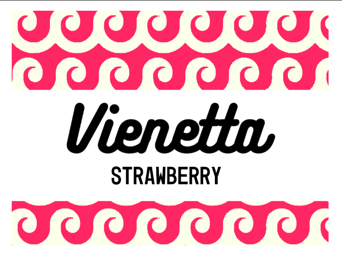
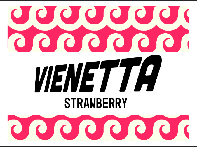
A contemporary strong typeface that elevates the brand in to the present
Clear to read
Has relation to the unique pattern of the dessert (curved/waved/stacked form)
Appealing to contemporary audience as well as being recognisable to older audience/clear to read
FEEDBACK
The top ones or the second to last are clearest. When using the top it felt too cosmopolitan. When using the second to last, it represents the pattern of Vienetta but have to be careful not to make the packaging too feminine and keep it looking like packaging that is modernised but still part of a family fridge.


No comments:
Post a Comment