The best part of this project was getting all the amazing feedback from people with my body positive survey- finding out how these women used to feel growing up and seeing their shift in to accepting who they are. The purpose of the zine and instagram is to get together this community to celebrate conquering these doubts, brought on by peers/magazines/unrealistic body image standards, and then combining that with the newest and strongest pressure, social media. By using their stories and dolls to represent the pressures and combining this with the Instagram format of the zine, this becomes relevant to those growing up now with these even tighter pressures now. Giving them body positivity, which I didn't feel was around when I was younger (due to early days of social media, before instagram etc), is a goal of this zine.
This zine has the aesthetic appeal to young women straight off the bat from the reference to the infamous Mean Girls 'Burn Book' which is why this cover was chosen. The cultural reference stands by the point being made by the format and use off dolls with plastic surgery/weight worries etc. Having a cover like this is done to entice those who may not want to face these worrying influences in to opening something fun, tongue in cheek with the image editing, yet uplifting and positive. This is why the contrast is used, to engage a wider audience who may not follow body positive movements. It is deliberately designed to look over feminine, vain, etc.
I was worried about leaving it as an Instagram as gaining followers with these sorts of things takes daily posting and personal relation to a person, and it takes time. With a publication like this, it is a concept that can start being sold on zine markets etc but could work in a book format as the simple design comes straight from Instagrams layout making it a versatile publication.
There was a lot of experimentation in the beginning with images used, collage, adding stickers to add nostalgia/diary effect etc. However, putting it in this instagram format was a sure way of making the concept contemporary and up to date with movements and history of body poisitivity. I felt like collaging magazines and adding stickers, as I tried with the Instagram account, was already done, and that making the stories as instagram comments and the pictures with 'like' bars was a format we were familiar with but hadn't seen as much before in this context.
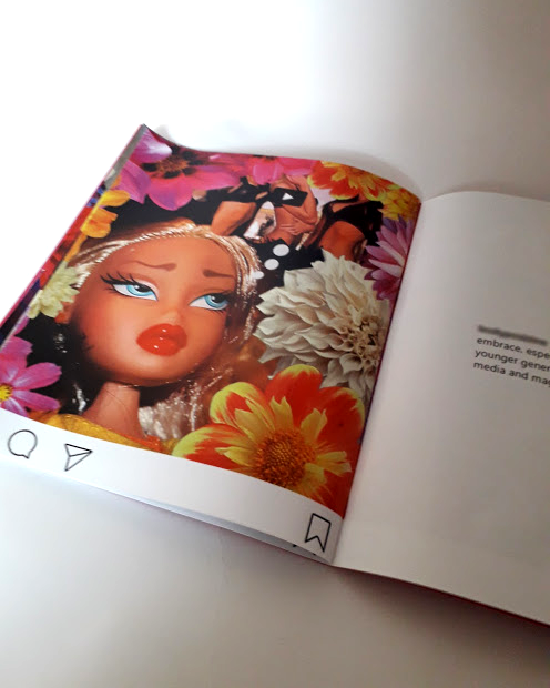
I wish I had got to grips with the concept earlier to create a book, but the experimentation was a learning curve! The flowers were kept consistent as a symbol of uniqueness and growth, deliberately feminine.
The end result is for the specific target audience of those I gained quotes from who are young women who grew up with dolls and images in magazines to compare their own bodies to which the audience can definetley relate to. Through researching the scary toll on young women, even young men, social media images have mental health wise, worse than it ever has been as shown in research, creating something bold but positive was an important project to create and getting stories from people was the best thing about it. I want to work with others to share their stories a lot more in the future, and try to create even a small positive change through design.


No comments:
Post a Comment