'...his covers were chosen for their ability to “lure in” the reader, “by posing questions that I don’t want to ignore.”- luckily the topic is extraordinary in itself, questions about our universe and being, which means having the cover express this mystery of the galaxy will create wonder and excitement/hopefully rush.
https://www.itsnicethat.com/articles/new-york-times-best-book-covers


All mentioned in this article have a spark and flair to them without being too conservative. Still simple, which emphasise the main theme of the cover and book which the reader in inevitably looking for.
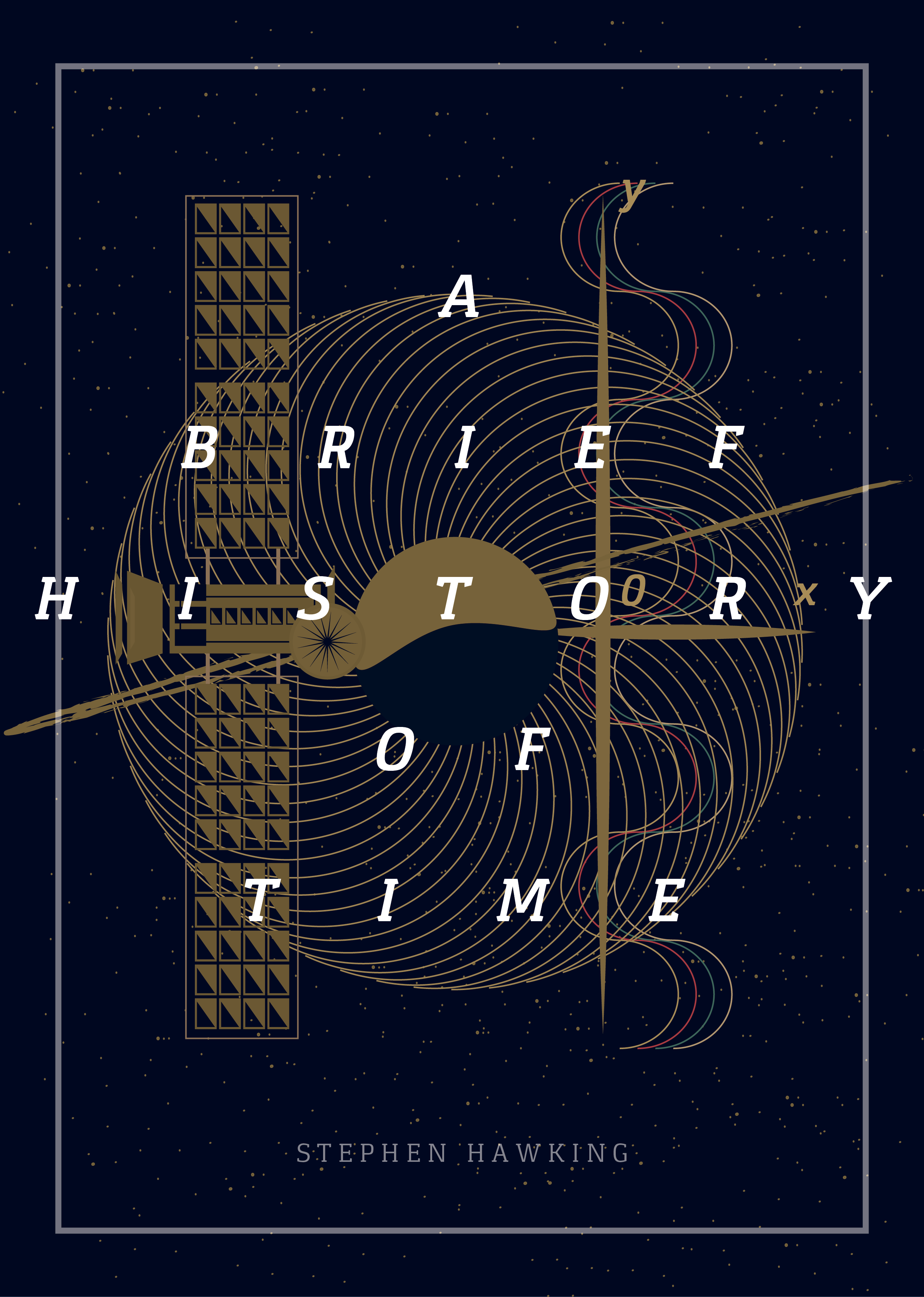
I like the idea of a surrounding detail, the galaxy/sky surrounding the title maybe.


Previous winners of this award went for the very simple but bold design too taking one idea from the story itself with hand-wrendered detail which is to be considered.


Looking for covers science fiction/space themed that lured me in to various styles I had loosely imagined, which have inspired me to experiment with a variety of layers/segments/effects and composition! The overall idea I want to portray is Hawkings wonder and love for the universe, represented as a sky. Target Audience The book has great critical acclaim and commercial success since it's release two decades ago, which highlights it's need to be designed in a very high professional way that will be respected by the readers.
The core audience for this book is a large span of ages, as it is written in a way that can be understood by beginners in science. Not young high schoolers, but from college to senior, both genders. Mostly those interested in or studying/working in science who would undoubtedly have been used to very traditionally designed science book covers and also a fantasy element. Due to his high status within the sector, and this having been a best seller this would be distributed to a huge audience continuously, also as he adds when there is new science to support. It is important to consider the new generation of young adult readers and styles of the time.
This would be an audience of self learners, students, and teachers and those who want to know more about our fascinating universe, perhaps more as time goes on due to decline in religion.
Questions explored within this book: How did the universe begin—and what made its start possible? Does time always flow forward? Is the universe unending—or are there boundaries? Are there other dimensions in space? What will happen when it all ends? With exciting images and profound imagination. Themes Cosmology
How things work in the universe
How we see the universe
How the universe exists
Space/time
Black Holes
Origin of universe
Forces of nature
As I have not studied physics it's important to look at the illustrations that have been in the book through various editions for a reflection of these through the cover.

This page gives an insight in to different visualisations of themes of the book that could be incorporated- cannot just focus on one as these are all the themes explored so if they could be combined in some way to summarise the book visually

Initially when picking the cover, a galaxy image like this came to mind as we are all familiar with this type of imagery and is an insight and wonder in to topics of the universe, and represents an exploration of the unknown which makes the concept appear not as scary and more mystical which could be a positive outlook which is exciting to the buyer. Encouraging people who wouldn't have normally bought the book to consider it by the cover is the aim (targetting a new generation of readers as required in the brief)

This illustration is very different to what you would expect which could make the cover stand out.

This imagery makes you want to know what is happening and what causes the colours/reaction.
Other covers I found
Within this cover the designer has incorporated structures shown in the book with a galaxy background. It looks well structured and professional, as the author is. However, the typography doesn't really lift off the page and is lost slightly within the lines. As the brief wants strong typography I would avoid using type in this way.

This design has a lot going on, and is quite post modernist in its design. Although it has the appeal for sci-fi fans and gives an insight in to themes explored such as time and scientific diagrams the title is too small for this brief. Including an image of Hawking is a good idea as he is such a celebrated pioneer within physics and it gives a trust factor in to what you are buying.
No comments:
Post a Comment