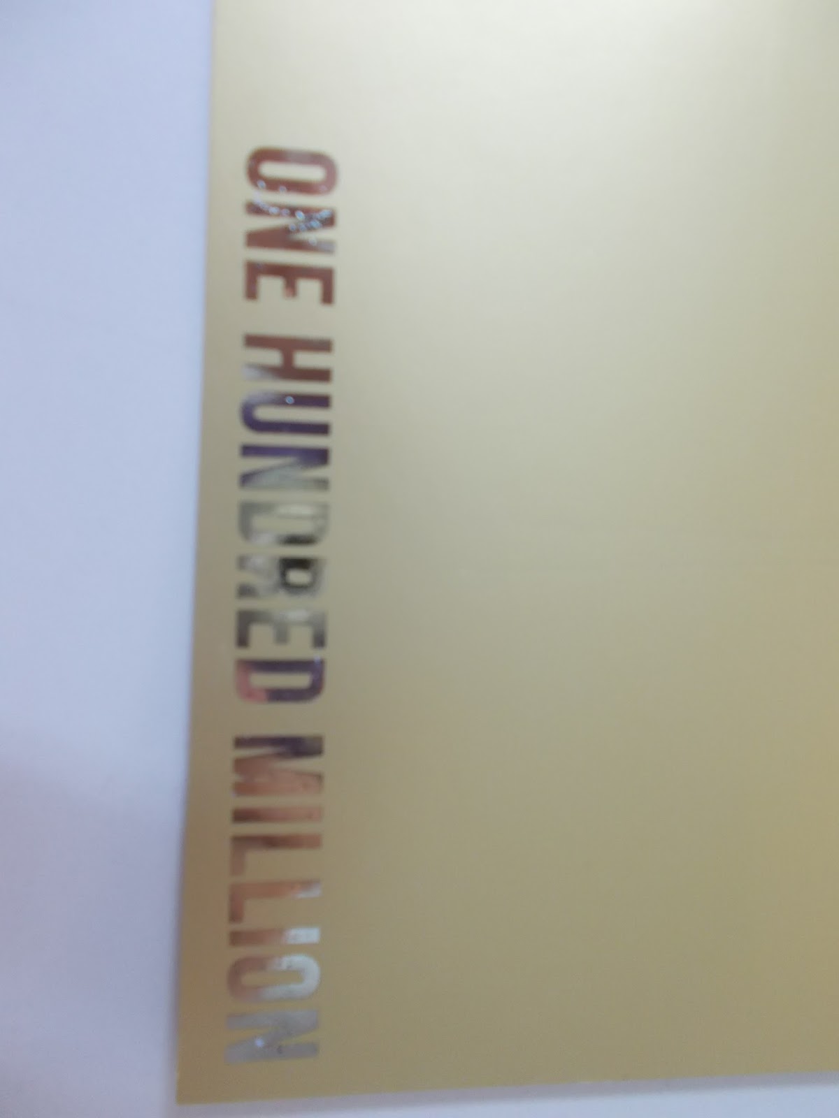
My outcome is opulent and looks royal and special, which I intended. I preferred my carved lino as I had the idea to describe that it was worth its weight in gold and I found the lino print process to be truly unique and satisfying to make. Printing both designs on varied stock was crucial as lighter stocks really didn't work and compliment the fine art detail of the linoprints effect. Knowing this could be a downfall, I had to make it work as an art piece that celebrates the speciality of such a grand currency and I feel it is fitting for an exhibition piece as it reminds me of a high valued fine art piece. Having the other side foiled seemed to be the technique that would work hand in hand with my opulent concept and other print method. This adds the cutting modern edge needed for the other side that celebrates the finer details and luxury detailing with foiled text radiant from all angles along with the 'real gold' gfsmith stock I chose to use for my final.
Another way I could have produced a more perfected outcome was to book the laser cutter to zigzag the edges in an acceptable way instead of trying to mock this golden ticket design influence with the craft scissors. The results were appalling and I have learnt in future if I am going to create a design inspired by so many grand inspirations I need to perfect and plan this properly to do it justice. Despite this, my final sides were cut to reduce printing gaps and the sizing is ideal a little larger than the standard banknote as this kind of currency isn't what would be put in pockets evidenced in research, but held in banks or framed to appreciate its extremely high value and tonal 'real' gold design. The currency was not added as this amount would be grand and dreamt of in all countries such as the golden ticket in the film. This is the golden note of dreams, which could have been crafted a whole lot better with more practice and better time management but I think will stand out in the exhibition with its use of metallic tonal golds and fine detailing. The speckled foiling is definitely not ideal, and as it is present in the text may bring down the design but numerous attempts showed no change which I think is down to that particular stock which was the most ideal in its thickness and reflective detail. This is a redesign with the purpose to be designed to match the true value and desire context of the high currency, and has the fine details with the purpose to allow it to be admired like highly valuable fine art is the most prestigious galleries. Having the cut out/zig zag detailing added degraded the high value I am portraying through the design.


No comments:
Post a Comment