for the oh ok but design, 'fold out series? bold and direct. other design elements that you'd like to see with this style? meaning is it enough as it is or would it be more motivational if there were elements such as pattern/illustration etc added, is typography enough
'motivation manifesto poster format: If I implemented bright colour would this be too busy/too much?' trying to understand how people would take in the advice the best way, in chunks or implemented on one large digital piece
'What motivates/would motivate you?' speaking directly to my target audience and gathering research that will inform my initial designs and route I take
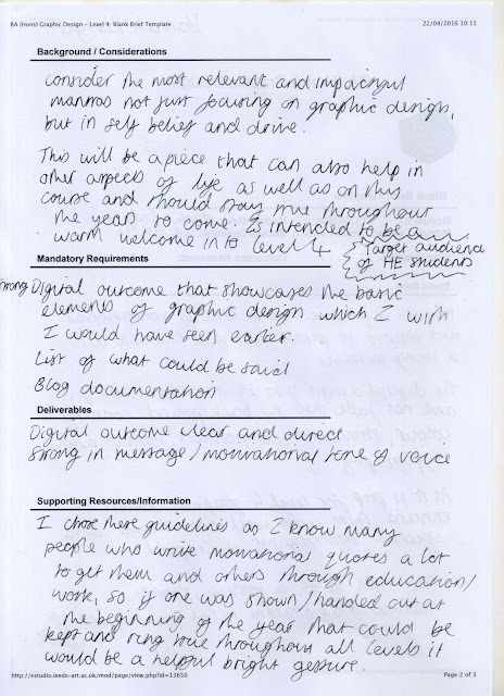
I want to make a motivational piece as being in so much and having a lot of interaction with other students and sharing so much, sometimes you feel your work isn't up to the highest standard and compare yourself to others. It is beneficial to have reminders and quotes relevant to your course. As I had said in my brief, a lot of the time I have seen fellow students drawing motivational quotes to ease them in to starting their work. If there was a handout that would be stuck up on the pin board you will see everyday and look to for some motivation and self confidence it would be a small but very helpful feature for your transition in to higher education graphic design.


No comments:
Post a Comment