I am going to experiment with the original Wonka typeface, the Colliseum one used in the latest Wonka movie Tim Burton made and like suggested try a serif, more classic script typeface as this may fit the design better and look the part for a very luxury 100 million pound note.
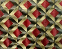
I will further research what other patterns or backgrounds which could be etched foiled or embossed depending on the stock, which I want to be very refined and sophisticated in which I will attempt to create digitally following from previous inspiration and from this list given to me. I will also begin experimenting drawing them but I am worried about converting them to digital as creating clean finer detailed vectors is something I need to improve on.
Although it was recommended that I combine gold with royal colours such as blues and reds, I feel this would ruin the delicacy of the design and want to pursue working in two tone gold with the foiled part as the pattern/highlight or using the shadows creating tone through embossing.


No comments:
Post a Comment