
Although I don't particularly like the main type as I think it probably too inconsistent, it communicates to the audience it is for children straight away which I remembered throughout creating this leaflet as that is a key element of design skills, capturing your target audience through the design.

Very basic, easily fillable vectors that transform when coloured. These would probably be for slightly younger, reception-y2 perhaps before being as aware of genres of films which mine aim to provoke. Having them given out at book fairs and libraries is set as in classes they probably have began reading varied genre books and are more aware of the types of films they enjoy more and the themes that go along with certain genres and characters.
This also shows that having the titles in a type that can be coloured also allows the person filling them in to set the theme.

Creating characters is a very popular way of appealing to younger audiences as they can be humorous and because of this, memorable. The design is clean and legible but by using characters and the chubby soft rounded sans serif typefaces, it becomes a young non serious publication with a running context of characters becoming elements of colour theory. This is an amazing concept but more suited to a larger publication rather than a leaflet.

An example of getting children to interact with a colour leaflet in a fun way which educates them. This is the fold out format I originally opted for as it is easy to work through due to the sectioning. The difference in mine is that there are no right answers as it is the childs perception of each genre which makes it more fitting for slightly older target audience of late primary school. Also, this design plays it very safe whereas I wanted the typography to instantly indicate colouring in/drawing/childrens publication by using an imperfectly kerned and uneven lined title and outlined title pages that also can be coloured in.
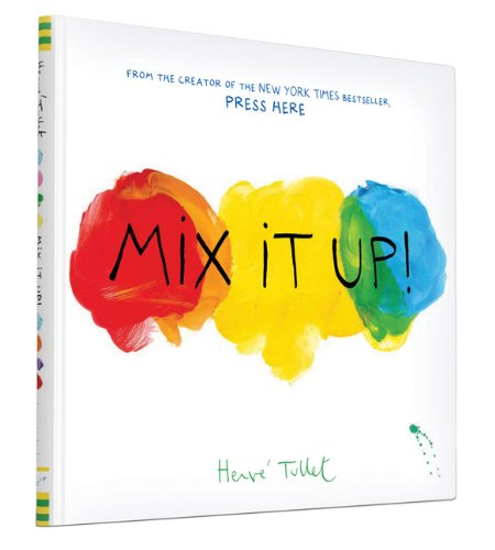
This book appears to communicate the freedom and excitement of primary school art classes, experimenting with mixing paints and gaining an interest in drawing/painting/identifying which colours go together. To me art was always a more exciting lesson where you weren't expected to have a perfect straight response, there would be variations in everyones work and that should be celebrated as you are encouraged to gain a unique style as you progress in the subject. This is made clear through the messy paint mix photograph and the handdrawn looking typefaces used rather than using very safe typography such as in the leaflet in the above description.
No comments:
Post a Comment