
First piece directly inspired by initial concept influence of Andy Warhol's 'Money' painting from the 60's, using the colour scheme and style but warping it with varied typefaces and combining most recognisable currencies from around the world with the central standing out implying the future concepts of currency are not known and would entice the viewer to want to visit the exhibit.
My very rough building design was shown to the group as a way of incorporating the architecture of the building to celebrate it, and a way of using the LCA colour scheme showing who we are, taking over bunkhouse. I then began to try placing currency symbols in certain ways which wasn't working how i'd envisioned and the group also were undecided on how this would work. I mainly wanted to make use of bank house collaborating with LCA and celebrating this.


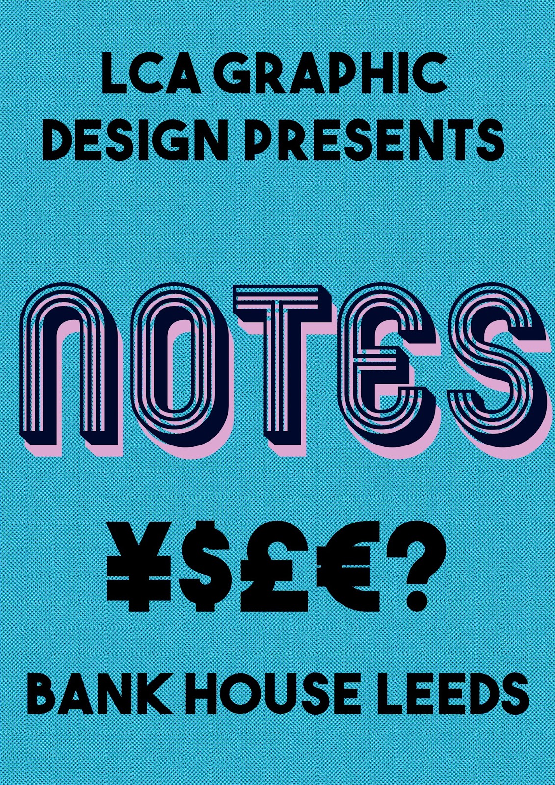

My initial poster designs we brought to the first presentation were intended to be consistent exciting, bold and fun, whilst creating a range of distinctive hand outs/invites/posters/branding using the warhol money colour scheme whilst using halftone affect relating back to the 60s also, giving the background the subtle texture of a bank note.


This other typeface was also considered before going with Mexcellent as it was more striking.


Combination of my first two designs which is perhaps way too vibrant to be part of the exhibition identity.


I really enjoyed these designs as they brought my concept all together, using the building the colour scheme, and having a modern take but still being 60's inspired with the typeface and architecture/typeface. I wanted a modern distinctive impactful branding that warped an old theme and made it new, like our exhibition pieces would be doing. However, it was agreed these were too busy and we took my simple colour background designs to our first presentation.

A rough initial concept I thought of based on initial discussions of connecting the currency symbols, seeing the opportunity to use the lines as a way of doing this using black and white referencing first directs colour scheme. This design was liked by my group, and the idea of connecting the lines was later implemented in to way finding before being told this has been done before in the Mexican olympics and that it was too reminiscent of sport due to this. I feel that my design input was positive and pushed the boundaries slightly due to the combinations of striking text colour and background, and I am proud of these designs but having feedback and working so well as a group to strip this down and take the most successful parts made the designs better as a whole. Elements such as contrasting colour, halftone and using the building in my work inspired our final outcomes.
No comments:
Post a Comment